Download
1 / 2
20 likes | 23 Views
Inspired By Nature As Biophilia and everything that connects with nature continue to be a trend in interior design, the ideal materials to combine this color are neutral materials like wood finishes. Especially in light tones to create contrast with the darkness of the urban bronze color if youu2019d choose to partner

E N D
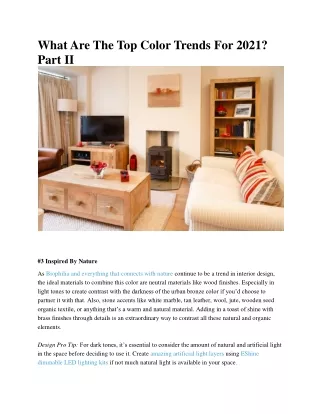
What Are The Top Color Trends For 2021? Part II #3 Inspired By Nature As Biophilia and everything that connects with nature continue to be a trend in interior design, the ideal materials to combine this color are neutral materials like wood finishes. Especially in light tones to create contrast with the darkness of the urban bronze color if you’d choose to partner it with that. Also, stone accents like white marble, tan leather, wool, jute, wooden seed organic textile, or anything that’s a warm and natural material. Adding in a toast of shine with brass finishes through details is an extraordinary way to contrast all these natural and organic elements. Design Pro Tip: For dark tones, it’s essential to consider the amount of natural and artificial light in the space before deciding to use it. Create amazing artificial light layers using EShine dimmable LED lighting kits if not much natural light is available in your space.
#4 Illuminating Yellow & Ultimate Gray Every year, Pantone chooses a color depending on trends, situations and human behavior. As people look for ways to fortify themselves with energy clarity and hope these days, Pantone selected two colors—illuminating yellow and ultimate gray as the color of the year. Colors evoke feelings and emotions. Yellow is the color of happiness, optimism, creativity, joy, sunshine, and spring. It’s the brightest of all the colors in the spectrum. It’s the color that captures our attention and evokes creativity more than any other color. The juxtaposition of these two colors selected by Pantone is interesting. Gray is a prevalent neutral color used in interior design. However, yellow is such an energetic color and therefore, we must use them in appropriate doses and places. Yellow is best used as an accent color it can be for the front door pillow accents, chair, ottoman, kitchen, tools, cabinets an eye-catching sofa in a neutral room, etc. If you need a torch of optimism and joy, this might be a good option, be creative but be careful. Gray and yellow can be combined with other neutral colors such as white and black for a contemporary look. If you like bold and vibrant colors, you can combine yellow with a few contemporary touches of colors.