Download
1 / 16
160 likes | 260 Views
PAGE DESIGN . Giving Your Work the Best Possible Appearance. Introduction. Definition and Purpose Page Layout Space Fonts Type Size Headings Graphics Emphasis Navigation. Definition and Purpose.

E N D
PAGE DESIGN Giving Your Work the Best Possible Appearance
Introduction • Definition and Purpose • Page Layout • Space • Fonts • Type Size • Headings • Graphics • Emphasis • Navigation
Definition and Purpose • Page design is a clear arrangement of materials (formatting options) that lets readers understand the document from a visual standpoint. • The appearance of a technical writing document is as important as the information it contains. • Good design makes it as easy as possible for the audience to read and understand the document.
Affects how audiences react to and interact with the information on the page Poor organization—readers can’t find what they need. Unattractive appearance—readers are reluctant to read the document. Expectations—readers want visual appeal, logical organization, and easy navigation. Page Layout
White (Empty) Space • Space breaks up the regular visual pattern • Reluctant readers are easily intimidated • Page attributes • Non-threatening appearance: • Double space • Wide margins • Threatening appearance: • Single space • Narrow margins • Small type
Adding Empty Space • Columns • Multiple columns per page shorten the horizontal line of text • Extra empty space appears in margins between columns • Graphics • Small pictures or icons provide contrast to text • Graphics need a border of empty space so as not to crowd the text
Fonts • Sans serif example, Comic Sans MS • Serif example, Garamond (font used on these slides) • Either ok for short documents • Serif preferable for long documents
Type Size • 10 or 12 point size is the average choice for documents. 10 point is okay for large fonts, 12 point for small fonts. • This is 10 point. • This is 12 point. • PowerPoint uses 28 and 32 point sizes for easier viewing of slides. This is 28 point. Slide title = 44 point. • The type of document determines the best font size.
Headings • Purpose: to announce document organization, point readers to information, divide document into accessible chunks, help readers remember information • Style: all headings on same level should have identical appearance • Sans serif fonts good for headings • Phrase or question format for headings • Grammatical parallelism is as necessary as visual consistency (slide headings are all noun phrases).
Headings 2 • Heading hierarchy shows the levels in the document. • The title is the largest heading. • Heading 2 points larger than type in the section • Location as well as appearance shows levels • Center major headings and title • Place minor headings at left margin • Documentation styles define heading appearance and spacing.
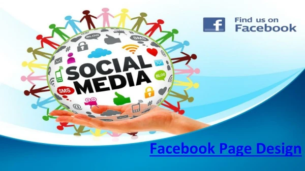
Graphics • Purpose: to supplement text • Placement alternatives • On the same page as the text: allow plenty of empty space around graphic. Can wrap text around graphic • On page of its own: should be the page after the graphic is referred to in text. • Some graphics have labels: table or figure #. Title or caption.
ADDING GRAPHICS 2 • When adding graphics using a computer, the amount of empty space will already be calculated. PowerPoint may not allow label creation with certain slide styles.
Emphasis • Use design elements to bring important points to your audience’s attention. • Bold, italicize, or underline important words, phrases, or sentences. • Use emphasis sparingly to avoid diluting its impact.
Navigation • Keep audience from getting lost within document. • Use page numbers, table of contents, headings, or hyperlinks to help audience maneuver through the document.
Page = Road Map • Visual hierarchy (headings, graphics, title) • Emphasis (bold, underlining, italics) • Navigation (page numbers, hyperlinks) • Contrast (text and empty space) • Format following Western reading convention (left to right)