Download
1 / 27
270 likes | 410 Views
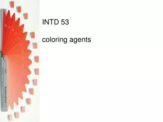
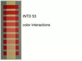
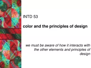
INTD 53 dimension of hue. hue is simply the kind or name of a color a pure hue has not been mixed with white, black, grey or its complementary color this distinction is important when trying to get colors to interact and react— pg.34. mixing hues all begins with primaries

E N D
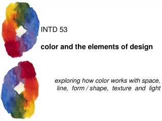
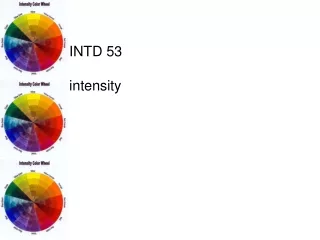
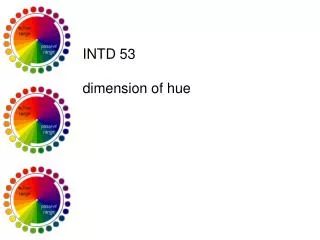
INTD 53 dimension of hue
hue is simply the kind or name of a color a pure hue has not been mixed with white, black, grey or its complementary color this distinction is important when trying to get colors to interact and react—pg.34
mixing hues • all begins with primaries • unequal proportions of the primaries are required to achieve equal VISUAL partnership • pigment wheel primaries? • munsell wheel primaries? • light wheel primaries? • process wheel primaries?
mixing hues • hues can be mixed in 3 ways: • two primaries— • equal/unequal • two adjacent colors— • equal/unequal • tertiary, quaternary, • quinary • two complementary • colors—equal/unequal
broken hues a combination of unequal proportions of all the primaries—infinite possibilities broken hues found in nature—russet, gold, ecru—called earth colors usually warmer, more opaque and less intense than other hues add a quality of richness
hues in compositions • compositions often work best with dominant hue— • few hues over a wide area • dominant hue sets tonality for the piece
hues in compositions • primary hues • attract the eye • most stable • most easily recognized • offer greatest contrast • function best when used: • in small quantities • on small areas • in upper portions
hues in compositions • secondary hues • less stable • compatible with other colors • function well when used: • in large masses • in the lower portions of compositions
hues in compositions • tertiary hues • least stable—can become stable if used in greater proportion to primary • impart the least contrast • function well when used: • in large masses • in the lower portions of compositions
INTD 53 dimension of value
value • the lightness or darkness of a hue • changed only by adding white or black • tint—white added • shade—black added
values of hues • pure hues vary in value • yellow—lighter value • purple—darker value • squint test—blend together? 9 white
values of hues: lighting • reduced light— • red, orange & yellow appear darker • blue & green appear lighter • strong light— • lighter, pure values seem more intense • dim light— • dark-valued pure hues seem more intense
values of hues: discords when the value of a hue is opposite to its natural order EXAMPLES: purple—naturally dark hue add white—creates lavender lavender—discord to purple yellow—naturally light hue add black—create discord
values of hues: discords play supporting role in artists’ work: easily overshadowed—but stop tendency of “spread” avoid large areas of light discord—weak; small areas reduce monotony “highlights” rules for highlights—pg. 40… based on primary color closest to object featuring highlight etc…
value and spatial clarity: pattern & texture differences in value create contrast which creates pattern & texture delineates shapes as well as space—can be subtle or obvious
participation activity: value pattern …using the simple pattern provided and your markers, create an example of pattern using different values of only one hue …hint: use layers of marker to create darker values
value and spatial clarity • value clarifies space in 5 ways: • 2D forms made to appear solid as result of shading • creates pattern and texture • imparts emotion • can give definition and emphasis • difference in values imparts contrast
value and spatial clarity: shading chiaroscuro—traditional form of shading: highlight, light, shadow, core of shadow, reflected light, cast shadow
value and spatial clarity: emotion stark contrasts—precision, firmness, objectivity, alertness close values—haziness, softness, vagueness, quiet, rest, introspection dark compositions—night, darkness, mystery, fear light compositions— illumination, clarity, optimism
value and spatial clarity: definition & emphasis contrast in value can be used to create emphasis light values—more active, increase distance, make objects seem larger
value and spatial clarity: contrast & toning wide differences in contrast make objects stand out & increase perceived size
value and spatial clarity: contrast & toning toning—when a composition is worked on a mid-value surface
value in compositions: boundaries dissolving boundaries—broken hues disappearing boundaries—analogous hues
participation activity: grisaille …using the “paint-by-number” image provided, create an example of the grisaille technique—make the image appear to have depth using only shades of gray