Download
1 / 71
710 likes | 722 Views
Data Presentation, Interpretation and Use. Learning objectives. Participants will be able to: Understand different ways of summarizing data Choose the right table/graph for the right data and audience Ensure that graphics are self-explanatory Create graphs and tables that are attractive.

E N D
Learning objectives Participants will be able to: • Understand different ways of summarizing data • Choose the right table/graph for the right data and audience • Ensure that graphics are self-explanatory • Create graphs and tables that are attractive
This is Better! Use of ITNs in Zambia
Effective presentation • Clear • Concise • Actionable • Attractive
Effective presentation • For all communication formats it is important to ensure that there is: • Consistency • Font, Colors, Punctuation, Terminology, Line/ Paragraph Spacing • An appropriate amount of information • Less is more • Appropriate content and format for audience • Scientific community, Journalist, Politicians
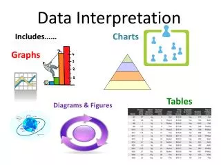
Summarizing data • Tables • Simplest way to summarize data • Data is presented as absolute numbers or percentages • Charts and graphs • Visual representation of data • Usually data is presented using percentages
Points to remember • Ensure graphic has a title • Label the components of your graphic • Indicate source of data with date • Provide number of observations (n=xx) as a reference point • Add footnote if more information is needed
Tips for Presenting Data in PowerPoint • All text should be readable • Use sans serif fonts • Gill Sans (sans serif) • Times New Roman (serif) • Use graphs or charts, not tables • Keep slides simple • Limit animations and special effects • Use high contrast text and backgrounds
Choosing a Title • A title should express • Who • What • When • Where
Tables: Relative frequency Percent contribution of reported malaria cases by year between 2000 and 2007, Kenya Source: WHO, World Malaria Report 2009
Use the right type of graphic • Charts and graphs • Bar chart: comparisons, categories of data • Histogram: represents relative frequency of continuous data • Line graph: display trends over time, continuous data (ex. cases per month) • Pie chart: show percentages or proportional share
Bar Chart Source: Quarterly Country Summaries, 2008
Stacked bar chart % Children <5 with Fever who Took Specific Antimalarial, 2007-2008
Bar Chart v. Histogram Data fabricated for illustration
Bar Chart v. Histogram (cont.) Data fabricated for illustration
Line graph Number of Clinicians* Working in Each Clinic During Years 1-4, Country Y *Includes doctors and nurses.
Caution: Line Graph Number of Clinicians* Working in Each Clinic During Years 1-4, Country Y *Includes doctors and nurses.
Pie chart Percentage of all confirmed malaria cases treated by quarter, Country X, 2011 N=257
How should you present… • Prevalence of malaria in 3 countries over a 30 year period? • Data comparing prevalence of malaria in 10 different countries? • Data on reasons why individuals not using ITNs (out of all individuals surveyed who own an ITN and are not using it)? • Distribution of patients tested for malaria by parasite density
Summary • Make sure that you present your data in a consistent format • Use the right graph for the right data and the right audience • Label the components of your graphic (title, axis) • Indicate source of data and number of observations (n=xx) • Add footnote for more explanation
Learning objectives • Understand basic chart terminology • Create charts in PowerPoint using data in Excel • Give a description of the data presented in each chart
Pie Chart Source: MEASURE Evaluation, Retention, Use and Achievement of “Universal Access” Following the Distribution of Long Lasting Insecticide Treated Nets in Kano State, Nigeria, 2009
Individual Work: Bar Chart Source: Tanzania HIV and Malaria Indicator Survey, 2008
Analysis vs. Interpretation • Analysis: describing data with tables, graphs, or narrative; transforming data into information • Interpretation: adding meaning to information by making connections and comparisons and by exploring causes and consequences
Interpreting Data • Does the indicator meet the target? • What is the programmatic relevance of the finding? • What are the potential reasons for the finding? • How does it compare? (trends, group differences) • What other data should be reviewed to understand the finding (triangulation)? • Conduct further analysis
Practical • Question: • Are ANC clinics in country X reaching their coverage targets for IPTp? • Data Source: • Routine health information
Data Source General ANC Registers • Which of these variables are relevant to answer your question? • Which elements will be included in your numerator and which in your denominator? • Answers: • 1) New ANC clients, IPTp-1 • 2) New ANC clients =Denominator, • IPTp-1 and IPTp-2= Numerator
IPTp Coverage-Facility Performance Number of ANC clients receiving IPTp • Question: • Among the five facilities, which one performed better? • Answer: • Cannot tell because we don’t know the denominators
IPTp Coverage-Facility Performance Number of ANC clients receiving IPTp Question: Now, you have the denominators, which of these facility performed better? Response: Facility 5
Are facilities reaching coverage targets? Target-80% * National coverage target for pregnant women receiving IPTp-2 is 80%.
Additional Questions • Which facility is performing better/worse than expected? • What is the trend over time for these facilities? • How would you assess each facility’s performance based on the data? • What other data or information should you consider in providing recommendations or guidance to the facilities?
Learning Objectives By the end of this session, participants will be able to identify: • The purpose of dissemination • Dissemination issues and concerns • Strengths and weaknesses of different communication formats • The main components of a dissemination plan
Dissemination Framework Source: MEASURE DHS
Purpose of Dissemination • Disseminating data can help potential users: • Understand current health status • Reach decisions based on quality data • Make changes to existing health programs and policies • Take other actions to improve health outcomes
Plan Materials Carefully • Use different formats if possible, including: • Print materials • HIS Reports, Success story, Posters, Key findings, Fact Sheet, Press Report • PowerPoint presentations • CD-ROMS with datasets • Videos • Online media
Focus on a Specific Audience • Create different materials for different users: • Meet the audience’s needs • Translate materials into local languages • Produce reports on specific topics • Impact • LLINs • Case Management • IPTp • Match the medium to the audience
Make Sense of the Data • Help users make sense of the data: • Add policy recommendations and conclusions • Highlight key points • Break down findings by categories of interest • Province • Education • Wealth • Use maps and graphics to convey information