Download
1 / 14
180 likes | 346 Views
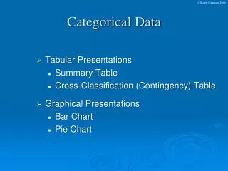
Chapter 2 Summarizing Categorical Data. In this chapter, we will look at some charts and graphs used to summarize categorical data. A table of the form: Frequency = the count or number in the sample falling into the category value

E N D
Chapter 2Summarizing Categorical Data In this chapter, we will look at some charts and graphs used to summarize categorical data.
A table of the form: Frequency= the count or number in the sample falling into the category value Relative Frequency= the percentage of the sample that falls into the category value Frequency Tables
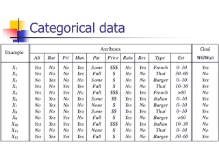
Construct a frequency table for eye color using the data from “ACSC”. Example 1
A graphical version of a frequency table: • the horizontal axis has each category value (in any order) equally spaced apart • the vertical axis should be appropriately scaled, and it represents either the frequencies or relative frequencies • rectangles (of equal width) are then drawn above each category with heights corresponding to each frequency or relative frequency Bar Charts
Construct a bar chart for eye color using the data from “ACSC”. Example 2
A circular version of a bar chart: Each category value is graphed with its appropriate “wedge size” in a circle rather than bars/rectangles side by side. Pie Charts
Construct a pie chart for eye color using the data from “ACSC”. Example 3
A two-way table that gives the frequencies (or relative frequencies) for 2 categorical variables simultaneously: Contingency Tables
The table shows the frequencies of 120 movies released in 2005 based on genre and rating. Example 4
The table shows the frequencies of 120 movies released in 2005 based on genre and rating. The first thing we should do with such a table is fill in the totals. Example 4
The table shows the frequencies of 120 movies released in 2005 based on genre and rating. (a) What percentage of the movies were comedies? Example 4
The table shows the frequencies of 120 movies released in 2005 based on genre and rating. (b)What percentage of the movies were rated PG? Example 4
The table shows the frequencies of 120 movies released in 2005 based on genre and rating. (c)What percentage of the dramas were rated R? Example 4
The table shows the frequencies of 120 movies released in 2005 based on genre and rating. (d)What percentage of PG-13 movies were Horror films? Example 4