I can create histograms.
160 likes | 326 Views
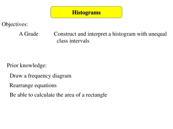
I can create histograms. I can interpret histograms. Warm Up Write an equation to match the sentence: 3 less than the product of 2.5 and a number equal 30. Miss Arnold- Pass around height sheet!. What do you know about. bar graph? double bar graph? Histogram?. Bar Graph.

I can create histograms.
E N D
Presentation Transcript
I can create histograms. I can interpret histograms. Warm Up Write an equation to match the sentence: 3 less than the product of 2.5 and a number equal 30. Miss Arnold- Pass around height sheet!
What do you know about • bar graph? • double bar graph? • Histogram?
Bar Graph • A bar graph can be used to display and compare data • The scale should include all the data values and be easily divided into equal intervals.
Double Bar Graph • Can be used to compare two related sets of data
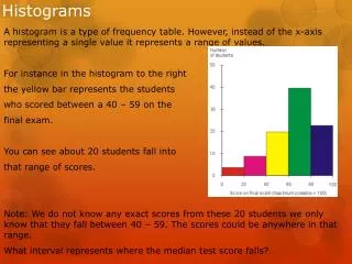
Histogram • Histogram is a bar graph that shows the frequency of data within equal intervals. • There is no space in between the bars.
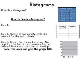
The table below shows the number of hours students watch TV in one week Make a histogram of all the data.
Step 1 • Make a frequency table of the data. Be sure to use equal intervals
Step 2 • Choose an appropriate scale and interval for the vertical axis. The greatest value on the scale should be at least as great as the greatest frequency.
Step 3 • Draw a bar for each interval. The height of the bar is the frequency for that interval. Bars must touch but not overlap. • Label the axes and give the graph title
What can we interpret from this graph? Most students watch ____ hours of TV. 4-6
How many students were surveyed? I hope you didn’t say 20 or 17. It’s all of the students….look back at the number of frequency's and add those up….to get 48 students.
I can create histograms. I can interpret histograms.
Classwork • Now create a histogram from the frequency table. • **Use your notes!**