Download
1 / 1
10 likes | 29 Views
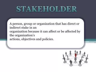
In order to create a map of all of the stakeholders to highlight the political dimension of a project. Here's what this presentation, and through PMP certification online - will help you understand the stakeholder landscape.

E N D
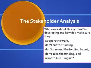
120 Matheson Boulevard East, Suite 203, Mississauga, ON, Canada L4Z 1X1 Website : https://www.educationedge.ca/project-management/ Understanding the Stakeholder Landscape To highlight the political dimension of a project, the first thing I like to do is create a map of all of the stakeholders. Two approaches in particular are effective. 1.Proximity Map Begin by creating concentric rings around your project, with your project in the centre. Each circle indicates a group of stakeholders who are not directly involved in your project. So your project team — or perhaps just your core team – is in the innermost circle. Following rings represent stakeholders who are further away from your project, such as co-workers and other departments of your company, business partners and portions of your supply chain, customers and the general public, regulators and pressure organisations. Each stakeholder should be assigned to their own circle. I occasionally utilise left to right placement to signify various levels of opposition or support for my idea. Alternatively, top to bottom orientation can be used to indicate influence strength. 2.Sociogram A sociogram is a more potent tool for comprehending the political component, but it takes longer to create. It exposes political influence trends among your stakeholders. Begin by making a list of significant stakeholders and writing them down as points on a large piece of paper. Then, to illustrate links, draw lines between them. Add an arrow to the line where one effects the other the most. If the impact is reciprocal, use two arrows; if it is solely a social relationship (as you interpret it), use none. Strong and fine lines can also be used to indicate the strength of the link or effect. Add more stakeholders to your diagram to complete the web of influence. This social network map will begin to illustrate the natural groupings and alliances, the powerful political players at the centres of those groups, the individuals who bridge groups and link them together, and the outliers. A Combination You could also overlay a network onto a proximity map, something I haven't attempted. This may be inconvenient, but it may disclose the pathways through which your deepest stakeholder can communicate with more distant stakeholders. Want to learn more about Stakeholder Landscape? Sign up for PMP Certification online classes today!