
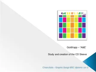
Goldfrapp – “A&E’
Explore the creative process of designing a Goldfrapp CD sleeve inspired by a golden apple and psychedelic disco themes. Learn graphic design techniques and the evolution of the artwork.

Goldfrapp – “A&E’
E N D
Presentation Transcript
Goldfrapp– “A&E’ Study and creationof the CD Sleeve Chiara Bullo –Graphic Design BTEC diploma Lev3
I’ve heard about “Goldfrapp” a couple of time, I didn’tknow anything about the group and the singer: this isthe first song I’ve ever heard…and I loved it! For some mysterious reason my mind linked the name of this group to an image of an APPLE. This was the very first image in my mind: a golden apple. I chose a photo of an apple from flickr and then I modified it in photoshop. Using adjustment layer and blending options such as gradient overlay I created my golden apple. Thanks http://www.flickr.com/photos/perldude/ 95703586/ for the apple picture
I didn’t want the sleeve to reflect the lyrics or the album’s name. I wanted the cover to be very “80’s disco” style. The first attempt was applying a kind of pattern on it. Using compound path and clipping mask First, I created a kind of stripy apple and then a variation of it using diamonds shape.
I’ve tried to manipulate the sleeve again to get a more complex image. I got the first one simply copying the golden apple using the “distort and transform” and then, the transform operation in order to create a kind of grid pattern. I also introduced a “rainbow” apple to get a touch of color. Using the same technique I create a colorful squared grid and I placed the golden apple on top.
The second version is much more elaborate: I used both the golden and rainbow apples to create a kind of flower simply using the rotate tool> click > 30° and then “ D” to repeat again the same command. I also applied a dotted background using graphic style and then I added the band’s name (“Braggadocio” font). I really liked the Idea of having colourful background in a sort of “psychedelic disco” style but at that point I wasn’t so sure about the apples....I thought it could be “too much”.
I made an additional cover without apples, simply using the colorful grid plus creating the font outlines > compound path > clipping mask, I created a sort of continuity between the design and the text. Actually although, I was ingenuously devoted to “the apple”,I must admit that this latest version works really well.
It was such a pity forsaking the apple that I decided to have it on the back of the sleeve. I used the same background of the front adding a white 90% opacity square and Lyrics in “Eurostyle Font”. As told before, I wanted to have the apple in my back cover and I Insert it in the lower right corner using clipping mask to cut it out.
In the end, I decidedtohave the rainbowappleinsteadof the goldenonebecause I didn’tliketoo muchcontrastbetween the pattern and the appleitself: I createdspace in lower right part simplyturning off or on the layerwhere the colorfulsquareswere. In the pageyou can see the finalresult.
I searched only content with a Creative Commons license. All the images can be modified, adapted, or built upon according to Creative Commons License.