Download
1 / 22
220 likes | 288 Views
Example on how to use this data visualization tool. Eg . Compare ANC between Indian and Brooktrout over time. Accept additional security prompt. Click button on top row to show field list. Remove the pH data area.

E N D
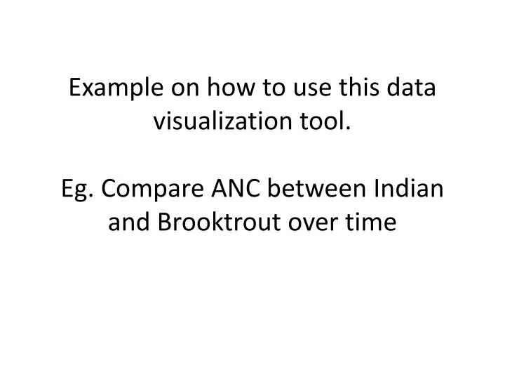
Example on how to use this data visualization tool.Eg. Compare ANC between Indian and Brooktrout over time
Add ANC to the data area then right click on it, go to autocalc, go to average
Click dropdown menu on Lake Name (category field) and select only Brooktrout
Click on field list drop down next to Date by week and Drag years to the category field
Click dropdown menu in the lake name (filter field) and select Indian as well
Move lake name from filter field area to multiple chart area
Compare pH over time between three lakes with a trend line on each
Select only Indian and Jockeybush from the Lake Name dropdown menu
Click on field list drop down next to Date by week and Drag years to the category field
Right click in white area of chart space, and click the button that forces all scales to be the same range
Click on the bars of the bar chart and the commands and option box will change to the chart series with an option to include a trend line with equation and r squared
Click on the axis and the command and options box will change to the axis options, go to second tab and and change the number from general to fixed to clean up the axis
Click dropdown menu next to lake name and select brooktrout as well to add it to this analysis
Click on each of the legends and press Delete to remove them from the page