Responsive Web Design Primary Five Steps |
A responsive website design (RWD) is web design that uses Cascading Style Sheets3 (CSS) media queries to activate and style specific CSS based on screen size, platform and orientation. This allows a website to provide an optimal viewing experience to the user based on screen size, platform and orientation.

Responsive Web Design Primary Five Steps |
E N D
Presentation Transcript
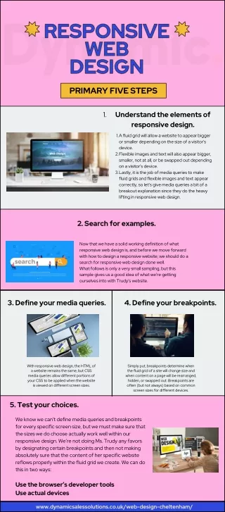
PRIMARY FIVE STEPS 1. Understand the elements of responsive design. 1. A fluid grid will allow a website to appear bigger or smaller depending on the size of a visitor’s device. Flexible images and text will also appear bigger, smaller, not at all, or be swapped out depending on a visitor’s device. Lastly, it is the job of media queries to make fluid grids and flexible images and text appear correctly, so let’s give media queries a bit of a breakout explanation since they do the heavy lifting in responsive web design. 2. 3. 2. Search for examples. Now that we have a solid working definition of what responsive web design is, and before we move forward with how to design a responsive website, we should do a search for responsive web design done well. What follows is only a very small sampling, but this sample gives us a good idea of what we’re getting ourselves into with Trudy’s website. 3. Define your media queries. 4. Define your breakpoints. With responsive web design, the HTML of a website remains the same, but CSS media queries allow different portions of your CSS to be applied when the website is viewed on different screen sizes. Simply put, breakpoints determine when the fluid grid of a site will change size and when content on a page will be rearranged, hidden, or swapped out. Breakpoints are often (but not always) based on common screen sizes for different devices. 5. Test your choices. We know we can’t define media queries and breakpoints for every specific screen size, but we must make sure that the sizes we do choose actually work well within our responsive design. We’re not doing Ms. Trudy any favors by designating certain breakpoints and then not making absolutely sure that the content of her specific website reflows properly within the fluid grid we create. We can do this in two ways: Use the browser’s developer tools Use actual devices www.dynamicsalessolutions.co.uk/web-design-cheltenham/