Download

1 / 76
760 likes | 897 Views
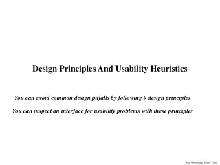
Usability heuristics serve as essential guidelines for designing and evaluating user-friendly systems. These broad principles, derived from common design issues across various systems, help identify usability problems without user involvement. Among the key advantages are their minimalistic approach, cost-effective nature, and versatility in application. However, they should not be treated merely as checklists due to their nuanced application. Nielsen’s Ten Heuristics highlight crucial aspects like system visibility, user control, and error prevention, providing a framework to enhance user interactions effectively.

E N D
Usability Heuristics CMPT 281
Outline Usability heuristics Heuristic evaluation
Usability heuristics • Heuristics: • rules of thumb that describe features of usable systems • As design principles: • broad usability statements that guide design efforts • derived by evaluating common design problems across many systems • As evaluation criteria: • the same principles can be used to evaluate a system for usability problems • becoming very popular • user involvement not required • catches many design flaws
Usability heuristics • Advantages • the minimalist approach • a few guidelines can cover many usability problems • easily remembered, easily applied with modest effort • discount usability engineering • cheap and fast way to inspect a system • can be done by usability experts and end users • Problems • principles are at the ‘motherhood’ level • can’t be treated as a simple checklist • there are subtleties involved in their use
Nielsen’s Ten Heuristics • Visibility of system status • Match between system and the real world • User control and freedom • Consistency and standards • Error prevention • Recognition rather than recall • Flexibility and efficiency of use • Aesthetic and minimalist design • Help users recognize, diagnose, and recover from errors • Help and documentation
Visibility of system status • The system should always keep users informed about what is going on • Appropriate feedback within reasonable time
Visibility of system status What mode am I in now? What did I select? How is the system interpreting my actions?
Match between system and real world • The system should speak the users' language • Words, phrases and concepts familiar to the user • Not system-oriented terms • Follow real-world conventions • Put information in a natural and logical order
User control and freedom • Users often choose system functions by mistake • They need clearly marked “emergency exits” • Let them get back without extended dialogue • Support undo and redo
Consistency and standards • Users should not have to wonder whether different words, situations, or actions mean the same thing. • Follow platform conventions
Consistency and standards Ok Cancel Cancel Ok Done Never Mind Accept Dismiss
Error prevention • Even better than good error messages is a careful design which prevents a problem from occurring in the first place. • Two options: • Eliminate error-prone conditions • Check for them and present users with a confirmation option before they commit
Recognition rather than recall • Minimize the user's memory load by making objects, actions, and options visible • The user should not have to remember information from one part of the dialogue to another • Instructions for use of the system should be visible or easily retrievable whenever appropriate
Flexibility and efficiency of use • Accelerators can speed up interaction for expert users • Accelerators are unseen by the novice user • The system can cater to both inexperienced and experienced users • Allow users to tailor frequent actions.
Aesthetic and minimalist design • Dialogues should not contain information that is irrelevant or rarely needed • Every extra unit of information in a dialogue competes with relevant units, and diminishes their visibility
Help users recognize, diagnose, and recover from errors • Error messages: • Should be expressed in plain language (no codes) • Should precisely indicate the problem • Should constructively suggest a solution
Help and documentation • Best if the system can be used without help! • May be necessary to provide help and documentation • Help should be: • Brief • Easy to search • Focused on the user's task • Concrete
Neilsen’s Nine Heuristics • 1. Simple and natural dialog • 2. Speak the user’s language • 3. Minimize user’s memory load • 4. Be consistent • 5. Provide feedback • 6. Provide clearly marked exits • 7. Provide shortcuts • 8. Deal with errors in a positive manner • 9. Provide help
1. Simple and natural dialogue • Use the user’s conceptual model • Match the users’ task in a natural way • minimize mapping between interface and task
1. Simple and natural dialogue • Present exactly the information the user needs • less is more • less to learn, to get wrong, to distract... • information should appear in natural order • related information is graphically clustered • order of accessing information matches user’s expectations • remove or hide irrelevant or rarely needed information • competes with important information on screen • use windows frugally • don’t make navigation and window management excessively complex
2. Speak the users’ language • Terminology based on users’ language for task • e.g. withdrawing money from a bank machine
2. Speak the users’ language • Use meaningful mnemonics, icons, and abbreviations • eg File / Save • Ctrl + S (abbreviation) • Alt FS (mnemonic for menu action) • Open folder (toolbar icon)
3. Minimize user’s memory load • Promote recognition over recall • Computers good at remembering things, people aren’t! • menus, icons, lists vs. command lines, field formats • relies on visibility of objects to the user (but less is more!)
3. Minimize user’s memory load • Input formats • Indicate required format • give example and default entry
3. Minimize user’s memory load • Small number of rules applied universally • generic commands • same command can be applied to all interface objects • interpreted in context of interface object • copy, cut, paste, drag and drop • for characters, words, paragraphs, circles, files
4. Be consistent • Consistency of effects • the same words, commands, and actions should always have the same effect in equivalent situations • increases predictability • Consistency of language and graphics • same information and controls in the same location • forms should follow boiler plate • use the same visual appearance across the system • e.g. icons, UI widgets • Consistency of input • consistent syntax across system Ok Cancel Cancel Ok Done Never Mind Accept Dismiss
> Doit > Doit This will take5 minutes... 5. Provide feedback • Continuously inform the user about: • what the system is doing • how the system is interpreting the user’s input • The user should always know what is going on What’s it doing? Time for coffee.
5. Provide feedback What mode am I in now? What did I select? How is the system interpreting my actions?
5. Provide feedback • Be specific, based on user’s input • Interpretation of feedback: • Simpler when in the context of the action
5. Provide feedback • Response time • how users perceive delays • 0.1 second: perceived as instantaneous • 1 second: user’s flow of thought stays uninterrupted, but delay noticed • 10 seconds: limit for keeping user’s attention focused on the dialog • > 10 seconds: user will want to perform other tasks while waiting
5. Provide feedback • Dealing with long delays: • Cursors/Throbbers • for short transactions • Percent done dialogs • for longer transactions • how much left • estimated time • what it is doing… • Random animation/Throbber • for unknown times Contacting host (10-60 seconds) cancel
6. Provide clearly marked exits How do I get out of this?
6. Provide clearly marked exits • Users don’t like to feel trapped by the computer! • offer an easy way out of as many situations as possible • Strategies: • Cancel button (for dialogs waiting for user input) • Universal Undo (can get back to previous state) • Interrupt (especially for lengthy operations) • Quit (for leaving the program at any time) • Defaults (for restoring a property sheet)