IELTS line graph task 1
The IELTS writing test, a gateway to international education and migration opportunities, assesses your ability to communicate effectively in English. Task 1 throws a visual your way, often a line graph or bar graph, and asks you to summarize the information it presents. While it may seem straightforward, excelling in this task requires understanding the visual format and possessing the right vocabulary.


IELTS line graph task 1
E N D
Presentation Transcript
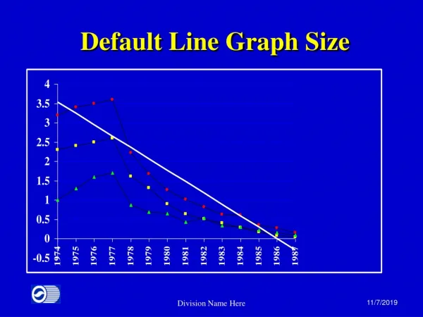
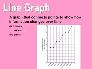
IELTS line graph task 1 The IELTS writing test, a gateway to international education and migration opportunities, assesses your ability to communicate effectively in English. Task 1 throws a visual your way, often a line graph or bar graph, and asks you to summarize the information it presents. While it may seem straightforward, excelling in this task requires understanding the visual format and possessing the right vocabulary. This comprehensive guide dives deep into the world of line graphs and bar graphs in IELTS Task 1. We'll break down their key features, equip you with essential vocabulary, and provide strategies for describing trends and comparisons effectively. Additionally, we'll showcase example IELTS line graph task 1 and bar graph task 1 prompts with detailed breakdowns to solidify your learning. By mastering these visual representations, you'll approach IELTS Task 1 with confidence, ensuring your writing reflects a clear understanding of the data presented. Demystifying Line Graphs: Understanding Trends Over Time Line graphs are visual representations that showcase how data changes over a specific period. They are ideal for illustrating trends, increases, decreases, and fluctuations. Let's delve into the key features of line graphs and the vocabulary you'll need to describe them effectively in your IELTS Task 1 response. Key Features of Line Graphs X-axis (Horizontal axis): This axis represents the time period, such as years, months, or quarters. Y-axis (Vertical axis): This axis represents the variable being measured, often indicated with a unit (e.g., number of people, temperature in °C). Lines: Each line on the graph represents a category or data set being compared. Data points: These are the points where the lines intersect the vertical axis, signifying the value for a specific time on the horizontal axis. Trend: The overall direction (upward, downward, or fluctuating) of a line over time. Essential Line Graph Vocabulary (20 Examples) X-axis: horizontal axis, time period Y-axis: vertical axis, variable, unit Line: trend line, data series Data point: value, figure Trend: upward trend, downward trend, fluctuate, remain stable, surge, plummet, gradually increase, steadily decrease, exhibit a sharp rise, experience a slight decline Comparison: be similar to, differ significantly, show a contrasting pattern, remain relatively constant throughout the period Overall: generally, across the entire period, throughout the timeframe Initial: at the beginning, in the first year, initially Final: by the end, in the final year, ultimately Peak: highest point, maximum value Trough: lowest point, minimum value Strategies for Describing Line Graph Trends
Here are some key strategies to remember when describing trends in line graphs for your IELTS Task 1 response: 1.Identify the Overall Trend: Start by analyzing the general direction of each line. Is it increasing, decreasing, or fluctuating? Use vocabulary like "upward trend," "downward trend," or "remain relatively constant." 2.Compare Lines: If multiple lines are present, compare their trends. Do they exhibit similar patterns, or do they show contrasting behavior? Use terms like "be similar to," "differ significantly," or "remain relatively constant." 3.Highlight Specific Changes: Focus on significant changes in the lines, such as sharp rises, fluctuations, or periods of stability. Use vocabulary like "surge," "plummet," "gradually increase," or "steadily decrease" to pinpoint these changes. 4.Quantify When Possible: While the focus isn't heavy on numbers, if specific values are crucial for understanding the trend, mention them. For example, "There was a 20% increase in sales between 2020 and 2021." 5.Use Transition Words: Employ transition words to connect your descriptions smoothly. Words like "initially," "subsequently," "finally," and "in contrast" will enhance the flow of your writing. IELTS Line Graph Example with Breakdown Prompt: The line graph below shows the number of tourists visiting two countries, Canada and Mexico, from 2016 to 2020. Summarize the information by selecting and reporting the main features, and make comparisons where relevant. Breakdown: X-axis: Year (2016-2020) Y-axis: Number of Tourists (no specific unit mentioned) Lines: Two lines, one representing Canada (blue) and another representing Mexico (red) Analysis: Overall Trend: The number of tourists visiting Canada (blue line) exhibits a steady increase throughout the period. In contrast, the number of tourists visiting Mexico (red line) fluctuates with a slight upward trend overall. Comparison: Initially (in 2016), Canada received significantly fewer tourists than Mexico. However, the gap begins to narrow by 2018, and by 2020, the number of tourists visiting both countries is relatively similar. Specific Changes: For Canada, there's a gradual increase in tourist numbers each year. Mexico experienced a sharp rise in tourists between 2016 and 2017, followed by a slight decline in 2018. Tourist numbers in Mexico then gradually increased again in 2019 and 2020. Sample Response: The line graph illustrates the number of tourists visiting Canada and Mexico from 2016 to 2020. Overall, the number of tourists visiting Canada steadily increased throughout the period, while Mexico experienced fluctuations with a slight upward trend.
Initially, in 2016, Canada received significantly fewer tourists compared to Mexico. However, the gap between the two countries narrowed over time. By 2020, the number of tourists visiting both destinations became relatively similar. Looking at the trends in more detail, Canada witnessed a gradual increase in tourist numbers each year. In contrast, Mexico experienced a sharp rise in tourists between 2016 and 2017, followed by a slight decline in 2018. Tourist numbers in Mexico then gradually increased again in 2019 and 2020. Conclusion: Line graphs are frequent visitors in IELTS Task 1. By demystifying these visual representations and mastering the key vocabulary, you'll be well on your way to conquering this section. Remember, the key lies in understanding the features of each graph type (line graph IELTS, bar graph task 1 vocabulary) and the trends or comparisons they present. Utilize the IELTS line graph example and vocabulary provided to solidify your understanding. With a focus on clear descriptions, comparisons, and formal language, you'll be able to effectively summarize the information in these visuals. So, the next time you encounter a line graph in IELTS Task 1, breathe easy! You've got the tools and knowledge to tackle it with confidence. Good luck with your IELTS journey! If you liked this blog, you can read more here IELTS line graph task 1