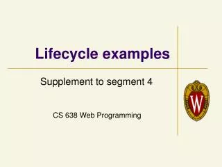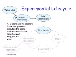
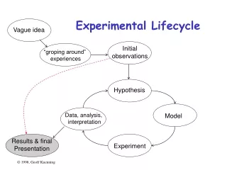
Experimental Lifecycle
This guide explores common mistakes in data visualization, such as using multiple scales and symbols instead of text, and provides best practices for creating clear and informative graphics.

Experimental Lifecycle
E N D
Presentation Transcript
“groping around” experiences Vague idea Initialobservations Hypothesis Model Experiment Data, analysis, interpretation Experimental Lifecycle Results & finalPresentation
Common Mistakes in Graphics • Excess information • Multiple scales • Using symbols in place of text • Poor scales • Using lines incorrectly
Start here Multiple Scales • Another way to meet length limits • Basically, two graphs overlaid on each other • Confuses reader (which line goes with which scale?) • Misstates relationships • Implies equality of magnitude that doesn’t exist
Using Symbolsin Place of Text • Graphics should be self-explanatory • Remember that the graphs often draw the reader in • So use explanatory text, not symbols • This means no Greek letters! • Unless your conference is in Athens...
Poor Scales • Plotting programs love non-zero origins • But people are used to zero • Fiddle with axis ranges (and logarithms) to get your message across • But don’t lie or cheat • Sometimes trimming off high ends makes things clearer • Brings out low-end detail
Using Lines Incorrectly • Don’t connect points unless interpolation is meaningful • Don’t smooth lines that are based on samples • Exception: fitted non-linear curves
Pictorial Games • Non-zero origins and broken scales • Double-whammy graphs • Omitting confidence intervals • Scaling by height, not area • Poor histogram cell size
Non-Zero Originsand Broken Scales • People expect (0,0) origins • Subconsciously • So non-zero origins are a great way to lie • More common than not in popular press • Also very common to cheat by omitting part of scale • “Really, Your Honor, I included (0,0)”
The Three-Quarters Rule • Highest point should be 3/4 of scale or more
Double-Whammy Graphs • Put two related measures on same graph • One is (almost) function of other • Hits reader twice with same information • And thus overstates impact
OmittingConfidence Intervals • Statistical data is inherently fuzzy • But means appear precise • Giving confidence intervals can make it clear there’s no real difference • So liars and fools leave them out
Confidence Intervals • Sample mean value is only an estimate of the true population mean • Bounds c1 and c2 such that there is a high probability, 1-a, that the population mean is in the interval (c1,c2): Prob{ c1 < m < c2} =1-awhere a is the significance level and100(1-a) is the confidence level • Overlapping confidence intervals is interpreted as “not statistically different”
Reporting Only One Run(tell-tale sign) Probably a fluke(It’s likely that withmultiple trials this would go away)
1960 1980 Scaling by HeightInstead of Area • Clip art is popular with illustrators: Women in the Workforce Any quesses? w1980/w1960 = ?
The Troublewith Height Scaling • Previous graph had heights of 2:1 • But people perceive areas, not heights • So areas should be what’s proportional to data • Tufte defines a lie factor: size of effect in graphic divided by size of effect in data • Not limited to area scaling • But especially insidious there (quadratic effect)
1960 1980 Scaling by Area • Here’s the same graph with 2:1 area: Women in the Workforce
Histogram Cell Size • Picking bucket size is always a problem • Prefer 5 or more observations per bucket • Choice of bucket size can affect results:
Histogram Cell Size • Picking bucket size is always a problem • Prefer 5 or more observations per bucket • Choice of bucket size can affect results:
Histogram Cell Size • Picking bucket size is always a problem • Prefer 5 or more observations per bucket • Choice of bucket size can affect results:
Special-Purpose Charts • Histograms • Scatter plots • Gantt charts • Kiviat graphs
Tukey’s Box Plot • Shows range, median, quartiles all in one: • Variations: minimum quartile median quartile maximum
Scatter Plots • Useful in statistical analysis • Also excellent for huge quantities of data • Can show patterns otherwise invisible
Gantt Charts • Shows relative duration of Boolean conditions • Arranged to make lines continuous • Each level after first follows FTTF pattern
Gantt Charts • Shows relative duration of Boolean conditions • Arranged to make lines continuous • Each level after first follows FTTF pattern F T F T T F F T T F F T T F
Kiviat Graphs • Also called “star charts” or “radar plots” • Useful for looking at balance between HB and LB metrics HB LB
Useful Reference Works • Edward R. Tufte, The Visual Display of Quantitative Information, Graphics Press, Cheshire, Connecticut, 1983. • Edward R. Tufte, Envisioning Information, Graphics Press, Cheshire, Connecticut, 1990. • Edward R. Tufte, Visual Explanations, Graphics Press, Cheshire, Connecticut, 1997. • Darrell Huff, How to Lie With Statistics, W.W. Norton & Co., New York, 1954
Ratio Games • Choosing a Base System • Using Ratio Metrics • Relative Performance Enhancement • Ratio Games with Percentages • Strategies for Winning a Ratio Game • Correct Analysis of Ratios
Choosing a Base System • Run workloads on two systems • Normalize performance to chosen system • Take average of ratios • Presto: you control what’s best
Using Ratio Metrics • Pick a metric that is itself a ratio • power = throughput response time • cost / performance • improvement ratio • Handy because division is “hidden”
Relative Performance Enhancement • Compare systems with incomparable bases • Turn into ratios • Example: compare Ficus 1 vs. 2 replicas with UFS vs. NFS (1 run on chosen day): • “Proves” adding Ficus replica costs less than going from UFS to NFS