Download
1 / 23
230 likes | 346 Views
DJ Mag, the world's foremost dance music magazine, has been the best at the WMC for seven consecutive years. Established in 1991, it caters to a youthful audience passionate about dance music, with a circulation of 32,500. Its mission emphasizes honoring those who contribute significantly to the industry. The magazine's vibrant designs reflect the energy and excitement of its readers, predominantly single males around 25, who enjoy clubbing and aspire to advance in the music scene. This dedication drives DJ Mag's ongoing support for the UK music culture.

E N D
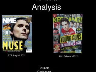
Textual Analysis Research • Sam Rayner
DJ Mag DJ Mag is the world’s leading dance magazine. It has been voted the best dance music magazine at the WMC for 7 running years. It has been around since 1991 and targets to reach a youthful audience that are inspired by dance music. Circulation of DJ Mag is 32,500 Mission Statement ‘With 18 categories covering everything from Best Remix and Best Radio Show to the ultimate accolade of Outstanding Contribution to Music, DJMag’s mission is clear; bring to the forefront those that have tirelessly worked over the last year to improve and progress our enviable industry. DJMag take great pride in their support of the UK scene and never fail to be excited, entertained and overcome by its unfaltering quality.’ Reader Profile ‘DJ Mag’s reader would typically be 25 year old male that is employed and single. They are single because the like to go clubbing once a week in town. They enjoy being a DJ and want to further this occupation to get further into the music industry. They are dedicated to music and enjoy their life on a day to day basis.’ Thrust Publishing Ltd. are the publishers of DJ Mag.
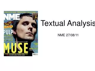
Front Cover - Issue: Vol. 4 no. 94 February 2011 Colour The colours of the issue here are quite bright. They could represent fire with the mixtures of red, orange and yellow. The mood can be linked to the reader of this magazine. This would be young with a passion for music with a lot of energy. Energy is a vibe you can gain from the colours of this cover. The orange background colour acts as an in between from the two extremes. The magazine title is at the lower end of the scale with the dark red and the yellow colour of the cover lines are at the higher end of the scale. The orange background acts as an in between to make the rest of the colours stand out and be able to depict them form the image. Using a red for the magazine title makes it stand out so the readers can see this magazine stand out from others. The alternating colours for the cover lines are useful because it enables the readers to understand importance. The yellow colour stands out more so it is likely to be more influential or impacting to the reader. This could be seen as an influence for my magazine as it will enable me to put the more important cover lines in a more important colour. The colours are in some ways quite dull as there aren’t many but the colours used for this cover have a message. They are trying to convey the energy that this magazine contains. Design The design uses a conventional style which would be expected when you see a front cover of a magazine. I read a book called ‘The Magazine Handbook’. Jenny McKay stated that (about masthead) “this doesn’t mean the whole word has to be visible but enough of it’s distinctive lettering should be there to make it clear to readers which title they are looking at” . This shows that this technique has a professionals initiative to back it up as well. This technique is used for a lot of magazine covers. I will propose to use this for my own magazine when I begin to produce it. Cover lines are placed in front of images and the main cover line is placed on the right side of the cover. This is not typical to what I have seen before. Conventionally you would expect the main cover line to be on the left side of the cover because this is where a viewers eyes will draw to naturally first. This may be because the main image is primarily to the right and takes up most of the right space. Cover lines are placed on either side which another conventional and typical approach. The masthead is placed at the top with a strap line above it to draw extra attention to readers. The style of text is strong and bold. It doesn’t have any wavy or curvy style to it. It holds strong and this can be linked to the style of music being a lot louder and busier than other genres. The design of this is all quite typical and I would like to use this idea for my own cover, however, I don’t expect to have two people for my main image so I will have the choice of choosing which side to place my main cover line on.
Front Cover - Issue: Vol. 4 no. 94 February 2011 Images/Pose The main image is obviously linked with the genre of music that the magazine focuses on. The two men stand next to each other with very stern looks. This could be a code to show that they both mean business with their musical talents and where they hope to get to in the industry. This would encourage readers just like these as half the readers of this mag are DJ’s. They are encouraging them to be serious about their work. It could also be trying to convey the seriousness of the magazine or something similar. The background looks as if it was taken at night. This could have been used to show links with the night life and clubbing. The Branston and Stafford (2010) theory could be linked to thus because DJ’s are typically male. This is a stereotype that has been generalised by the media and this is what the theory tries to convey. It has categoriesed DJ’s as this type of male. The Male Gaze theory can be linked into this as well. The pose of the tow men would be influential to males. Males want to look strong, good and with the latest fashion which is what the Male Gaze suggests. It contributes more to influence males rather than targeting towards females. The use of two people for the image seems quite odd. I’m not sure if I would use this for my front cover but I can see that they have only done this because their main feature is a group of two. Composition & Framing The shot used for the main image is a mid shot because it composes them from the waist up. This is to convey the influential Male Gaze. It just about shows the DJ’s with their hands in their pockets which gives them their status. This is how typically males want to look. Most of the main parts on the cover are on the right hand side. This is not conventional. It does make your eye move however, the first thing seen is the masthead and then you move to the right and down. The person on the right is also at the front so it stands out even more, this is why the main cover line is placed on top. Then as your eye has scanned down the right side, it moves to the other few cover lines on the left. I think that the importance is split so that there is a right side and the left side. The importance of the issue is on the right and then some other stuff is on the left, which is why the ‘Plus’ section is placed on the left. The background is not plain and looks dark. This is trying to convey a night time life style as this is when DJ’s are mostly around. I like the use of this because it has a message, but I wouldn’t use this for my own magazine cover because it drags your attention slightly away from the image and the cover lines. Using a plain background would make the main conventions stand out more.
Front Cover - Issue: Vol. 4 no. 94 February 2011 Written Codes/Language There is a strap line places just above the masthead. The strap line is used well because the first word is ‘Free’. The word ‘free’ will attract almost anyone because of the economy that we belong to. Getting a free CD is a great money maker for this magazine. The magazine probably makes the CD for next to nothing but it encourages more readers to buy the magazine. The main cover line is big and attracts the audience. The words ‘Stir It Up’ have very close links to a DJ such as when they spin the discs. The language used on cover lines is ver abrupt and short. They use small puns but in a positive manner to get the point across quickly. ‘Taking Care of Business’ is a ‘to the point’ phrase which would attract the employed that read this magazine. This can link to the Maslow’s Hierarchy of Needs theory. This theory believes that peoples basic needs can be fulfilled and the media try to satisfy their consumers with these needs. The words, ‘Taking Care of Business’ have links to the need of safety through financial security and also esteem through being motivated. Most of the cover lines are big and would not have to be read up really close. This is a certain thing I want to include in my front cover. I wouldn’t use any small text because the cover wants to attract the readers, not send them away. The language of the text on the cover all mainly appeals to the audience. It is to the point and not to technical. A lot of the text used are just artists which are featured in the magazine. I don’t think the language is very important to the readers of this magazine as long as the content is appealing. I can’t see any signs of the language being sarcastic from the front cover, just to the point and shortened. Overall Impression My overall impression of the magazine front cover is a mixture of positives and negatives. I think from what the cover lines suggest, there will be a lot of good content in the magazine. This is what their readers want which I suppose works well. I think the use of colours to convey a message is better than the use of colours to make it look good or stand out. The reds, oranges and yellows can convey energy and a ‘hot’ sense to the magazine. There is a lot of text regarding musical content in the magazine which appeals towards the audience as they are interested in the content of music in the magazine. All music lovers want to know the latest and also getting their hands on free music will never be missed. There are some negatives which I find with this cover. The use of the background does convey a message but it doesn’t work well in my opinion as it’s almost a distraction. Using a lot of the main cover lines on the right is different and not so conventional. It does work though along with the image being mainly on the right. I still don’t think I would use this for my own magazine. I think that overall it does appeal to the audience of this magazine but not to readers which may be interested in reading a lot. The use of a big image may suggest that there will be more images in the magazine than text. This is only what it suggests, this may be different for what is actually in the magazine.
Contents Page - Issue: Vol. 4 no. 94 February 2011 Colour I don’t believe that the colours for this contents page are trying to convey a message. The reason for me believing that they don’t have connotations is that there are a mixture. I think that the colours used for the contents page here are mainly used to distinguish between different parts such as headings and important cover lines. The main page uses a white colour which gives the impression that this will be the same throughout the magazine as it could be the house style. The words ‘contents’ are in a grey colour which gives a lighter and relaxed style to the page. The colours used to highlight the certain sub categories in the magazine are a mixture. The main features tab is in a highlighted black box with white text, this could be to contrast between the two and make it stand out. Black and white are the most obvious of contrasting colours so it makes the features part stand out more, which is good because it is the main topic anyway. The subheadings match the colour of the topic box. The mini features that are on the right have some whole text which matches the topic box. The mixture of colours such as pink, blue and brown give it a more outward and professionalised approach as there aren’t certain colours to match with each other. I like the idea how the mag has chose to put some of the main features in a yellow highlighted box. These stories stand out more to the reader because of this which I think is a good technique, a certain one I would think about for my magazine. There are images in colour which link to the features as well. Design I think the design here is well thought and looks professional. The images sit in place and the featured cover line image is made bigger to make it stand out. The placement of main features and mini features either side of each other also works well and will most probably be an influence. The choices of fonts are clever because they aren’t too stylistic but they are broad to make it an easy read. The text in the topic boxes are in lowercase which is unexpected because it doesn’t really attract the reader. Maybe the magazine chose to do this because it looked different so it did attract the reader? The main features are in uppercase lettering and stand out most on the page. Overall the text styles used are what we would expect and link to the genre, but the use of lowercase letters as a header is something quite different. This is in my opinion is an off put but this may be a different case for other readers. All the images fit well within the page and the overall design of the contents page is quite sophisticated and professional.
Contents Page - Issue: Vol. 4 no. 94 February 2011 Images/Pose The images used are very realistic to the genre. The image on the top right would represent the lifestyle of a reader and is quite influential. The use of this image would most probably take the reader to this page. The featured image at the bottom left is very similar to the main image on the front cover. This once again uses the influential Male Gaze theory because they are looking very ‘cool’ what with their pose and their slick hairstyle and fashion. They influence the reader. All other images on the page relate to the genre and lifestyle of the typical reader of DJ Mag. The uses of these images are to make the readers turn to the specified pages because they like the look of what is going on. Linking lifestyle with images is not only a great technique but also important because it could be the difference of gaining a reader or not. The people in the crowd images all look like they are having a good time as well. I like the use of a lot of images because it would make me turn to that certain page. Seeing as I’m a target reader then I would think that it would work the same for other readers. This could be an influence. Composition & Framing The framing uses a three column guide on this page. The right column contains the main features. The middle column contains the micro features of the magazine and the right column contains some images which are in the magazine. This is a good technique as from previous research into magazines and eye movement I have found that the eye naturally moves from left to right. So in this case, the editors have made it so that the readers read the most important bits first and then travel to the right from most important to least. This is a very good technique in my opinion. It’s professional and I would definitely choose to use this idea for my own contents page when I begin to create it. The images looked cropped so that only the important features can be seen. Also the image of the sound system has been digitally improvised so that it stands out on the page. This image can be linked to the Maslow’s Hierarchy of Needs theory because it links to the belonging and esteem sections. If the reader owns a similar system then they feel confident because they own something which has been featured in a magazine that many people look at. The framing on this page is used well because it is easy on the eye and it allows the reader to look at everything and still understand what is important and what is going on.
Contents Page - Issue: Vol. 4 no. 94 February 2011 Written Codes & Language The sub headings outline the main features. These capture the eye and need to be attractive to the reader so that they turn to that page. In this case, the features can be seen and are to the point but have an abrupt, catchy tone to them so that it gives the reader more of an initiative to turn to that page. ‘No Stone Unturned’ is an example of this. It makes me think about what it could be so I would turn to that page myself. The feature, ‘No Idol Gossip!’ suggests that the readers of this mag are interested in gossip but generalised around music. This is expected because the target is of a youthful audience anyway. ‘Collabs’ is a slang term for collaborations. This shows that the magazine could include slang terminology throughout. It straight away suggests the target reader as of a younger age and maybe not demographics of A or B class. The suggestive language on this page can give us a great idea of the readers and audience. It has a good connection and this is something I will have to think about when creating my magazine because my target audience are of the youthful era as well. The text is small but legible. It all fits with the design of the contents page. Overall Impression I really like this contents page. The design is perfect as the framing and positioning of typical conventions are perfect. I now see the typical reader of this magazine more through the language and the denotations of images. It appeals to a youthful audience that are very interested in music and want a cool and hip lifestyle. This is very similar to what my target audience are so I can gain many influences from this page. I don’t like the use of lowercase lettering for the topic headings because it just doesn’t look right. I think if this was in uppercase then the contents page would be almost perfect. I hope to use a similar style with highlighting certain main features to convey importance. I also hope to use many images on this page because it will attract more readers to different pages.
double page spread - Issue: Vol. 4 no. 94 February 2011 Colour There isn’t much colour used on the double page spread for the featured story. As I suspected by looking at the contents page, the house style sticks to the contrast of black and white with some greys and colouration defined by images. The use of a house style makes it more professional but I like it here because it is easy on the eye. The reader can read the text without having other colours burst out to distract them. The headline is in black and it certainly attracts the reader to the story because of the contrast it has with the white background. All other text such as the stand first and body copy are in black as well, once again making it easy on the eye. The body cap is a lot larger and is also in black, as well as the byline, they all stick to a consistent style, adding real professionalism. A quote is placed on the right page among the image used. This quote is in white as it makes it easy to read among the colours of the image. The image is very similar to the one on the front cover with the same colours. The colours aren’t exciting but it sets that cool and laid back lifestyle that the two featured musicians have. There is hardly any colour used on this double page spread. It is easy on the eye but it could put some readers off. I think I will have to do some secondary research into the use of colours for my pages. Design The page has been designed simply but looks neat. The only untidy part of the design is the fact that the text hasn’t been justified and looks almost unfinished. I see that same three column style that was used on the contents page. The stand first is placed on the left column away from the body copy. It is placed here but the readers would probably read this second after the headline because of it’s size and boldness. The drop cap, body copy as well as the main headline take up the middle and right columns. This style of columning is consistent and looks professional. The fonts use sans serif lettering as this is more applicable for the audience. The audience wouldn’t want all fancy text because they are looking for an easy but interesting read. The quote that sits on the image on the right page works well because it sits away from the main features of the people such as their face and shoulders. All the conventions are placed together so that the double page spread looks consistent and professional. I am beginning to really like the use of three columns to separate certain features. I will consider this style for my own magazine. Images/Pose There is only one image on this double page spread and it takes up the whole of the right page. It is very similar to the image on the front cover, with the featured musicians in a similar pose that is connected to the influential Male Gaze theory. The image anchors the body copy and the feature of this double page spread. It is used so that when the readers turn the page over to this double page, they see the image on the right side first. Then when they see the image, they are influenced by them as they are massive musicians that are doing well in the music business, so they decide to read the featured article on the left. This is a very good technique and I would consider this for my own magazine without a doubt. I’m not sure if I would make the image the whole size of the page however. It’s something to look at in secondary research. Composition & Framing The image on the right page uses a mid-close up as the shot is cropped to their faces and just below their shoulders. This emphasises on the influential Male Gaze theory as it gives a closer look at their facial expressions and feelings. The page on the left has no background composition which is good because it means that there is no distractions for the reader. The use of bold lettering and sizing of text allows us to move across the page by biggest to smallest text. Our eyes begin at the headline, then move to the stand first and then follow to the drop cap which begins the body text. The use of this is also emphasised by the three columns which is what I believe will work well in my own magazine.
double page spread - Issue: Vol. 4 no. 94 February 2011 Written Codes & Language The text used is in a bold style with no fancy lettering. This suggests that the editors are not fooling around with their readers and want to just get to the point of the article with no distractions. This is probably a big positive for the magazine as it shows that they respect their readers and audience. All the bold lettering contrasts with the background well so it would most probably stand out if a consumer was flicking through the pages of the magazine. The stand first uses the words ‘stadium-smashing Chase & Status’. This is a catchy slogan with the use of alliteration which probably wins over the reader. This is obviously something the reader or audience like and want to see more of to make the read more interesting. The headline uses the word ‘Gossip’. This straight away suggests to the reader that there is something interesting and unknown about a certain subject which could be influential to them. This also targets the youthful audience as they are interested in gossip. The byline gives the name of the editors that provided the text and images. However, the words that the editors have used are ‘Words’ and ‘Pics’. This sounds more catchy than text and images and is obviously a ploy to make the read for the consumers more interesting. The overall language of the body copy is neutral. There are not many uses of slang but not too many posh or over exaggerated words. There are uses of longer words such as ‘pertinently’, which shows that the editors don’t want to talk down to their readers and make them feel less intelligent. The text shows that the audience they are targeting at are ones that want to do well in life, maybe generally with their music. They want to study and make the most of what they can do, not to people that don’t care about how they study or a job. I think from the language and overall text on this double page spread, I have seen that this magazine wants to target to readers with some intelligence. They are targeting at a specific audience, and with the elements they include they are probably successful. Overall Impression I have certainly gained knowledge from this double page spread. It targets well towards the audience and I can tell that the magazine appreciates their readers. The style of the three columning has become very favoured by me and I like the idea of it a lot. The use of bold lettering allows the reader to focus on conventions and move from one to the other. Quotes are used respectfully and quite a lot throughout this page spread. Quotes are good to use because they influence the reader. They want to aspire to be like the featured artists, they are role models to the readers. The language used has given me a whole new approach to what I believe will be inserted into my magazine. I will need to do some secondary research on a few things to find out what will work best. I need to also think about the image size I should use for my right hand page. I think it is defiantly best to put it on the right hand side instead of the left but the size is something else to think about. This double page spread has given me influences but has also got me thinking about a lot of things. I do like this double page spread a lot.
KMAG (Knowledge) KMAG claimed to be the UK’s leading Drum & Bass print magazine but later turned to an online version in 2009. It’s first issue was published in 1994 and was originally known as ‘knowledge’ until it was rebranded to ‘KMAG’ in 2007. The magazine mainly included Drum & Bass but also has subsequent articles about Dub step, breakbeat and some hip-hop. The editor claimed that the article stopped publishing in print due to loss in sales and revenue which was probably influenced by the mass increase of New Media Technologies. Publishing online meant that KMAG could reach a further market and could include forums, podcasts, etc. Circulation of KMAG is 43,000 Mission Statement ‘Our strength through the print years was our quality of editorial, armed with the same team, we provide our users with daily added, premium content through a wide range of blogs – each of the main genres we cover (drum & bass, dubstep, hip hop, electronica and breakbeat) have their own individual blogs as well as non-music topics like music technology, gadgets & games, fashion and art. Plus video content, podcasts, exclusive features, daily news, forums, competitions and user generated content. Knowledge’s extensive print issues and cover CDs are also accessible.’ ‘Focus on what’s best for the community. Our goal is to create a product our niche audience love. If they love it, they’ll talk about it. They’ll promote it. They’ll come back. They’ll bring their friends. They’ll work with us to make it better.’ Reader Profile ‘Our users hold authority in the youth music and lifestyle arena. Our site is a source of information for Information Catalysts – who are most likely to spread information about products. These are the people you have to reach if you want to influence the buzz about your brand. People like to feel that they are in the Know; Knowledge provides deep, rich content. Readers like our site, as there are a lot of new things happening. Knowledge reaches the young audience (16-24 core) who love to talk about brands and products. They tend to have money to spend and are eager for new ideas.’ KMAG was published by Vision Publishing. I am looking at the print issues for my textual analysis so their background information may give me some extra knowledge which could help to better my own magazine. Vision Publishing is based in London and tries to make the best impression to their customers. They publish business cards, marketing flyers and brochures, websites, journals and magazines. They have many professional workers and also can provide the latest publishing technologies to publish a customer’s media. They also provide publishing courses form design to technology. This tells me that KMAG may have looked to be published by a younger and newer group that offer younger groups courses as well. KMAG reaches out to the younger market and if Vision Publishing offer courses for younger groups then this can be linked.
Front Cover - Issue: 95 December 2007 Colour The colours on this cover are mainly blues and greens which tells me straight away that KMAG want to keep to a consistent style and don’t want to go all out or to over the top with their colours. The colours mix well and give the cover a relaxed feel to it. Blues may be used as the featured artist has blue eyes. They look as if they have been brightened The reflection gives off a green tint to add more of a shadow to the side with a reflection. This in my opinion is so that the conventions on this side can be made more obvious or less obvious. The white cover lines stand out more on the side with the reflection than they would on the side without. The use of this lighter colour on a darker background makes it stand out to the reader more. Almost all the text on the page apart from the main cover line is in white to contrast with the darker background. This works well because it gives that simple but desired effect to attract the viewer. The low amount of information and conventions however, does give the cover only small parts that stand out. The white lights of the ‘K’ for the masthead are linked to the lifestyle and genre of this music. Drum & Bass and other electronic music would be played in clubs and gigs with many flashing lights, so this is what the masthead and it’s colours are trying to convey. The blue banner on the centre contains the main cover line which gives the featured artist. The blue is lighter than the rest to make it stand out to the viewer. The designers have used photoshop or another photo editing programme to lower the opacity of this banner so that it doesn’t look too out of place. Another effect has also been used so the text doesn’t have a colour. This may have been done to keep to the relaxed style of this front cover so nothing is over powering which looks out of place and doesn’t fit. I like the use of colours here because it keeps the magazine cover professional. It’s simple but attractive. Design The design of this cover has been kept simple so that it looks neat. Another reason for making this neat is that it looks more generalised to their target audience. Using a design which is all over the place and uses many circular shapes, etc. would focus to a child audience of 12 or younger as there is more to look at and keep them focused. A strap line is placed at the top of the magazine and above the masthead so that the magazine can get a quick marketing technique to lure the readers in. Anything free will bring in readers. The masthead can be seen at the top right but isn’t so obvious so that it takes up a lot of space on the cover. It is enough to give recognition to the magazine. The banner in the centre contains the main cover line and acts as a centre and focal point. This is more emphasised because of how important it is to this certain issue. Other conventions are placed in this banner as well such as the price, issue no. and barcode. This is something different but works well because it fits well with the design to keep it simple. The cover lines under the banner are all placed on the right. They aren’t long and are more like words but this once again connects with the simpleness of this front cover. There is a split between the main conventions to the more simpler conventions. A mirrored reflection almost gives a split down the last third of the page. The smaller cover lines, bar code and the issue no. are on this far side. It gives a professional and neater look to the cover. I like the use of this a lot. It allows a split and the cover to not have conventions all over the place. There is an obvious space which can be used for the free CD that would come with the issue. I will use the same space for a free CD with my magazine.
Front Cover - Issue: 95 December 2007 Images/Pose The main image has a link to the Male Gaze Theory. This states that the feature of a person influences a person to gaze at them. This is usually linked to men looking at a woman but this cover has an influential approach as the readers aspire to be like the featured artist. They are a role model to them so this inspires them to purchase the magazine to read about them or to look like them. The artist here looks stern with a distinctive look towards the reader. It relates more to the audience because the audience are mainly DJ’s themselves or males. Dom here is standing side on with his face turned. His shoulders are up and his chest is out to give him extra mannerisms. It makes readers want to have the same mannerisms. He has very blue eyes which stand out and link to the colours of the magazine. This look gives it a consistent style. A reflection is also placed on the right third of the page. This reflection allows the mag to separate certain conventions but can also have other connotations such as, ‘where ever you look, there is someone looking at you.’ If this was the desired effect then it is used in a positive way because it makes the viewer feel guilty if they don’t buy the magazine. The background image looks to be a set of mirrors which could increase the desired effect here. The focal point of the main image is in the centre, even though the main part of the artist is on the right of the cover. This pose allows the viewers to give a tighter focus on the featured artist. I believe that this a good effect and I also like how the image doesn’t take up so much of the front cover. I have now seen from this magazine and from the previous that the main cover uses a background as well as a main image so this may be something I need to think about for when creating my magazine. Composition & Framing You can tell that most of this front cover has been edited to give the effect that the designers were looking for. I think that the background was placed on the cover after the photo of the artist was put there. It is a kind of abstract detail to add to the presence of the cover which connects to the genre because it is a bit different and out of the ordinary. The reflection look may have been used because of the abstract background containing mirrors. It may have also been used to keep the look symmetric, what with the left and right side being green and the centre being grey. I am going to most probably use a background image for my front cover after seeing this. Something which is abstract but this can be assessed in secondary research. The first thing you see when you look at this cover is most likely to be the main banner in the middle with ‘Dom & Roland’. This is not a typical convention but may be used because the artist is so influential to the readers, so it is emphasised to make the readers see this first. The next thing that is seen is the strap line. The strap line is connected to the Maslow’s Hierarchy of Needs Theory. This theory states that people have certain needs and magazines try to reach these certain needs through the conventions of their magazine. The need that is taken on here is esteem. Having a free CD can boost self esteem as people may not be able to afford one or it just gives them something extra to listen to before their friends. The next convention seen is the masthead and then finally the smaller cover lines. The use of this does make the viewer look all over the page so that they don’t skip certain parts. Even though there is nothing much you can skip here.
Front Cover - Issue: 95 December 2007 Written Codes & Language There isn’t much text on this front cover to analyse. This can tell me that the magazine wants to keep it’s reading for inside or is mainly about the images, I will only be able to find out when I analyse the double page spread and contents page. It could also be a link to the simpleness of the front cover. Keeping it simple keeps it professional and gives some information the readers actually need. It isn’t a great selling point because it doesn’t engage the readers or give them that extra information of what the article is about that artist. However, this may encourage readers to flick through and find out for themselves, which then makes them buy it or read it further. Reading it in the shop quickly could lead to them buying it because it looks good. The strap line uses a short sentence as well and makes sure it uses the least amount of words it can. It is almost like a note, ‘Free CD Every Issue!’ There isn’t much language to be analysed here but the overall message that can be interpreted is that the readers of this magazine are more visually impacted. Overall Impression This front cover gives me the impression that the magazine is targeted towards a more intellectual audience as the cover looks neat and professional. It isn’t very cramped and the conventional elements are positioned well. I don’t really like this cover because there isn’t much to it and it is not very attractive. I have gained some inspiration from this however. The position of the cover lines and main cover line will probably be similar to where I position mine because the free CD will be taking up the position on the bottom left. This is the second drum and bass magazine that I have seen use a background rather than just a plain colour. This means that it is typical to the genre of this type of magazine. I will most probably use this same technique as I want my magazine to be typical to the genre. The cover lines typically show that the audience are interested mainly about the artist rather than what the article is actually about. This magazine doesn’t attract me but it was the most popular print magazine for its genre so something they have done is right, which I must think about.
Contents Page - Issue: 95 December 2007 Colour The colours are similar to the ones used in DJ Mag. The silver and white colours keep the mood of the magazine relaxed. It also contrasts well because the box that outlines the features are in grey and the text inside is black. The combination of colours works well and makes it look more professional. The image also uses similar colours so that it sticks to the style of the page. This is the second time I have seen these colours used in a magazine of this genre. I think they work very well together and I am considering asking my audience if they would like colours like this. There is also extra colour used on the small thumbnails of the pages in the magazine. I think this is a clever idea but they could attract their readers to a certain page with just an image rather than the whole page itself. I think overall the colours work well here to keep to the sophisticated style of the contents page. I also think that this relaxed style helps us tell that the readers will probably have more intelligence because the focus is mainly on text rather than visual effects. Design The design works well for this contents page. It is something different that I have not seen in a magazine before. A main image is placed across the centre of the page underneath the title. This image connects to the title so this is probably why the designers chose to do this. The font looks quite abstract which is what I would expect from the design of a magazine based on an abstract genre. The bottom half of the page is labelled as the contents but the whole page is what I am focusing on here. The text and images are placed in an outlined box to attract the attention of the reader. On the far right is a column used for the text. This text fits in line with the images so it all looks neat on the page. The images are small thumbnails of certain double pages in the mag. This works well because they are all aligned and I can also see that the typical house style is going to use a white background and silver or black text. The design is different but I think it works well. I don’t think I would use this for my own magazine however, as I won’t have time to make all the other pages and use them only for small thumbnails.
Contents Page - Issue: 95 December 2007 Images/Pose The image anchors the denotations of the text on this page. The text says that this is a silver issue and the image can be connected to this because a silver disco ball is shown. This also connects to the lifestyle of someone that reads KMAG because they enjoy clubbing and discos. The image and colours all connect to make the page seem more realistic and professional. This image also contains some subliminal shots of the featured artist from the font which can only just be seen on the far left of the main image. It is a similar looking pose to the one on the cover where he seems stern and powerful with a slight smirk. This links to the influential male gaze theory as mentioned before. Another main theory that can be linked to this main image is Maslow’s Hierarchy of Needs. This theory states the basic needs to higher aspirations. It believes that these needs can be seen in magazines through elements they contain. This image can relate to the need of Esteem because when a reader is in a club where a disco ball is present, they feel more confident about the person they are. There are other small thumbnails that relate to the pages in the magazine. These images are used to give an idea to the audience of what elements are on a certain page. I am drawn to the bottom left thumbnail of the double page spread because it looks interesting. Composition & Framing When a reader turns to the contents page they will firstly look at the image because it is placed in the centre of the page. They will then read at the top that it is a silver issue and then they will focus on the main text of the contents page to looks at some features that they are interested in. The contents box acts as a major insert of the page. This has been manipulated so that the reader can looks at some of the pages in the magazine before even turning to them. This is a good technique because it means that a reader may turn to a page that they were not originally interested in because it looks attractive. The main part of the contents page only takes up a third of the space. This could be because the editors didn’t know what other information to include so they had to make the contents part smaller, or it could just be that the editors want the readers to mainly focus on the image. Either way, the page will draw the readers in with the use of the main image placed on the centre of the page.
Contents Page - Issue: 95 December 2007 Written Codes/Language The title doesn’t say contents but says ‘The Silver Issue’. This makes the issue seem more interesting than other issue of the magazine in the past. The rest of the page doesn’t have much text here and it only uses one word for each individual element. Under the features section there are only names of artists to accompany the page numbers. There is also a section called regulars with words such as ‘Fashion’ and ‘Art’. From this I can tell that the readers of this magazine are drawn in by what is there rather than how good it sounds. It also tells me that the main things that the readers are interested in such as fashion and art. My audience have also said they are interested in art which I found when I did my focus group. You can tell that the readers will be young adults and teenagers rather than young kids or older adults because generally this readership are interested in fashion. I can see from the images that the body copy on the pages take up a lot of the space, so I think that the editors know that their readers will see what or who the page is about and then read the article when they get to that page. This means that the readers don’t need to be drawn to the pages of the magazine by catchy slogans. The size of the text is small and this tells me that the editors don’t need to attract their audience by big fonts; they know that their readers will take a look at the contents anyway. Overall Impression This is quite a different contents page to what would be typically seen. You would expect the contents to take up the whole page but it really only takes up one third of the space. This can be connected to the readership of the magazine. We can tell that the readers are most likely quite intelligent because the magazine looks quite professional and tidy. So the editors make the contents only small because the readers don’t need any more information other than their certain interest and the page it appears on. This contents page isn’t very influential because I think it doesn’t look very attractive. It’s tidy but it doesn’t have that usual construction of a contents page which makes it what it is. It does make it look unique for KMAG but I would not be blown away by the contents myself, and I am typically the readership that would be expected.
Double Page Spread - Issue: 95 December 2007 Colour The colour used for the main image is very dull. It’s almost like a sepia look which makes the setting of the image seem more rural. This will have connections to the genre of music being quite street wise. The two artists are also wearing dull coloured t-shirts which is good because it allows them to blend into the setting. This then gives the readers something to look out for in the image because they look like they are camouflaged. The artists are also repeated several times in the image. The use of this effect and the colours used, gives the readers a sense of entertainment. They get the chance to look at what the artists are doing in the image. The title on this page is white so that it contrasts with the background image. It also sets well with the rest of the colour for where the body copy is because they are both white and both connect. The body copy is in black which allows contrast between it and the background colour. This is once again where I have seen black or grey text used on a white background in this type of music magazine. I think that it works well and makes it look more professionalised and easy on the eye. Design I think the design of this double page spread is very unique and works very well. It is something different from the conventional use of the body copy on one side and the main image on the other. The image sits on the top of the double page spread and travels across the two pages. The body copy then sits underneath this image across the two pages. This is a good design because it is more impacting as the reader feels like they have more to look at. It is good for drawing readers in and also looks professional. The title sits on top of the main image and it uses a bold font which would be expected from the type of genre, because it is strong and noticeable. The body copy sits in the desired columns and looks neat. The text is not justified to the column which in fact looks good because it makes it something different to a newspaper. I think that this design is very original and I can see this as a big influence for my double page spread. Images/Pose The image sits on the top half of the double page spread and looks more impacting when you turn the page and see it. This is because there is more eye room for the reader to look at and take in. It’s in a suited position. The editors have used an effect on the image so that the artists appears in the setting more than once. Each pose used is different and this makes the image seem more interesting. If the image looks interesting then it is most likely that the reader will take a look at the article as well because they think that will be as interesting. Te image represents KMAG’s readership and genre. The image is quite abstract which can be linked to the abstract genre that this magazine specialises in. It represents the readership because of the similar fashion that this age group may have and also the area that the image is set in looks quite rural and abandoned. This could be seen as a place that young teenagers would choose to hang out in which are also the target readership of KMAG. I really like the way this image is manipulated so that it makes it more interesting for the reader. This is something I want to think about and look further into when I come to creating my final product. I think that it will represent my target audience well and it is also very creative. Composition & Framing The main image uses a long shot of a setting. The shots of the people are also long shots which allow the reader to see the whole of the artist. This is influential because they can connect to their body language and how they dress. When the reader turns to this double page spread they are very likely to see the image first. They will see that the image has been digitally manipulated and will then begin to look at all the poses it uses. They will find this interesting and then look at the title of the double page because it is quite bold and it also sits on the actual image. Then if the readers found the image or they find the artist interesting, then they will turn to the article and read from left to right across the page. The framing works very well because it draws in the readers. The conventions wouldn’t be as impacting if they were placed on their opposites so the body copy was at the top and the image at the bottom of the spread.
Double Page Spread - Issue: 95 December 2007 Written Codes/Language The text is in a simple font which is easy to read. This is because the readers don’t want anything fancy or off putting. They just want an easy and comfortable read and the editors respect their audience. The body copy contains a use of sarcasm, ‘Without getting to Pink Floyd about it, this is a brilliant concept album’. This tells me that the readers aren’t stubborn; they are easy going and like to have a laugh and a joke. This can represent the readers. The readers aren’t likely to be A or B class demographic; mainly because they are looking for a very intellectual read. This target group are still intelligent but want an interesting read, not something filled with facts and opinions which they well get bored with. The editors need to use this type of sarcastic language to keep their readers interested in the article. Another part in the article says, ‘I don’t even care if I sound like a wanker now – It really is that fucking good.’ The use of this bad language tells me that the editor wants to connect with the lifestyle of the readers. The audience probably use bad language their selves and the editor wants to be on a par so that they can connect to their readers. It also shows once again that the article isn’t extremely serious. Other than these two important notes about the text, the rest is just respectful language which gives the in depth talk about the feature. It doesn’t go off subject or become less interesting. I have seen from this article that the readers of KMAG are most probably laid back people with a good imagination and aren’t serious. They are interested in the music and the feature, not what kind of person the editor is, so they read the article how it is. This double page spread sticks to the Six Rules of George Orwell. The six rules offer some guidance of English for non-literary purposes. This article doesn’t use long words and there are no metaphors used. There are also no random foreign or scientific phrases in it. This is expected of KMAG however, due to their readers being of the younger age with a comfortable life style. Overall Impression This double page spread has been very influential. I think that I will take this idea and use it for myself because it looks interesting and it’s an original idea. I will have to plan how I will compose the image but other than that, the design is simple yet effective. The designers of this page are clever because this would draw many readers in. I have also seen from this double page spread more use of sarcastic language. I can now say that the body copy in my article won’t use serious language. It will be interesting but relaxed so that it keeps the audience reading. KMAG respects their readers and makes sure that everything is designed the way they would like it. The style of this double page spread seems interesting enough for readers to take a look at, even if they aren’t interested in the featured artist.
Influences From Magazines • I have gained some certain influences from the two magazines that I have analysed. There is a difference between influences and what will make my magazine look conventional. I think that things I will have to include in my magazine to keep them conventional to the magazines I have analysed are: • Using an actual background for my front cover instead of a plain cover. This makes the magazine more street wise and separates it from the other styles of magazine on the market. I have seen this on both magazines that I have analysed so this will be something I need to include. • Using the contrasting colours of black and white or white and silver. I have noticed this in both magazines and some other magazine that I took a look at. This isn’t actually an option I put towards my focus group but I will see if they would like this idea. I think the contrasting colours make it look professional and easy on the eye. • Placing the cover lines on the right side of the magazine cover rather than on both sides or on the left. I will be using the left side for the free CD that I will be giving away. If I position cover lines on this left side as well then the cover will look to cramped and not represent my more intelligent readers. • These are the main influences that I have gained from the magazines I have analysed: • The cover page here looks neat and separates all the features of the magazine in an appropriate way. I will most likely use this style for my contents page where the different features are separated and the feature is outlined in a coloured box, to make it stand out and keep it interesting for the reader.
Influences From Magazines I really like the style of this double page spread. I will use a pretty much identical style for mine. I am choosing to this because it is different and very impacting for the audience. I will have to plan my time so that I can edit the image but I’m sure it will turn out to look good.