Dotplots
Learn about dotplots, stemplots, and histograms for visualizing data in statistics. Discover how to make histograms using the TI-83 calculator and use percents to compare data. Also, explore how to find cumulative frequency, relative cumulative frequency, percentiles, and use ogives for data analysis.

Dotplots
E N D
Presentation Transcript
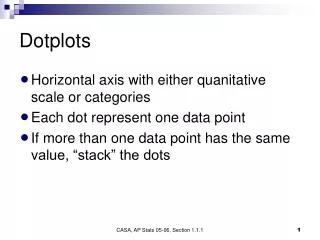
Dotplots • Horizontal axis with either quanitative scale or categories • Each dot represent one data point • If more than one data point has the same value, “stack” the dots CASA, AP Stats 05-06, Section 1.1.1
Stemplots • Each data point is represented by a single number (leaf) associated with a more significant number (stem) • Rounding can help the shape of the distribution become more noticeable. CASA, AP Stats 05-06, Section 1.1.1
Histograms • Each row of a stemplot represents a number of data points found in a range. What kind of ranges might a stemplot have? • Histograms have the same general idea, but histograms are more flexible in terms of the ranges. • Ranges have equal width CASA, AP Stats 05-06, Section 1.1.1
Histograms • Histograms may be less useful than stemplots because you can’t see the actual data. CASA, AP Stats 05-06, Section 1.1.1
Histograms • Ranges for histograms generally include the lower end of the range, but does not include the upper end of the range CASA, AP Stats 05-06, Section 1.1.1
Using the TI-83 to make histograms • The TI-83 can be used to make histograms, and will allow you to change the location and widths of the ranges. CASA, AP Stats 05-06, Section 1.1.1
Using the TI-83 to make histograms • Start by entering data into a list • Example: Enter the presidential data from page 19 into any list; in this case, we will use L1 CASA, AP Stats 05-06, Section 1.1.1
Using the TI-83 to make histograms • Choose 2nd:Stat Plot to choose a histogram plot • Caution: Watch out for other plots that might be “turned on” or equations that might be graphed CASA, AP Stats 05-06, Section 1.1.1
Using the TI-83 to make histograms • Turn the plot “on”, • Choose the histogram plot. • X-list should point to the location of the data. CASA, AP Stats 05-06, Section 1.1.1
Using the TI-83 to make histograms • Under the “Zoom” menu, choose option 9: ZoomStat CASA, AP Stats 05-06, Section 1.1.1
Using the TI-83 to make histograms • The result is a histogram where the calculator has decided the width and location of the ranges • You can use the Trace key to get information about the ranges and the frequencies CASA, AP Stats 05-06, Section 1.1.1
Using the TI-83 to make histograms • You can change the size and location of the ranges by using the Window button • Press the Graph button to see the results CASA, AP Stats 05-06, Section 1.1.1
Using the TI-83 to make histograms • Voila! • Of course,you can stillchange the ranges if youdon’t like the results. CASA, AP Stats 05-06, Section 1.1.1
Using Percents • It is sometimes difficult to compare the “straight” numbers. For example: • Ty Cobb in his 24 year baseball career had 4,189 hits. Pete Rose also played for 24 years but he collected 4,256 hits. Was Pete Rose a better batter than Ty Cobb? CASA, AP Stats 05-06, Section 1.1.1
Using Percents • Ty Cobb had a career batting average of .366. (He got a hit 36.6% of the time) • Pete Rose had a career batting average of .303. • Comparing the percentage, we get a clearer picture. CASA, AP Stats 05-06, Section 1.1.1
Relative Frequency • When constructing a histogram we can use the “relative frequency” (given in percent) instead of “count” or “frequency” • Using relative frequency allows us to do better comparisons. • Histograms using relative frequency have the same shape as those using count. CASA, AP Stats 05-06, Section 1.1.1
Finding Relative Frequency • For each count in a class, divide by the total number of data points in the data set. • Convert to a percentage. CASA, AP Stats 05-06, Section 1.1.1
Finding Relative Frequency CASA, AP Stats 05-06, Section 1.1.1
Finding Relative Frequency CASA, AP Stats 05-06, Section 1.1.1
Histograms CASA, AP Stats 05-06, Section 1.1.1
Finding Cumulative Frequency CASA, AP Stats 05-06, Section 1.1.1
Finding Relative Cumulative Frequency CASA, AP Stats 05-06, Section 1.1.1
Percentiles • “The p-th percentile of a distribution is the value such that p percent of the observations fall at or below it.” • If you scored in the 80th percentile on the SAT, then 80% of all test takers are at or below your score. CASA, AP Stats 05-06, Section 1.1.1
Percentiles • It is easy to see the percentiles at the breaks. • “A 64 year old would be at the 93rd percentile.” • What do you do for a 57 year old? CASA, AP Stats 05-06, Section 1.1.1
Ogives or “Relative Cumulative Frequency Graph” CASA, AP Stats 05-06, Section 1.1.1
Section 1.2Part 1 AP Statistics September 3, 2014 Mr. Calise
Describing Distributions with Numbers: Center/Mean • The Mean • The Average • The Arithmetical Mean • The mean is not a resistance measure of center AP Statistics, Section 1.2, Part 1
Describing Distributions with Numbers: Center/Median • When numbers are ordered from low to high, the median is the middle number (if n is odd) or the average of the two middle numbers (if n is even) • Resistant measure of center AP Statistics, Section 1.2, Part 1
Describing Distributions with Numbers: Spread/IQR • The first quartile (Q1) is the median of the first half of the distribution • The third quartile (Q3) is the median of the second half of the distribution • The interquartile range (IQR) is the distance between the first and third quartiles. (IQR = Q3 – Q1) AP Statistics, Section 1.2, Part 1
Finding M, Q1,Q3,IQR • Barry Bonds’ home run counts per season (average=35.4):16, 19, 24, 25, 25, 33, 33, 34, 34, 37, 37, 40, 42, 46, 49, 73 • Hank Aaron’s home run counts per season (average=34.9):13, 20, 24, 26, 27, 29, 30, 32, 34, 34, 38, 39, 39, 40, 40, 44, 44, 44, 44, 45, 47 AP Statistics, Section 1.2, Part 1
Finding M, Q1,Q3,IQR • Barry Bonds: Q1=25,M=34, Q3=41,IQR=16 • Hank Aaron: Q1=28,M=38, Q3=44,IQR=16 • What does this say about comparing Bonds and Aaron? AP Statistics, Section 1.2, Part 1
Describing Distributions with Numbers: Outliers • If a data point falls more than 1.5 * IQR above the Q3 or falls less than 1.5 * IQR below the Q1. • Barry Bonds: M=34, Q1=25,Q3=41,IQR=16 • 41 + 1.5 * 16 = 65 (anything above 65) • 25 - 1.5 * 16 = 1 (anything below 1) AP Statistics, Section 1.2, Part 1
Side by Side Boxplots AP Statistics, Section 1.2, Part 1
Modified Boxplot AP Statistics, Section 1.2, Part 1
Describing with Numbers: Spread/Standard Deviation • s2 is called the variance, and its in units2 • s is called the standard deviation, and its in units. AP Statistics, Section 1.2, Part 1
Describing with Numbers: Spread/Standard Deviation • s measures spread about the mean and should be used only when the mean is chosen as the measure of center • s equals 0 only when there is no spread. This happens only when all observations have the same value. • s is not resistant. Outliers effect it adversely. AP Statistics, Section 1.2, Part 1
Calculating s by hand AP Statistics, Section 1.2, Part 1
Calculating s by hand AP Statistics, Section 1.2, Part 1
Calculating s by hand AP Statistics, Section 1.2, Part 1
Calculating s by hand AP Statistics, Section 1.2, Part 1
Calculating s using TI-83 AP Statistics, Section 1.2, Part 1
Calculating s using TI-83 AP Statistics, Section 1.2, Part 1
Calculating s using TI-83 AP Statistics, Section 1.2, Part 1
Linear Transformations • Adding “a” does not change the shape or spread • Adding “a” does change the center by “a” AP Statistics, Section 1.2, Part 1
Linear Transformations • Multiplying by “b” does change the shape or spread by “b” • Multiplying by “b” does change the center by “b” AP Statistics, Section 1.2, Part 1
Comparing Distributions • We have already seen the usefulness of comparing two distribution in the answering difficult questions like: • “Who was a better home run hitter, Barry Bonds or Hank Aaron?” • We used side-by-side boxplots to answer that question. AP Statistics, Section 1.2, Part 1
Back-to-Back Stemplots • We can use stemplots as a way of doing comparisons between two distributions. • For example, which baseball league is more competitive, the American League or the National League? AP Statistics, Section 1.2, Part 1
Back-To-Back Stemplots AP Statistics, Section 1.2, Part 1
Back-To-Back Stemplots AP Statistics, Section 1.2, Part 1
Reminders • If there are outliers, don’t use mean or standard deviation to compare distributions. • You can’t compare a standard deviation of one distribution to the IQR of a different distribution. • You can’t compare a mean of one distribution to the median of a different distribution. AP Statistics, Section 1.2, Part 1