Download
1 / 3
30 likes | 174 Views
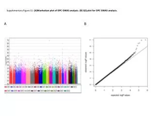
Supplementary Figure S1: (A)Manhattan plot of OPC GWAS analysis. (B) QQ plot for OPC GWAS analysis. A. B. Supplementary Figure S2: Comparative scatter plot by HNSCC tumor site vs HPV E6 serology. Supplementary Figure S3: DAPPLE randomization and extended boundary analysis.

E N D
Supplementary Figure S1: (A)Manhattan plot of OPC GWAS analysis. (B) QQ plot for OPC GWAS analysis. A B
Supplementary Figure S2: Comparative scatter plot by HNSCC tumor site vs HPV E6 serology.
Supplementary Figure S3: DAPPLE randomization and extended boundary analysis.