Download
1 / 2
20 likes | 36 Views
With the above-mentioned tips and tricks, you may have gained and insight into how to tactically<br>implement a few steps into your data studio template, so as to make your data<br>studio templates reports stand a better chance to achieve the business goals. By applying the abovementioned<br>tips in any combination that you find fit for your business, your business report will be less<br>cluttered, more intuitive, and engaging.<br>

E N D
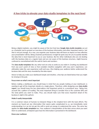
A few tricks to elevate your data studio templates to the next level Being a digital marketer, you might be aware of the fact that how Google data studio template can act as a fantastic tool to present an overview of the business information and other important metrics. but that is not just enough. As a way, you organize your business data will leave an impact on how effective your presentation will be. Being a business professional, it might be quite easy for you to quickly identify the data that is most important to you or your business. But for other individuals who are not dealing with the business data on a regular basis and are not aware of the business structure, might become confused or overwhelmed with the wall of charts and numbers. The data studio templates like any other tool are only as useful as you make it. Creating any dashboard from any user’s point of view or that considers intuitive navigation with easy user’s experience, can ultimately make the user experience swift and easy. Also helping your audience better understand the business data and the story revealed by the data report. Hence to help you make your dashboard simple and intuitive, a few tips are listed below that you might be missing in the past. Focus more on what’s most important Before making a dashboard, you should keep in mind that any people looking at your dashboard, is wanting to get all the important details at a single glance. Therefore, while designing your datastudio report, you should keep the key observations and important points in a prominent area. Taking into account the z pattern of reading. The most important thing to consider here is the customer KPIs and the total points you want to make. Thus, you should make sure that every important detail of the business is right in the upfront. Make it easily interpretable It is a common nature of humans to interpret things in the simplest form with the least efforts. The moment we found out any information that seems quite complicated to us, we immediately resist understanding it or we do not get the will to send out energy to understand the same. The same law applies for data studio templates too. Your audience’s interpretation of the data versus what you want them to understand, all depend upon how the information is presented in the dashboard. Know your audience
Knowing your targeted audience is the key to any business success.as, everyone has a different level of understanding and expertise, so when you are putting your business data together in the report, just make some extra effort to design and tailor it according to your targeted audience. For example, if your audience consists of the people who are less technical and are senior in age, then they might have less patience to understand what they are looking for. All that they would value is a single view easy to understand business details. Hence just try to be concise give them the bottom line quickly. The bottom line With the above-mentioned tips and tricks, you may have gained and insight into how to tactically implement a few steps into your data studio template, so as to make your data studio templates reports stand a better chance to achieve the business goals. By applying the above- mentioned tips in any combination that you find fit for your business, your business report will be less cluttered, more intuitive, and engaging.