Download
1 / 59
590 likes | 694 Views
BSc/HND IETM Week 9/10 - Some Probability Distributions. When we looked at the histogram a few weeks ago, we were looking at frequency distributions.

E N D
When we looked at the histogram a few weeks ago, we were looking at frequency distributions.
It is possible to convert such frequency distributions into probability distributions, such that the probability of encountering some particular value (or range of values) of x is plotted on the vertical axis, rather than the number of occurrences of that value of x.
There are a few standard forms of such distributions, which make analysis rather easy - so long as the data really do fit the chosen form.
We shall look at two of these standard forms, the normal and the negative exponential distributions.
Suppose that our previously-mentioned (and, sadly, hypothetical) optional unit for your course, ‘Flower Arranging for Engineers’, becomes extremely popular.
In fact, it becomes so popular that it is studied by 208 students, from all the various BSc courses in the School.
In an effort to analyse the performance of the students, so as to determine if any improvements to the unit are required, we might decide to plot a histogram of the final marks obtained.
As we know, this is a frequency distribution, and might be obtained from the following summary of the students’ scores, as shown:
Frequency polygonsThe first step in the conversion is to change from the histogram to what is called a frequency polygon. This is simply a line graph, joining the centres of each of the chosen data intervals.
At the ends, our frequency polygon reaches the zero axis as shown, since no student can obtain less than zero or more than 100 per cent. In situations when this doesn’t apply, it is conventional to terminate the polygon on the zero axis, half way through the next interval.
It is very easy to obtain probability distributions from diagrams such as those above. All that is necessary is to divide each frequency by the total number of (in this case) students, to obtain the probability of any individual student, selected at random, obtaining a mark in a particular range.
For example, to convert the histogram on page 1, or the frequency polygon on page 2, into probability distributions, simply divide every number on the vertical axis (and therefore also the numbers written on the plots) by 208.
Thus, the vertical axes would now be calibrated in probabilities from zero to 53/208 = 0.255.
The probability of any given student obtaining a mark in the range 40 to 49.9 per cent will be 47/208 = 0.226. The probability of a student scoring 90 per cent or more will be 3/208 = 0.0144, etc.
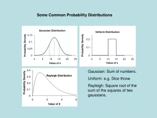
The normal distribution It is not very surprising that the marks distribution (frequency or probability) looks like the diagrams above.
In a fair examination, taken by a large number of students, we would expect that only a few students would obtain either abysmally low marks or astronomically high marks.
We would expect the majority of marks to be ‘somewhere in the middle’, with a ‘tail’ at both the low and the high ends of the range.
We would expect the majority of marks to be ‘somewhere in the middle’, with a ‘tail’ at both the low and the high ends of the range. This is what we see above.
Several real-life situations fit this general form of distribution, where it is most likely that results will be clustered around the centre of some range, with outlying values tailing off towards the ends of the range.
Wisniewski, in his ‘Foundation’ text, uses an example based on the distributions of the weights of breakfast cereal packed by machines into boxes.
There should always ideally be the stated amount in a box but, inevitably, some boxes will be lighter, and some heavier. There will be the odd ‘rogue’ boxes a long way from the mean.
To make it easier to cope with such situations, they are often assumed to fit a standardised probability distribution, called the normal distribution.
By doing this, it is possible to use standard printed tables to make predictions such as (for example), how many students would be expected to score less than 40 per cent
To allow standard tables to be used, we need to assume a certain fixed shape of probability distribution, and we also need to define it in terms of mean and standard deviation.
We cannot define it in terms of actual data values (e.g. examination marks, or weight of cereal in a box), otherwise we would need a different set of tables for every new problem.
The normal distribution curve is actually defined by a rather unpleasant formula (but we don’t need to use it, as we are going to use tables which have been derived from it by someone else).
If the variable in which we are interested is x (e.g. a mark in per cent, or the weight of cereal in a box in kg), the mean value of x is and the standard deviation of the data set is x,
then the normal distribution curve is defined by the probability that x will take a particular value (P(x)) obeying the following relationship (I believe there is an error in Wisniewski’s version):
The resulting plot of P(x) as x varies is a ‘bell-shaped’ curve, as shown in the next slide.
Notes1. The “x axis” is in STANDARD DEVIATIONS2. The total area under the graph is 1 unit.3. The area under the graph between two values of x gives the probability that the quantity will be between those values.
ExampleSay that a large set of examination results has a mean of 55 per cent, and a standard deviation of 15 per cent.
How many students would we expect to fail the examination (if we define a failure as obtaining less than 40 per cent), and how many students would we expect to get a first-class result (defined as obtaining 70 per cent or more)?
X = 1.0 (1 SD from mean)First : Probability 0.1587Fail: Also 0.1587 !
The negative exponential distributionTo cover a wider range of real-world situations, more ‘standardised’ probability distributions are required.
The other one we shall briefly look at is the negative-exponential distribution. This is also sometimes called a ‘failure-rate’ curve, because it tends to describe how components fail with time.
If a certain number of components is manufactured and put into service, it is reasonable to assume that they will all eventually fail.
If a certain number of components is manufactured and put into service, it is reasonable to assume that they will all eventually fail. The probability of any one of the components failing during a given time period might well depend on how many components are left in service.
Choose to measure time t in the best units for the problem (seconds, months, years, etc.). Technically, the unit chosen should be short compared with the expected lifetime of a component, so that any given component is expected to last for many time units.
Let be the failure rate, that is, the proportion of components expected to fail in one time unit. This means that must have ‘dimensions’ of (1/time). In the example above, we said that 1 per cent of components might fail in three years so, in that case, the failure rate 0.01/3 (proportion per year).
This can also be viewed as a probability - there is a probability of 0.01/3 that any given component will fail in a given period of one year.
Therefore, to find the proportion of components expected to fail over a time t (measured in our chosen units), we need the quantity t. This is now dimensionless - it is actually the probability that any given component will fail over the stated time period.