Download
1 / 31
350 likes | 560 Views
Digital Media Production. Principles of Web Design. Dr. Tery Griffin. tag211@nyu.edu. Agenda. DISCUSS why you should care about principles, instead of just having fun with design. INTRODUCE the 5 main principles of web design.

E N D
Digital Media Production Principles of Web Design Dr. Tery Griffin tag211@nyu.edu
Agenda DISCUSS why you should care about principles, instead of just having fun with design INTRODUCE the 5 main principles of web design SHOW how they're used on a page you might recognize -- and mention some changes I would suggest (if asked) ASK you to help me apply them to a "brother-in-law" page (a.k.a. a "neighbor-down-the-street" page) Please feel free to ask questions at any time!
WHY SHOULD I CARE? The more difficult you make it for users to find what you really want them to know . . . . . . the more likely it is (by far!) that they'll miss something important A good, solid, design -- no matter how simple -- is worth more than any amount of techno-wizardry you can cook up
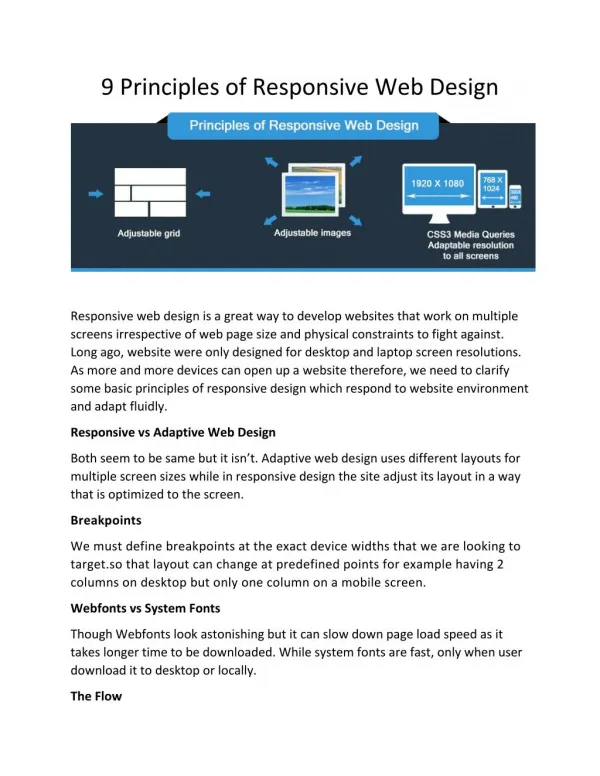
MAIN PRINCIPLES Everything on the page should have a reason for being on the page 1. Content 2. Contrast Everything on the page should have a reason for being where it is on the page 3. Alignment 4. Repetition 5. Proximity
CONTENT Screen space is scarce: Use it well! Everything on the page Every image G'BYE Every word Every line should have a reason for being on the page
CONTENT Screen space is scarce: Use it well! Everything on the page Every image Every word Every line should have a reason for being on the page
What exactly do we get from these images as they are here? What do all these horizontal lines give us? Is the scrolling text the best use of this screen real estate? Is this getting the screen space it deserves? Are these links worth the bottom 40% of the site's main page?
CONTRAST Guides user's eyes around the page Type that's bigger, bolder, or a very different style Creates a hierarchy of information Allows users to skim quickly and pick out what they need Differentcolors Spatial arrangements Can be
With projected text, it's often easiest to read light text against a dark background The grey buttons do not contrast sharply with the background And the black text does not contrast as sharply against the grey buttons White text on a blue background is fairly standard for a government site
What about guiding your eye around the page? How does that work here? What about hierarchy? What hierarchy do you perceive on this page?
Practice Practice: Book Buddies! a.k.a. the brother-in-law site the neighbor-down-the-street site
ALIGNMENT left right center Of text and images top bottom Choose one and use it for the entire page Everything on the page should have a reason for being where it is on the page
Everything is centered Down here we have multiple selections on each line, and they're aligned on the bottom
REPETITION Makes the pages of a site look like they belong together Helps users understand and navigate the site layout color navigation typography illustrations
What do you see repeated on this page? If I click the City button, what would you expect the next screen to look like, in general?
This it the top -- maybe 5% -- of the page brought up by the City button
This is the part that appeared on the previous screen This is a VERY squished version of the entire page It's the same font But what else might suggest that it's part of the same web site? Where's my color scheme? Where are my navigation buttons?
Is this a little closer to what you expected to see? Why or why not?
Practice Practice: Book Buddies! a.k.a. the brother-in-law site the neighbor-down-the-street site
PROXIMITY 2 items that are together appear to be related user will have to work to figure out they are not items with space between them do not appear to be related -- user will have to work to figure out that they are Click on the dog to go to the doghouse page
PROXIMITY Keep headlines or subheads close to the text they belong with Keep captions close to their pictures Group items together that belong together
Images are grouped together here And buttons are grouped together here Are there other possibilities for grouping that might give us a stronger page? What do we gain from the groupings on this page?
How about this as a possibility? What are its strengths and weaknesses?
How about this as a City page? Better than the real one? Worse? Why? What are its strengths and weaknesses?
Practice Practice: Book Buddies! a.k.a. the brother-in-law site the neighbor-down-the-street site
Digital Media Production Principles of Web Design Dr. Tery Griffin tag211@nyu.edu