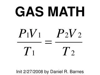
Download
1 / 24
260 likes | 411 Views
Math 2: Unit 6 Day 1. How do we use scatter plots, correlation, and linear regression?. Scatter Plots. http://www.shodor.org/interactivate/activities/ScatterPlot/. A scatter plot is a graph of a set of data values ( x , y ) that shows the relationship between 2 quantitative variables. Ex:.

E N D
Math 2: Unit 6Day 1 How do we use scatter plots, correlation, and linear regression?
Scatter Plots http://www.shodor.org/interactivate/activities/ScatterPlot/ • A scatter plot is a graph of a set of data values (x, y) that shows the relationship between 2 quantitative variables. • Ex:
Correlation • Data has a positive correlation if y increases as x increases and has a negative correlation if y decreases as x increases.
Tell if the following show positive, negative, or no correlation: • The amount of hours you study and your test scores. • The speed you drive, and the amount of time it takes to get to your destination. • The color of your eyes and your height. Positive – the more (↑) you study, the better (↑) your test score will be. Negative – the faster you drive (↑), the less time it takes. No correlation!
You decide: What type of relationship might you expect? positive • The weight of a sirloin steak and the selling price. • The number of problems assigned for homework and the amount of time spent doing homework. • Athletic ability and musical ability. • The number of days you are absent, and your grade in the class. • The number of dogs in 30 California cities and the number of cats in 30 Texas cities. positive No correlation negative THINK: more ↑ absences means a worse ↓ grade. No correlation
Correlation Coefficient • A correlation coefficient, denoted by r, is a number from -1 to 1 that measures how well a line fits a set of data pairs (x, y). • If r is near 1, then the points lie close to a line with a positive slope. • If r is near -1, then the points lie close to a line with a negative slope. • If r is near 0, then the points do not lie close to any line. *See handout
Correlation Ex:Decide whether the data have a positive correlation, a negative correlation, or approximately no correlation. Then, tell whether the correlation coefficient is closest to -1, -0.5, 0, 0.5, or 1. 1. 2. Positive correlation; 1 No correlation; 0
Correlation Ex:Decide whether the data have a positive correlation, a negative correlation, or approximately no correlation. Then, tell whether the correlation coefficient is closest to -1, -0.5, 0, 0.5, or 1. 3. 4. Negative correlation; -1 Positive correlation; 0.5
An outlier is a value that is outside the clustered majority of points on a graph. Ex: outlier
Association • Positive slope indicates a positive association and a negative slope indicates a negative association. negative positive
To clarify… • Statistically, correlation and association are not synonymous – they do not mean the same thing. • Association describes the nature of the relationship between 2 variables, whereas correlation measures the direction and strength of the linear relationship between 2 variables. • i.e. Correlation gives a numeric value and association does not. • Correlation does not imply causation! *An action or occurrence can cause another (such as smoking causes lung cancer), or it can correlate with another (such as smoking is correlated with alcoholism). If one action causes another, then they are most certainly correlated.
Your turn. The table shows the number of absences and grades for 16 students. • Make a scatter plot for these data. • What type of relationship seems to exist between absences and grades? Strong negative correlation.
Before moving on, we need to review what the different types of graphs look like. • Linear: Quadratic:
Cubic: Exponential: • Absolute Value:
Ex: Which type of function could the data in the scatter plot below best be modeled by: quadratic, linear, logarithmic, or exponential? 3. 4. quadratic linear
Ex: Draw a scatterplot of the following data to determine which model would best describe the data: linear, exponential, absolute value, or quadratic. 5. linear
Ex: Draw a scatterplot of the following data to determine which model would best describe the data: linear, exponential, absolute value, or quadratic. 6. quadratic
Line of Best Fit • The line of best fit is the line that lies as close as possible to all the data points. Linear regression is a method for finding the equation of the regression line, .
Ex 7: The ordered pairs (x, y) give the height y in feet of a young tree x years after 2000. Approximate the best fitting line for the data. (0,5.1), (1,6.4), (2,7.7), (3,9), (4,10.3), (5,11.6), (6,12.9) Use the points (0, 5.1) and (1, 6.4) to find the slope. Estimate the y-intercept from the graph.
Ex 8: The table below gives the number of people y who attended each of the first seven football games x of the season. Approximate the best-fitting line for the data.
Ex 9: The table gives the average class score y on each unit test for the first 6 units of Math II. Approximate the best fitting line for the data. y = 1.3x + 81.9
HOMEWORK • Unit 6 Day 1 Handout