Download
1 / 25
250 likes | 268 Views
Learn how to create impactful poster presentations, avoid design errors, and engage your audience effectively. This guide provides layout and design tips, along with key recommendations for constructing and presenting your poster. Prepare your content wisely to convey your research clearly and memorably.

E N D
PREPARING A TECHNICAL POSTER PRESENTATION • This guide is intended to: • Illustrate elements of layout and design for poster presentations • Illustrate common errors in design and how to avoid them. Chem 333 Fall 2006
Poster Presentations: Poster presentations provide the opportunity for the presenter and the audience to talk with one another. Typically, each presenter is provided with a free-standing bulletin board, usually around 3.5 feet high by 3 feet wide, on which to display the poster. [NOTE: The most common size for posters is 3.5 - 4 feet high by 5.5 - 6 feet wide. Check to make sure your poster adheres to the requirements of the conference at which you will be presenting.] A relatively large number of posters will be displayed during each poster session. During the designated period, the audience moves through the poster displays, stopping to interact with those who are presenting research that is of special interest to them. Thus, the interaction between the presenters and the audience is likely to be more meaningful than is typically the case in paper sessions. Therefore, when constructing your poster, remember to utilize the opportunities provided by this method of presentation.
General Poster Presentation Recommendations: • Construct the poster to include the title, the author(s), affiliation(s), and a description of the research, highlighting the major elements that are covered in the abstract. • Minimize detail and try to use simple, jargon-free statements. • Remember that pictures, tables, and figures are amenable to poster display • If you can, use color in your visuals. • Make sure your lettering is neatly done and is large enough to be read from a distance, i.e., do not simply pin up a set of typed pages--reserve these for your handout. • Consider using a flow chart or some other method of providing the viewer with a guide to inspecting your display. • Don't overwhelm the viewer with excessive amounts of information; rather, construct a poster display that enhances conversation.
General Poster Format: • Determine the one essential concept you would like to get across to the audience. • Determine if you have all the elements you'll need for the poster: Poster board, glue, razor blades? How much time will you need to prepare the data for presentation (e.g., tables and figures)? Does material need to be sent out & returned (e.g., photographic services)? • Preparing a poster will take as much time as you let it. Allocate your time wisely. If you have little experience making posters, it will take longer. .
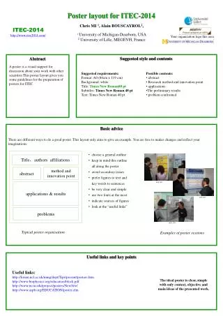
4’ 3’ Sketch it out! Make a sketch of the poster. Arrange the contents in a series of 3, 4, or 5 columns. This will facilitate the flow of traffic past the poster. • Place the elements of the poster in position: • The title and abstract across the top. • A brief introduction at the upper left. • The conclusions at the lower right. • Methods and Results in remaining space.
The Title: • This part of the poster includes the title of the work, the authors names, & the institutional affiliations. Think BIG! • The poster title should be readable from 15 - 20 feet away. • If space permits, use first names for authors to facilitate interactions. Middle initials and titles are seldom necessary. • Use abbreviations where possible. • There are seldom rules regarding line justification of the title. Determine if you will left or center justify the text of the title once it has been formatted, based upon personal preferences and space constraints.
Sequencing Contents: • A poster should use photos, figures, and tables to tell the story of the study. For clarity, present the information in a sequence that is easy to follow: • Determine a logical sequence for the material you will be presenting. • Organize that material into sections, e.g., Introduction, Methods or Experimental Section, Results, Discussion, Error Analysis, Conclusions, Acknowledgements, &, if necessary, Literature Cited. (Avoid using too many citations) • You may wish to use numbers to help sequence sections of the poster. • Arrange the material into columns. • The poster should not rely upon your verbal explanation to link together the various portions.
Edit Ruthlessly! There is almost always too much text in a poster. 1. Posters primarily are visual presentations; text serves to support the graphics. 2. Look critically at the layout. If there is about 20% text, 40% graphics and 40% empty space, you are doing well 3. When in doubt, rephrase text or delete it. 4. Use active voice when writing the text. 5. Delete all redundant references and filler phrases. 6. Because the abstract is usually published, there may be no need to repeat it in the poster. The brief introduction should be sufficient to identify the purpose of the study. The poster is not a publication of record, so excessive detail about methods, or vast tables of data are not necessary. This material can be discussed with interested persons individually during or after the session, or presented in a handout.
Illustrations: • The success of a poster directly relates to the clarity of the illustrations and tables. • Self-explanatory graphics should dominate the poster. • A minimal amount of text materials should supplement the graphic materials. • Use regions of empty space between poster elements to differentiate and accentuate these elements. • Graphic materials should be visible easily from a minimum distance of 6 feet. • Restrained use of 2 - 3 colors for emphasis is valuable; overuse is not.
Show no mercy when editing visual materials! • Use short sentences, simple words, and bullets to illustrate discrete points. • Remove all non-essential information from graphs and tables. • Label data lines in graphs directly, using large type & color. Eliminate legends and keys. • Lines in illustrations should be larger than normal. Use contrast and colors for emphasis. • Use colors to distinguish different data groups in graphs. Avoid using patterns or open bars in histograms. • Colored transparency overlays are useful in comparing/contrasting graphic results.
Poster Text: Double-space all text, using left-justification; text with even left sides and jagged right sides is easiest to read. The text should be large enough to be read easily from at least 6 feet away. For section headings (e.g., Introduction), use boldface, maybe about 32-36 point. For supporting text (e.g., text within each section & figure captions), use about 22-24 point (boldface, if appropriate). In general, use font sizes proportional to importance: largest type - Title next largest type - Section headings medium type - Supporting material smallest type - Details Keep in mind that san serif fonts (having characters without curlicues or other embellishments) are easiest to read. Finally, be consistent. Choose one font and then use it throughout the poster. Add emphasis by using boldface, underlining, or color; italics are difficult to read.
The Poster's Background: Two basic rules to keep in mind are that: artistry does not substitute for content, and the fancier the poster, the greater the time investment There are several common approaches. 1. Pieces of mat board (or Bristol board) make a solid background for the entire poster. A complementary color may be chosen as a border for important elements of the poster. This gives a unified appearance and is easier to hang straight. 2. Smaller pieces of board may be used to frame only the elements of the poster, leaving spaces between the elements empty. This style is less expensive and is easier to carry to and from the meeting. 3. The choice of a background color is up to you. However, softer colors (pastels & greys) may work best as a background - they are easiest to view for hours at a time, and offer the best contrast for text, graphic, and photographic elements.
Use a colored background to unify your poster: 1. Muted colors, or shades of gray, are best for the background. Use more intense colors as borders or for emphasis, but be conservative - overuse of color is distracting. 2. Two to three related background colors (Methods, Results, & Discussion) will unify the poster. 3. If necessary for emphasis, add a single additional color by mounting the figure on thinner poster board, or outlining the figure in colored tape. Color can enhance the hues or contrast of photographs: 1. Use a light background with darker photos; a dark background with lighter photos. 2. Use a neutral background (gray) to emphasize color in photos; a white background to reduce the impact of colored photos. 3. Most poster sessions are held in halls lit with harsh fluorescent light. If exact colors are important to the data, balance those colors for use with fluorescent lighting. Also, all colors will be intensified; bright (saturated) colors may become unpleasant to view.
Poster printing and assembly: A one-piece Poster is easiest to carry. University printing services or commercial firms like Kinko's offer this service. An alternative is to use a laser printer and double-stick tape: Set the printer output to landscape (wide) format, using 11 x 14 inch paper (you'll have fewer seams than if you use 8.5 x 11 inch paper). Print the title & lay it out on a table. Successive pages should overlap with only a small margin. Either method produces a poster which should be about 3 - 4 feet, and which can be rolled into a compact cylinder for travel.
Miscellaneous comments: • Because a poster is a visual presentation, try to find ways to show what was done - use schematic diagrams, arrows, and other strategies to direct the visual attention of the viewer, rather than explaining it all using text alone. • Design the poster to address one central question. State the question clearly in the poster, then use your discussion time with individuals to expand or expound upon issues surrounding that central theme. • Provide an explicit take-home message. • Summarize implications and conclusions briefly, and in user-friendly language. • Give credit where it is due. Have an acknowledgments section, in smaller size type (14 - 18 point), where you acknowledge contributors and funding organizations. • Vary the size and spacing of the poster sections to add visual interest, but do so in moderation. • (Some recommend that you do not use school mascots or logos on the poster; the claim is that these add a useless visual distraction to the poster and indicate a degree of jingoism incompatible with scientific endeavors. Others, however, claim that a judicious placement of a small university logo is appropriate. When in doubt check with your advisor.)
Do not wander too far away from your poster during the session; be available for discussion! • Be ready to pin up and take down your poster at specified times. • Be sure to bring thumbtacks with you. • Prepare for distribution, copies of a printed version of your paper (about 25) with the details of the research and/or a sign-up sheet on which interested people can request the paper. Be sure to indicate on the paper your identification, the conference source reference, and whether or not it may be quoted. • It is an honor to have the opportunity to present at a research conference. You have an obligation to prepare a neat, well-organized display and to be present at your display for the entire poster session period. With a little thought and creativity, you can make your presentation a very pleasing one for both you and your audience.
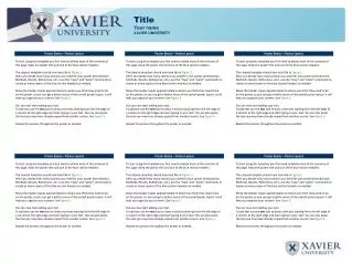
Colligative Properties of a Binary Liquid: Methanol and Water A. Cougarette and B. Cougar Chem 333, Department of Chemistry Washington State university, Pullman, WA 99164-4630 (This is a suggested format) Density and partial molar volume Viscosity Surface tension Phase diagram Introduction Measurements and Results Propagation of Error Calculations Discussion and Conclusions References
Propagation of Errors, Basic Rules Suppose two measured quantities x and y have uncertainties,Dx and Dy, determined by procedures described in previous sections: we would report (x ± Dx), and (y ± Dy). From the measured quantities a new quantity, z, is calculated from x and y. What is the uncertainty, Dz, in z? For the purposes of this course we will use a simplified version of the proper statistical treatment. The formulas for a full statistical treatment (using standard deviations) will also be given. The guiding principle in all cases is to consider the most pessimistic situation. Full explanations are covered in statistics courses. The examples included in this section also show the proper rounding of answers. The examples use the propagation of errors using average deviations.
Example: w = (4.52 ± 0.02) cm, x = ( 2.0 ± 0.2) cm, y = (3.0 ± 0.6) cm. Find z = x + y - w and its uncertainty. z = x + y - w = 2.0 + 3.0 - 4.5 = 0.5 cm Notice that we round the uncertainty to one significant figure and round the answer to match.
b) Multiplication and Division: z = x y or z = x/y The same rule holds for multiplication, division, or combinations, namely add all the relative errors to get the relative error in the result.
Example: w = (4.52 ± 0.02) cm, x = (2.0 ± 0.2) cm. Find z = w x and its uncertainty z = w x = (4.52) (2.0) = 9.04 cm2 The uncertainty is rounded to one significant figure and the result is rounded to match. We write 9.0 cm2 rather than 9cm2 since the 0 is significant.
f) Other Functions: Getting formulas using partial derivatives The general method of getting formulas for propagating errors involves the total differential of a function. Suppose that z = f(w, x, y, ...) where the variables w, x, y, etc. must be independent variables! The total differential is then We treat the dw = Dw as the error in w, and likewise for the other differentials, dz, dx, dy, etc. The numerical values of the partial derivatives are evaluated by using the average values of w, x, y, etc. The general results are
Example: Consider S = x cos (q) for x = (2.0 ± 0.2) cm, q = (53 ± 2) °= (0.9250 ± 0.0035) rad. Find S and its uncertainty. Note: the uncertainty in angle must be in radians! S = 2.0 cm cos 53° = 1.204 cm Hence S = (1.20 ± 0.13) cm (using average deviation approach) or S = (1.20 ± 0.12) cm (using standard deviation approach.)