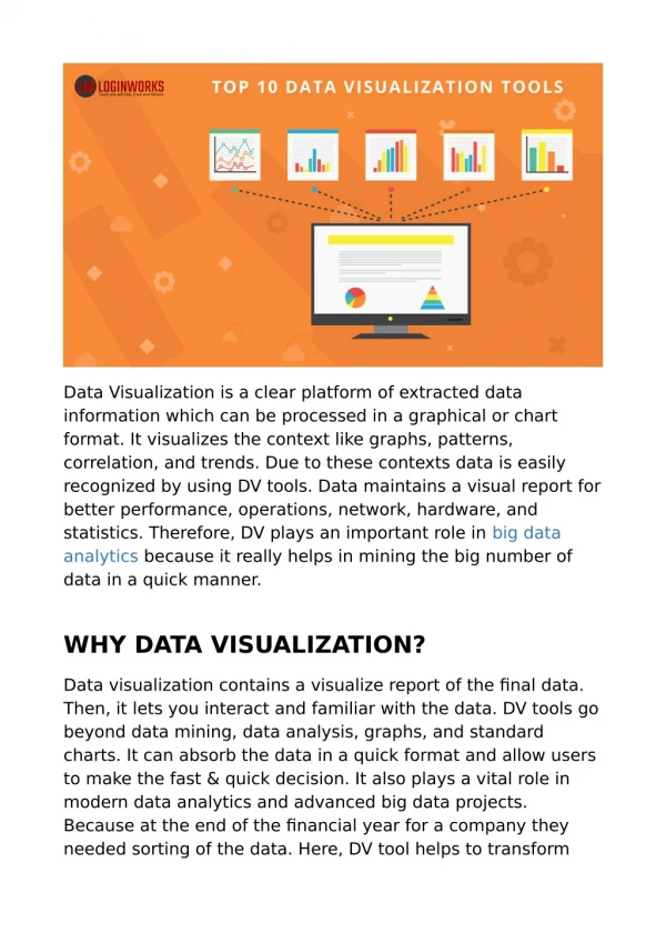
Data Visualization Principles and Tools
Data visualization is the graphical representation of data and information, making complex datasets more accessible, understandable, and usable. It utilizes visual elements like charts, graphs, and maps to highlight patterns, trends, and insights, aiding in better decision-making and communication.


Data Visualization Principles and Tools
E N D
Presentation Transcript
Data Visualization Principles and Tools Skillfloor.com
Highlights Introduction to Data Visualization Importance of Data Visualization Principles of Effective Data Visualization Choosing the Right Chart Type Color Theory in Data Visualization Data Visualization Tools Overview Detailed Tool Comparison Best Practices for Dashboards Data Storytelling with Visuals Skillfloor.com
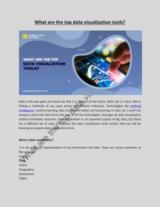
Introduction to Data Visualization Data visualization is the practice of transforming data into visual formats, such as charts, graphs, and maps, to make complex information more understandable and accessible. By turning raw data into visual representations, data visualization allows people to identify patterns, trends, and insights that might be missed in text- heavy or numerical formats. it is a key concept of Analytics . Skillfloor.com
Importance of Data Visualization Enhances Decision Making: Visual data aids quicker and more informed decisions. Effective Communication: Helps convey insights clearly to diverse audiences. Increases Engagement: Visuals are generally more engaging than raw data. Skillfloor.com
Principles of Effective Data Visualization Clarity: Ensure the visualization is straightforward and easy to interpret. Accuracy: Represent data truthfully to avoid misleading interpretations. Simplicity: Avoid unnecessary elements that clutter the visualization. Focus: Highlight key information and insights. Skillfloor.com
Choosing the Right Chart Type Bar Chart: Best for comparing quantities across categories. Line Chart: Ideal for showing trends over time. Pie Chart: Use for showing proportions within a whole. Scatter Plot: Useful for analyzing the relationship between two variables. Heat Map: Effective for showing data density and distributions. Skillfloor.com
Color Theory in Data Visualization Color Meaning: Choose colors that align with cultural meanings (e.g., red for warning). Consistency: Use consistent color schemes to maintain visual flow. Contrast: Ensure high contrast between background and data points for readability. Skillfloor.com
Data Visualization Tools Overview Power BI: Business intelligence tool with robust data transformation capabilities. Tableau: Known for flexibility in interactive visualizations and dashboards. Google Data Studio: Free tool for creating reports and dashboards. Excel: Widely used tool with basic charting and data visualization options. Skillfloor.com
Detailed Tool Comparison Ease of Use: Beginner-friendly vs. advanced customization. Cost: Free, paid, subscription-based. Features: Interactive dashboards, customization options, integration with other tools. Best Use Cases: Specific strengths (e.g., Tableau for flexibility, D3.js for custom web visuals). Skillfloor.com
Best Practices for Dashboards Focus on Key Metrics: Avoid overwhelming users; select metrics that align with business goals. Logical Layout: Place key information at the top or center for easy access. Interactivity: Use filters and drill-down features to allow users to explore the data. Responsiveness: Design for compatibility on various devices (desktop, tablet, mobile). Skillfloor.com
Data Storytelling with Visuals Context: Begin with background information on what the data represents. Insight: Highlight the main findings or trends revealed in the data. Narrative Flow: Arrange visual elements logically to lead the audience through the data story. Highlight Key Takeaways: Use annotations, labels, and callouts to emphasize insights. Skillfloor.com
Summary Effective data visualization is a crucial skill that transforms raw data into meaningful insights, enabling better decision-making and clearer communication. By applying core principles such as clarity, simplicity, and appropriate chart selection alongside choosing the right tools, we can create visuals that not only inform but also engage. Skillfloor.com