Download
1 / 40
440 likes | 853 Views
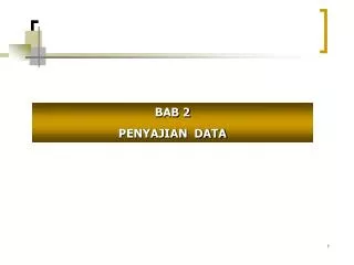
Statistika Bisnis. BAB 2 Menyajikan Data dalam Tabel dan Grafik. Tujuan Kuliah. Pada Bab ini Anda diharapkan mempelajari : Membangun tabel dan grafik untuk data kategori (categorical data) Membangun tabel dan grafik untuk data numerik

E N D
StatistikaBisnis BAB 2 Menyajikan Data dalamTabeldanGrafik
TujuanKuliah PadaBabiniAndadiharapkanmempelajari: • Membanguntabeldangrafikuntuk data kategori (categorical data) • Membangun tabeldangrafikuntuk data numerik • Prinsip-prinsip yang tepatdalammenyajikan data
Menyajikan Data • Data yang telahkitadapatbiasanyatidakmudahuntuklangsungdigunakandalampengambilankeputusan • Beberapatipepenyajian data dibutuhkan, yaitu: • Tabel • Grafik • Teknik-teknikmenyajikan data yang akandibahasdisiniadalah: • Bar charts and pie charts • Pareto diagram • Ordered array • Stem-and-leaf display • Frequency distributions, histograms and polygons • Cumulative distributions and ogives • Contingency tables • Scatter diagrams
Tabeland GrafikuntukCategorical Data Categorical Data Graphing Data Tabulating Data Summary Table Bar Charts Pie Charts Pareto Diagram
CONTOH • Kita melakukaninvestasisebagaiberikut: (in thousands $) Stocks 46.5, Bonds 32, CD 15.5, Savings 16 Buat summary table (tabelrekapitulasi) dangrafik bar/pie berdasarkanfrekuensisetiapkategori
The Summary Table (TabelRekapitulasi) Rekapitulasi data berdasarkankategori Contoh: PortofolioInvestasi
Bar and Pie Charts • Bar charts and Pie charts digunakanuntuk categorical data • Tinggidaridari bar atau size dariirisan pie memperlihatkanfrekuensidarisetiapkategori
Bar Chart Example Current Investment Portfolio Investment Amount Percentage Type(in thousands $) (%) Stocks 46.5 42.27 Bonds 32.0 29.09 CD 15.5 14.09 Savings 16.0 14.55 Total110.0 100.0
Pie Chart Example Current Investment Portfolio Investment Amount Percentage Type(in thousands $) (%) Stocks 46.5 42.27 Bonds 32.0 29.09 CD 15.5 14.09 Savings 16.0 14.55 Total110.0 100.0 Savings 15% Stocks 42% CD 14% Percentages are rounded to the nearest percent Bonds 29%
Bar dan Pie Chart • Apaperbedaan bar dan pie chart? • Bar chart digunakanuntukmelihatkategori data mana yang terbesar/terkecil • Pie chart digunakanuntukmelihatproporsidarisetiapkategoridibandingkeseluruhan
Pareto Diagram • Digunakanuntukmenggambarkan categorical data (nominal scale) • Pareto diagram digunakanpadagrafik yang sama bar chart denganmenambahkankumulatiffrekwensi • Untukmemisahkan “vital few” dari “trivial many”
Pareto Diagram Example Current Investment Portfolio % invested in each category (bar graph) cumulative % invested (line graph)
Organizing Numerical Data Numerical Data Frequency Distributions and Cumulative Distributions Ordered Array Stem-and-Leaf Display Histogram Polygon Ogive
The Ordered Array mengurutkandatakedalamtingkatan: • Memperlihatkanjarak(min to max) • Menghasilkan signal tentangvariasi yang terdapatdalam data • Bisamengidentifikasipencilan/outliers (unusual observations) • tapiapabila data sangatbanyak, the ordered array susahuntukdigunakan
The Ordered Array (continued) • Data mentah yang terkumpul: 24, 26, 24, 21, 27, 27, 30, 41, 32, 38 • Urutkan data memakaiteknikordered arraydari yang terkecilketerbesar: • Range:
Stem-and-Leaf Diagram • Cara yang mudahuntukmelihatdistribusi data METODA: Memisahkan data menjadi yang termasukkedalamleading digits (the stem) and the trailing digits (theleaves)
CONTOH Data in ordered array: 21, 24, 24, 26, 27, 27, 30, 32, 38, 41 • Here, use the 10’s digit for the stem unit: Stem Leaf 2 1 3 8 4 1 • 21 is shown as • 38 is shown as • 41 is shown as
CONTOH (continued) Data in ordered array: 21, 24, 24, 26, 27, 27, 30, 32, 38, 41 • Completed stem-and-leaf diagram:
Using other stem units • Using the 100’s digit as the stem: • Round off the 10’s digit to form the leaves • 613 would become 6 • 776 would become 7 • . . . • 1224 becomes 12 Stem Leaf
Tabulating Numerical Data: Frequency Distributions Apakah frequency distribution? • Frequency distribution adalahlist atautabel… • Berisikangrup-grupdarikelas(class groupings)(range/jarakberadadiantara data) …
MengapaMemakai Frequency Distribution? • Suatucarauntukmenyusun/summarize numerical data • Menyusun/meringkas data mentahmenjadisesuatu yang lebihbergunadanmudahdibaca... • Menyediakansuatudistribusi data yang bisadiinterpretasikan
Class Intervals and Class Boundaries • Setiapgrupkelas/class grouping mempunyailebar/jarak yang sama • Menentukanlebardarisetiapkelasdengan • Biasanyasedikitnya 5 kelastapitidaklebihdari15 kelas (Cara menentukanjumlahkelas :K = 1 + 3,3 log N • Batas setiapkelastidakoverlap • Akhirilebarkelassehinggasemua data masukkedalamkelas
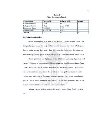
Contoh Frequency Distribution Contoh:Suatumanufakturpenyekatansecaraacakmemilih 20 musimdingindanmencatattermperaturtertinggiperharisbb: 24, 35, 17, 21, 24, 37, 26, 46, 58, 30, 32, 13, 12, 38, 41, 43, 44, 27, 53, 27
Contoh Frequency Distribution (continued) • Urutkan data:12, 13, 17, 21, 24, 24, 26, 27, 27, 30, 32, 35, 37, 38, 41, 43, 44, 46, 53, 58 • Range: 58 - 12 = 46 • Pilihjumlahkelas: 5(biasanyaantara5 and 15) • Masukanlebarkelas/class interval (width): 10 (46/5 ) • Tentukanbatassetiapkelas(limits): 10, 20, 30, 40, 50, 60 • Masukkannilaitengahsetiapkelas/class midpoints: 15, 25, 35, 45, 55 • Buattabeldistribusifrekwensi
Contoh Frequency Distribution (continued) Data in ordered array: 12, 13, 17, 21, 24, 24, 26, 27, 27, 30, 32, 35, 37, 38, 41, 43, 44, 46, 53, 58 Relative Frequency Class Frequency Percentage 10 but less than 20 20 but less than 30 30 but less than 40 40 but less than 50 50 but less than 60 Total
Tabulating Numerical Data: Cumulative Frequency Data in ordered array: 12, 13, 17, 21, 24, 24, 26, 27, 27, 30, 32, 35, 37, 38, 41, 43, 44, 46, 53, 58 Cumulative Frequency Cumulative Percentage Class Frequency Percentage 10 but less than 20 3 15 3 20 but less than 30 6 30 9 30 but less than 40 5 25 14 40 but less than 50 4 20 18 50 but less than 60 2 10 20 Total 20 100
Graphing Numerical Data: The Histogram • Grafik yang dibuatdari frequency distribution disebuthistogram • Batas setiapkelasdanclass midpointsdiperlihatkanpadahorizontal axis • Vertical axis digunakanuntukmemperlihatkanfrequency, relative frequency, or percentage
Histogram Class Midpoint Class Frequency 10 but less than 20 15 3 20 but less than 30 25 6 30 but less than 40 35 5 40 but less than 50 45 4 50 but less than 60 55 2 (No gaps between bars) Class Midpoints
Graphing Numerical Data: The Frequency Polygon Class Midpoint Class Frequency 10 but less than 20 15 3 20 but less than 30 25 6 30 but less than 40 35 5 40 but less than 50 45 4 50 but less than 60 55 2 (In a percentage polygon the vertical axis would be defined to show the percentage of observations per class) Class Midpoints
Graphing Cumulative Frequencies: The Ogive (Cumulative % Polygon) Lower class boundary Cumulative Percentage Class Less than 10 0 0 10 but less than 20 10 15 20 but less than 30 20 45 30 but less than 40 30 70 40 but less than 50 40 90 50 but less than 60 50 100 Class Boundaries (Not Midpoints)
Bar chart dan Histogram Apaperbedaan bar chart dan histogram? • Bar chart dipakaiuntukbeberapacatergoricalvariabel • Histogram dipakaiuntuksatuvariabelnumerik • Polygon digunakanuntuklebihdarisatuvariabelnumerik
Scatter Diagrams • Scatter Diagramsdigunakanuntukmengujikemungkinanadanyahubunganantaraduavariabelnumerik • The Scatter Diagram: • Satuvariabeldiukurdi vertical axis, danvariabel lain di horizontal axis
Ringkasan • Apaaja yang dipelajaridibabini: • Bar charts, pie charts, and Pareto diagrams • Ordered array and stem-and-leaf display • Frequency distributions, histograms and polygons • Cumulative distributions and ogives • Contingency tables and side-by-side bar charts • Scatter diagrams and time series plots
SOAL • Data berikutmewakilibiayalistrikselamaJuli 2006 untuksebuahsampelacakdari 30 kamarapartemendikotabesar: 96 171 202 178 147 102 153 197 127 82 157 185 90 116 172 111 148 213 130 165 141 149 206 175 123 128 144 168 109 167 a. Bangunsebuahfrekwensidanpersentasedistribusi (Sekaliandengancummulativepercentagenya)
SOAL b. Bangun histogram dan percentage polygon c. Bangungrafikcummulative polygon distribution d. Padabulanapaajabiayalistrikterkonsentrasi?
Bab 3 • Central tedency • Mean • Median • Mode • Geometric mean