Download
1 / 10
100 likes | 258 Views
Predictive Analysis in Tableau Desktop V8. Ashley Ohmann. Business Intelligence Services. February 20, 2013. Why Can It Do?. Tableau’s new forecasting functionality creates estimations of future values of a measure based on historical values. The user can

E N D
Predictive Analysis in Tableau Desktop V8 Ashley Ohmann Business Intelligence Services February 20, 2013
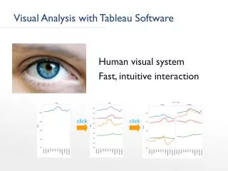
Why Can It Do? • Tableau’s new forecasting functionality creates estimations of future values of a measure based on historical values. • The user can • Identify the timeframe over which to forecast • Identify the granularity of the forecast • Adjust the forecast model to ignore seasonality/trends • Easily report on forecast accuracy and quality • Describe the forecast model with quality statistics • Resolve forecast errors
Requirements for a Successful Forecast • A forecast needs two basic components: a measure, and a continuous date field. • A continuous date is one that has an infinite number of possible values. For example, the Order Date field in Superstore Sales has possible values from year to individual day • The measure must be a basic aggregation—forecasts can’t be calculated for table calculations • At least one complete cycle of the data that you want to forecast—for example, if you want to forecast data for one year, you need at least one year—preferably two or more—of data
How to Create the Forecast • Creating a forecast is as simple as right-clicking on the visualization. • In our example, we’ll use month of Order Date and sum of Sales, as these are the same that Tableau uses in their example • Right-click and drag Order Date from Dimensions to the Columns shelf, and select MY as the dimension level at which to aggregate • Confirm that it’s continuous by right-clicking the pill • Drag Sales from the Measures pane to the Rows column. (The visualization defaults to a blue line graph.) • Right-click in the visualization, and under the Forecast option, select Show Forecast. • (Output is on the next slide.)
What Is This Telling Us? • In order to understand what Tableau has estimated and why, we need to look at the Forecast Options, which accessible under the Forecast menu. • Tableau automatically selects a forecast period based on the highest dimension level of historical data, which, in this case, is the yearly level. • It’s easy to change the forecast period to a set number of years or a set point in the future. • The user also can select the date level at which to aggregate and opt to fill in miss values with zeroes.
Forecast Model • The forecast model is the method with which Tableau creates the forecast. • Tableau automatically selects the best model possible. Options include trend and seasonality, trend only, seasonality only, automatic without seasonality, and no trend or seasonality. • This functionality allows the user to select the model that they know is the best fit for their data.
Determining Quality and Applicability • Without understanding the context of the forecast, an estimate isn’t very useful. • Describing the forecast is another option under the Forecast menu, and it lists the components of the forecast, along with the time period, effect of the models used to compute it, and the quality of the forecast.
Describing the Forecast Model • The forecast model specifies which components (level, trend, or season) are relevant factors for the forecast, and each of those either has no impact or an additive impact, which means that the component contributes to the overall forecast. (Level is always additive.) • The model description also includes quality metrics and smoothing coefficients, the latter of which
How Do We Know How Good the Forecast is? • Caveats for the analyst: • Tableau doesn’t know how inherently predictable, or normal, your data is. • Forecast values will not all be equally probable • Quality (closer to 100 is better) and precision (in this case, in currency and percent) can be added to the tooltip—or into a dual axis chart—by dragging the measure to the Level of Details shelf and then right-clicking to identify which forecast value to show. • The forecast will only ever be as good as your data, and the more you have of it, the better the forecast should be. • The forecast can’t account for external influences on your data, though, but you can factor those into your historical data to build more complex forecasting models. • For more information on forecasting, check out • http://beta.tableausoftware.com/qsg/forecasting.pdf (username: v8beta password: kraken • http://beta.tableausoftware.com/videos/Forecasting/Forecasting_Tableau_8_Beta.html (use the username and password above) • http://onlinehelp.tableausoftware.com/v8.0/pro/online/en-us/help.html#forecasting.html