Download

1 / 10
100 likes | 168 Views
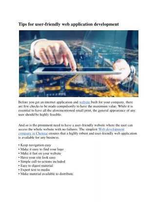
Cubet's services are backed by developers with more than 5 years experience to give you the best user-friendly UI/UX design standards. We are also past the stage where simply having a website is already an ingredient to e-commerce success. For any queries visit us at http://cubettech.com/service/uiux-design-services/ or Call us at 44 2071938618.

E N D
MAKE NAVIGATION EASY 1. Menus should be simple and easy to understand. The primary menu on any website should be prominent and allow visitors to quickly find the information they are looking for 2. This means avoiding weird labels for pages and limiting the number of submenu levels. At the very least, the most important pages should be at the top menu level. 3.Including a search bar in the navigation menu also makes the website more user-friendly because it allows any visitor to search for information on the fly.
ENSURE THE TEXT IS LEGIBLE 1. Another key factor for user-friendly websites is readable text. Numerous studies have shown that most people don’t actually read websites, they scan the content. 2. Because of this, you have to pay special attention to the fonts and ensure the text can be read even on smaller screens without any issues. 3. Avoid using script and calligraphy fonts or fonts that use a lot of special characters as they are generally harder to read.
BUILD WITH MOBILE IN MIND 1. More and more people are using their smartphones and tablets to consume the online content. 2. Having a responsive website that works on mobile devices just as well as on desktop computers is crucial for the end user. 3. However, a responsive design is just one piece of a puzzle. 4.In order for the website to be mobile-friendly, ensure that the buttons do not appear too small on mobile devices, that the form fields can easily be filled out, and that forms trigger the correct keyboard.
OPTIMIZE LOADING TIMES 1. Consider optimizing images for the web and reducing the number of multimedia items to an absolute minimum. 2. Combine and minify the stylesheets and script files and move the render-blocking elements to the footer of your website. 3. You can also use a CDN service to host those files along with images and videos instead of serving them from your client’s website.
PROVIDE FEEDBACK 1. Almost every website uses forms, call-to-action buttons, and buttons that allow visitors to either share their post, submit a comment or download a resource. 2. However, it’s common to make a mistake when filling out a form. Without an error message indicating what went wrong, users won’t know where they made a mistake and it’s more likely they will get frustrated and leave. 3. Similarly, some users are extremely cautious when downloading files from the web, not to mention users who rely on screen-reader software. 4. Provide an explanation of what type of file it is or what will happen once they click on the link.
BE CONSISTENT WITH THE COLOR SCHEME 1. Color plays an important element in any design. 2. When it comes to websites, you should choose between 2 and 5 colors that work well together and use them consistently throughout the website. 3. Doing this will allow your client’s brand to remain consistent and make it easier for you to update the colors if your client decides to rebrand later on. 4. It will also help website visitors to associate colors with certain actions on the website.
SIMPLIFY THE CONVERSION PROCESS 1. Understanding the primary goal of a website is crucial before starting the design process. 2. Whether your client wants to book more clients of their own, land a speaking gig, grow their email list or sell more products, the end goal always boils down to conversion. 3. As such, make sure the conversion process is as simple as possible. 4. Don’t design forms that ask for more information than necessary. 5. An email sign up form rarely requires more than an email and a name field while the forms on the checkout pages rarely require a user’s SSN.
ENSURE CTAS STAND OUT 1. Almost every website uses a call to action of some sort. 2. Ensure those buttons stand out from the background and are large enough to grab attention. 3. While it’s been proven that red buttons tend to convert better than green ones, that doesn’t mean red is always the perfect choice. 4. Keep in mind the chosen color scheme and use a bolder color from it as the background color for call-to-action buttons.
Contact Us: Website: http://www.cubettech.com Email: info@cubettech.com