Download
1 / 7
70 likes | 92 Views
A web header is the first thing audiences see when they click on a site, appearing on every page. A fantastic website header, with the help of a web development company, offsets uncluttered design and crystal-clear navigation to the internal pages of a portal. As such, it's essential to focus on the best methods to create a website header for your clients that helps their customers quickly get the information they need. To assist you in making great titles for your portals, we have provided you with a few factors or tips to consider.

E N D
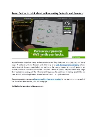
Seven factors to think about while creating fantastic web headers. A web header is the first thing audiences see when they click on a site, appearing on every page. A fantastic website header, with the help of a web development company, offsets uncluttered design and crystal-clear navigation to the internal pages of a portal. As such, it's essential to focus on the best methods to create a website header for your clients that helps their customers quickly get the information they need. To assist you in making great titles for your portals, we have provided you with a few factors or tips to consider. Coweso provides premium eCommerce Development services to companies of every walk of life. For more information, visit our webpage. Highlight the Most Crucial Components
One of the primary components to consider is to think of the first activity you want your site audience to perform and ensure that this activity or component is clearly displayed in the upper portion. For instance, one can have a 'Buy Now icon for an eCommerce site or a 'Book a Table' icon for portals related to restaurants. Typically, headers constitute details that make it straightforward for the audience to interact with the portal, including the following: Company logo: This feature will provide a boost to your brand at all times. Therefore, it is essential to put your logo on the header. Navigation URLs: This attribute enables customers to navigate around your web page with control easily. In addition, this feature also provides a stable base for users to return to in order to do such a movement. Contact Details: When you integrate this feature, users won't be forced to go around the portal to find ways to get in touch. This step also helps boost conversions and overall customer satisfaction. Call to Action (Call Now, Donate, Buy Now): This button will ultimately encourage browsers to use you and increase conversions on your platform. For more information, contact Coweso – Brisbane's leading web development company. Shopping Cart: This button will ease the process of reaching the checkout and thus improve conversions and welcome more transactions on your site. Tagline: You can reinforce your brand values with this content. Multi-language Toggle: Allows users to switch languages seamlessly for the best customer experience.
Social Media Icons: Boost your follower count and get engagement by providing effortless access to social channels. Consider which of the above are most important for your portal, and emphasise them. Ensure Using Spacious & Readable Fonts You must ensure that the user visiting your web page can read the content in the upper portion without difficulty. Try to use words that are short and select fonts that are clear and in relatively extensive font size. Most designers don't typically use stylised fonts in headers, as these can be challenging to read. You must be able to read the headings at a glance. Therefore, use readable, spacious, and clear fonts. Try Transparent Headers if the Site Has Beautiful Images
Another suggestion is to use a transparent upper portion with the help of a web development company in Sydney if the portal contains impressive images. Applying this technique provides optimal image exposure while displaying crucial links. If you've utilised a sticky header, it can be distracting to have it transparent on scroll because the header background also moves with the movement of the images. You can integrate colour in the background to bypass this issue and prevent the scrolling images from being a source of distraction from the links for the customers. Make the Crucial Details Visible by Using a Shrinking Header The shrinking header is one of the fantastic methods of reducing the amount of space taken by the upper portion when users scroll on the page without losing any key site details. This feature is especially useful if you've created a really large and impressive title bar. The shrinking header can display the logo, introductory navigation components, and the logo, apart from changing colour while a user is scrolling. Put the Shopping Icon on Top in Case of an Ecommerce Site
Another tip is to put a shopping cart icon in the header if you are running an eCommerce portal. This feature helps the visitors on the site to effortlessly complete their buying process in one click, irrespective of their location on the portal. This process will significantly reduce the number of abandoned carts as customers will always be only a single step away from buying your offerings. You can also include a hover function to the cart so consumers can also check what's in their basket without clicking on it. You can contact a website development company like Coweso for further clarity. Help Visitors Navigating the Complex Interface by Using Effects Another crucial tip is integrating hovering features or selected effects in your website's upper part. The attributes mentioned above are essential components in helping users while they are navigating your platform. It would help if you chose effects that are displayed in a manner to entice the customers. However, there must be a delicate balance, and they should not distract the audience from their objective. It is pertinent to note that you can witness some effects only on a desktop. Therefore, ensuring the selection of the impact that will also appear on mobile gadgets, such as underlining or colour change. Optimise your Logo by Selecting an Appropriate Upper Format
The headers are one of the first things the traffic coming to a website see. Therefore, one must ensure to display their company logo in this space prominently. You must select a layout for the upper part while creating a website that properly complements the logo style & shape. Practically, you can adorn the middle portion with round and square logos. If you wish to place your logo on the right or left side, it will be better to use the rectangular option by consulting with a web development company in Australia. Coweso offers top-class IT consultancy services at economical rates. If you are looking for such benefits, visit us on our home page. Utilise Elements in Design that Represents the Organisation's Identity Another crucial factor to consider is to provide an outlet to express your organisation's identity by using classy effects & colours. For instance, you can integrate a floating effect if the representative brand is light-hearted. Such an effect can be experienced by users while
going over the navigation, thereby intimating them of the personality. However, only some companies can use the abovementioned floating effect. It would not be ideal for persons like real estate dealers & lawyers who offer professional facilities.