Download
1 / 3
30 likes | 139 Views
Fast Food Logo Psychology. Technological Design. What do thee logos have in common?. Explanation.

E N D
Fast Food Logo Psychology Technological Design
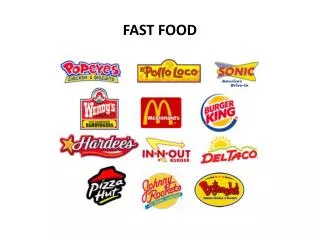
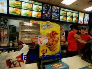
Explanation Drive down any street in America and you’re likely to see a similar scene. Whether it’s McDonald’s golden arches, Burger King’s bun halves, or the Hardee’s star, fast food logos all have one element in common– color. Take a look around and you’ll see that most fast food logos contain one or more of the following colors– red, yellow, orange, or green; particularly the former two. That’s because, according to the color theory, these colors are known to subconsciously trigger hunger and/or induce excitement. These colors encourage guests to spend more and leave quickly– which is exactly what fast food restaurants want you to do. Just how accurate is this theory? Research has shown that people eat more in a room with warm color surroundings as opposed to consuming food in a room painted in cold colors such as blue, black, or purple. As a matter of fact, studies have shown that these colors actually suppress appetite because they are associated with foods that may have become spoiled or foods that may be toxic.