Mastering Data Visualization Techniques
Learn how to create effective visual representations of data using bar graphs, circle graphs, line graphs, picto graphs, and dot plots. Understand the importance of clear titles, labels, and consistency in design for better data interpretation. This overview covers basic principles and best practices for creating visually appealing and informative graphs.

Mastering Data Visualization Techniques
E N D
Presentation Transcript
BASIC GRAPHS VISUAL REPRESENTATIONS OF DATA
OVERVIEW • Information can be represented quickly and efficiently • Information can be presented more attractively • Keep it simple and understandable • Viewers will look for apprx 7 seconds! • It starts with a TITLE newborns get a name right away! • It ends with ANALYSIS look for highs/lows/trends and then ask WHY? Why did we get what we got?
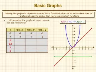
BAR GRAPHS • Allow viewer to see differences in data easily • Good tool for comparing several subjects • Categorical Data on the horizontal axis • Bars can go vertical or horizontal • Title! And Label the horizontal/vertical axes • Keep the increments (steps) the same • Keep the bars the same width
BAR GRAPHS cont. • Can have double bar graphs… use a key then • Can jump once…one time mulligan, squiggle • ?does this zoom in for sharper comparisons or does it deceptively exaggerate the differences? • Option: put exact number inside the bar, but NOT on top of bar • Pareto charts = vertical bar graphs arranged tall to small
CIRCLE (PIE) GRAPHS • Another popular method for visually representing data • Good tool for comparing parts of a whole…percentages of 100% • Begins with a circle or disc divided into slices/ sectors • Put # or % inside the sector…or use artistic abilities with a key • Pieces of the pie cannot overlap…data in just one sector • total cannot > 100% can use “other section”
LINE GRAPHS • Another fine tool, especially for showing change • Good when same subject is tracked repeatedly • Put a TITLE on and Label the horizontal/vertical axes • Keep the steps (strides) congruent • Put a dot as high as the data should go • Connect the dots from left to right with a straightedge
LINE GRAPHS cont. • Can have double (or multiple) lines… make a key for dashed, dotted, solid, zig zag lines etc, or colors • Can use the squiggle but only at the start, near the origin NOT in the middle of an axis • Time Plots are special line graphs involving, you guessed it, time (normally on the x axis) • Helpful in noting trends
PICTO GRAPHS • Rare, but cute • Uses repeated symbols • Full symbol = amount set in your key • Partial symbols < amount in your key • Title/ axes labeled/ can go vert or horiz • Maintain same sized symbols and same spacing! • Keep it simple, art majors
DOT PLOTS • Newer graphs, but not that modern • Similar to vertical bar graph, but uses dots to build upward • Good tool for analysis… center/shape/spread/outliers