Download

1 / 25
250 likes | 424 Views
Everyone can read a histogram, or can they?. Jennifer J. Kaplan, UGA Journal of Statistics Education (JSE) webinar 16 September 2014. Joint work with: John Gabrosek, GVSU, Phyllis Curtiss, GVSU, Chris Malone, WSU.

E N D
Everyone can read a histogram, or can they? Jennifer J. Kaplan, UGA Journal of Statistics Education (JSE) webinar 16 September 2014 Joint work with: John Gabrosek, GVSU, Phyllis Curtiss, GVSU, Chris Malone, WSU
The histogram below shows the distribution of yearly income in dollars for a random sample of 356 adults living in Atlanta, GA.
The histogram below shows the distribution of yearly income in dollars for a random sample of 356 adults living in Atlanta, GA. • What is the purpose of histograms? • What makes a good, complete description of this display?
Common Misconceptions about Histograms • Not distinguishing between a bar chart and a histogram, and why this distinction is important. • Confusing the frequency (y-axis) information with the data values (x-axis). • Thinking that a flatter histogram equates to less variability in the data. • Viewing a histogram as a time plot believing (incorrectly) that values on the left side of the graph took place earlier in time.
Misconception 1: Students don’t understand the distinction between a bar chart and a histogram, and why this distinction is important. Can the median of the data be found?
Misconception 1: Students don’t understand the distinction between a bar chart and a histogram, and why this distinction is important. The following graph shows the birthplace of students in a large introductory statistics course. Circle the letter of your choice.
A. Which of the following graphs gives the best display of the distribution of number of medals won in that it allows the sports fan to describe the shape, center and spread of the variable, the number of medals won by countries that won at least one medal? B. C. D. Which graph is a histogram?
A. Which of the following graphs gives the best display of the distribution of number of medals won in that it allows the sports fan to describe the shape, center and spread of the variable, the number of medals won by countries that won at least one medal? B. C. D.
Misconception 2: Students use the frequency (y axis) instead of the data values (x axis) when reporting on the center of the distribution and the modal group of values. Find the Median SAT score. Which group has the larger mode?
Misconception 2: Students use the frequency (y axis) instead of the data values (x axis) when reporting on the center of the distribution and the modal group of values. Find the Median SAT score. ~ 75% correct Which group has the larger mode?
Misconception 3: Students believe that a flatter histogram exhibits less variability than bumpy histograms. Which data set has the least variability?
Misconception 3: Students believe that a flatter histogram exhibits less variability than bumpy histograms. Which data set has the least variability?
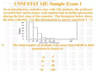
Misconception 4: For data that has an implied (though not collected) time component, students read the histogram as a time plot believing (incorrectly) that values on the left side of the graph took place earlier in time. Are there three times during the semester in which students spend a lot of money?
Misconception 4: For data that has an implied (though not collected) time component, students read the histogram as a time plot believing (incorrectly) that values on the left side of the graph took place earlier in time. There appears to be three times during the semester (beginning/middle/end) in which students spend a lot of money on printing at this college.
Common Misconceptions about Histograms • Not distinguishing between a bar chart and a histogram, and why this distinction is important. • Confusing the frequency (y-axis) information with the data values (x-axis). • Thinking that a flatter histogram equates to less variability in the data. • Viewing a histogram as a time plot believing (incorrectly) that values on the left side of the graph took place earlier in time.
The histogram below shows the distribution of yearly income in dollars for a random sample of 356 adults living in Atlanta, GA. • What is the purpose of histograms? • What makes a good, complete description of this display?
The histogram below shows the distribution of yearly income in dollars for a random sample of 356 adults living in Atlanta, GA. • What is the purpose of histograms? • What makes a good, complete description of this display?
The histogram below shows the distribution of yearly income in dollars for a random sample of 356 adults living in Atlanta, GA. • What is the purpose of histograms? • What makes a good, complete description of this display?
The histogram below shows the distribution of yearly income in dollars for a random sample of 356 adults living in Atlanta, GA. Shape, Center, Variability in Context.
Student Descriptions of Histograms Pre-Instruction vs. Post Instruction: • Three Prompts: • Describe as completely as possible the distribution shown in the histogram, being sure to explain what the graph tells you about yearly income for adults in Atlanta. • Describe as completely as possible what the graph tells you about yearly income for adults in Atlanta. • Describe as completely as possible the distribution shown in the histogram.
Student Descriptions of Histograms Pre-Instruction vs. Post Instruction: “College students tend to get 6 to 8 hours of sleep at night.” “The graph is unimodal and symmetric with median 7.”
Student Descriptions of Histograms • Three Prompts: • Describe as completely as possible the distribution shown in the histogram, being sure to explain what the graph tells you about yearly income for adults in Atlanta. • Describe as completely as possible what the graph tells you about yearly income for adults in Atlanta. • Describe as completely as possible the distribution shown in the histogram.
Student Descriptions of Histograms • Three Prompts: • Describe as completely as possible the distribution shown in the histogram, being sure to explain what the graph tells you about yearly income for adults in Atlanta. • Describe as completely as possible what the graph tells you about yearly income for adults in Atlanta. • Describe as completely as possible the distribution shown in the histogram. More likely to have context. “The graph is right skewed.”
Thank You! for your attention Research funded in part by NSF DUE 1322962 Questions? Kaplan, J.J., Gabrosek, J.G., Curtiss, P. & Malone, C. (2014). Investigating student understanding of histograms. Journal of Statistics Education, 22(2). http://www.amstat.org/publications/jse/v22n2/kaplan.pdf