Download
1 / 4
40 likes | 186 Views
We will explore some transformations which are useful to everyone who deals with HTML.

E N D
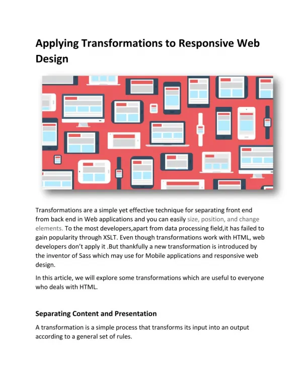
Applying Transformations to Responsive Web Design Transformations are a simple yet effective technique for separating front end from back end in Web applications and you can easily size, position, and change elements. To the most developers,apart from data processing field,it has failed to gain popularity through XSLT. Even though transformations work with HTML, web developers don’t apply it .But thankfully a new transformation is introduced by the inventor of Sass which may use for Mobile applications and responsive web design. In this article, we will explore some transformations which are useful to everyone who deals with HTML. Separating Content and Presentation A transformation is a simple process that transforms its input into an output according to a general set of rules.
The key thing is that it creates a separation between content and functionality from presentation. This separation is a design goal of many frameworks, but in a unique and effective way. The transformation data flow recast as a separation of concerns. An excellent example of this separation occurs in Enlive, Most templating engines use a customized markup language to mix HTML with programming constructs such as loops and variables. Take PHP, for example: <ul> <?phpforeach($task_listas$task){?> <li><?phpecho$task?></li> <?php}?> </ul> By contrast, Enlive templates use the same old HTML that you would get from your designer or PSD slicer. For example, a simple hello-world.html Enlive template might look like this:
<html> <body> <h1 id="output">Lorem Ipsum</h1> </body> </html> Instead of embedding logic in the markup, Clojure code that is associated with the HTML transforms it into output: (deftemplatehelloworld "hello-world.html" [] [:h1#output] (content "Hello World!")) Though the code above is not important, but you’ll probably recognize the h1#output argument as a CSS selector. In this example, a template named helloworld is being defined, in which the h1#output element’s content is replaced by “Hello World!” When executed, this template would output the following: <html> <body> <h1 id="output">Hello World</h1> </body>
</html> In this way you can build a web page without a Style Sheet, but only a developer knows that a style sheet improves workflow and productivity at scale.But with transformation, you can operate the visual design independently of the rest of the system and because in IT industry a simple thing like color, typography, style can affect conversation rates. It can changes presentation across multiple screen sizes. It also provide an effective way to make a website design responsive without the expense of rebuilding it.Hopefully the article exposed the power of thinking in transformations iMediadesigns provide cost effective web design and development solutions and offers custom web design services in Toronto


