Exploring GLOBE Data Visualization: A Comprehensive Guide
This tutorial provides an in-depth walkthrough of the GLOBE Visualization System. Users will learn how to access the GLOBE data, visualize various datasets such as Air Temperature, and utilize the mapping features to analyze data over the desired date range. Discover how to refine searches using filters, add additional data layers, and explore site information. This guide is instrumental for researchers and educators who want to leverage GLOBE's extensive datasets for scientific investigation and educational use.

Exploring GLOBE Data Visualization: A Comprehensive Guide
E N D
Presentation Transcript
Hold the mouse over the Explore Science menu, then click on Visualize and Retrieve Data.
Click on Visualize and Retrieve GLOBE Data or click on the map under GLOBE Data
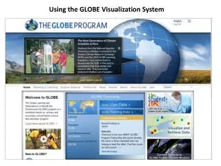
This is the GLOBE Visualization Landing Page. Read the Welcome box and then close it. The button on the upper right links to this tutorial.
Overview of the Visualization Window Features Map Type Help, Google Earth, Current Location Indicator Map Date Base Layer Controls Layers Controls Filters Controls Data Site Icons Multi-Site Plot Controls Movement Controls Legend Cursor Lat/Long
Click on Data Counts. The Data Counts view helps identify sites with larger datasets for a given data type.
To see some data, click on Add+next to Data Layers. Select the data type you wish to see from the drop down menu.
For this tutorial select Air Temperature Dailies from the drop down, click on the radio button next to Maximum Daily Temperature,and then click on the Add Layer button.
The new layer will be added to the map. By default, the Map Date Range isset to the entire history of GLOBE.
When the pop-out menus cover some of the data, they can be minimized and maximized by clicking on their tabs.
You can control how much of the world map is visible using the movement controls or your mouse. With the mouse, click and drag in any direction to move the map, double click to zoom in one unit on the cursor location, or use the mouse scroll wheel to zoom in and out.
Narrowing the Map Date Range to the past 10 years and zooming in shows the spread of GLOBE measurements and where there are sites with larger datasets. These sites offer better possibilities for study in research projects.
Clicking on an icon on the map opens a site info window. Since the map type is Data Counts, that is the default selection. A plot of the selected data type is displayed showing data counts for the last 5 years for the selected site. You can also select total years or a custom date range. range
Data Counts Site Info Window: This site info window gives information about the site and is the gateway to creating tables and plots of site data. Click icon to go to school organization page Cycle through sites whose icons are on top of each other Data Type and (total # of measurements) Roll-over bar graph to see the total # of measurements for each interval Datasets (select a dataset to change the plot view ) Change plot time range
Additional data layers can be added to find locations with multiple types of data. Using layers and the filter tool you can find a data set to meet just about any investigation need.
Now, let’s focus on measurements data. Zoom out and click on the Map Type Measurements. Now the map shows actual values of maximum air temperature for the current day. Change the date to April 3, 2013.
The box at the bottom right shows the legend for the data layer – the colors in the scale correspond to the possible data values for that data type. Each data layer has its own unique icon.
The Filters box is where you refine which data are shown on the map. Click on Filters on the left. You can limit the map to display only data at a specific location (such as a country) or at a specific elevation range.
Using the Filters tool, let’s select ‘Places’ in the Location/Site filter and then enter in Spain. The map will zoom into the selected place and only display sites in the location
You can also filter data sites using the ‘Drawing on Map’ option. This allows you to select sites by drawing a polygon around the sites you want to isolate. Click on the ‘hand’ icon to exit the tool.
Let’s search for a particular school in Spain. Type in ‘Cardenal‘ in the school name field. The system should auto-complete to show a list of schools that have that name in the title. Select ‘IEC Cardenal Pardo Tavera’.
Note how the site icon is a small red dot. This indicates no data from the added data layers was entered on the current map date
Let’s search for another school. Type in ‘Itaca‘ in the school name field and then Select ‘IEC Itaca’.
The first site found at IES Itaca is displayed and is now pointing at a Max Daily Temperature icon. Measurements were recorded within the 30 day time frame so the plot has data. You can also search by site or teacher. Let’s now examine the measurement data at this site.
Measurements Site Info Window: The measurements tab allows you to get your data in numerous ways Click this icon to view the plot data in a table Click this icon to view data tables for all of your data Click this icon to add the site to a multi-site time series plot Data at this site can be found in this date range Roll-over a plot point to see measurement value and date Measurement info for the selected data type Click the zoom icon for a larger plot view Change plot time range
You can also look at any measurement data at this site by selecting a data type in the drop menu.
Click on the table icon next to the Atmosphere title. You can either view data tables for the selected data type (Air Temperature Dailies) or all of your Atmosphere data. Select Air Temperature Dailies.
Note that this table gives values for local solar noon and minimum and maximum daily temperature. Clicking the button at the bottom will export the data in comma delimited format. Close this window.
Next, check the button to see all of the atmosphere data in a table view.
Now, all of your data is displayed in the table. If you right click any column header, a window will open to allow you to filter the data columns.
To compare this site data to other sites, you can add the site to a multi-site time series plot by clicking on this button. Keep the plot range at 30 days and then select the button
The site is added to the Multi-Site Plots list with the date range from the site plot pre-selected. You can change the dates by clicking on the date fields or by using the slider.
Now let’s select another site. Close the IES Itaca site info window and then select one of the sites in France. Again click on the icon to add the site to the multi-site time series plot.
The second site is now added. Now click on the ‘Plot All’ button to view the time series plot.
Here is the result. A maximum of 6 datasets can be added to the plot listand the maximum plot date range recommended is 5 years. Clicking the print button will print out a copy of this graph.
If you check the Use Auto Y-axis box, the software adjusts the y-axes individually to spread the data vertically on the graph. With two datasets with the same units, the result can be misleading. Click the ‘View Plot Data’ to view the data in a table.
Another way to output data is to view all data of a layer in a table. To do so, click on the layer name – A selection pop-up box appears. Click on View Layer Table. In this example we used the location filter to just show U.S. sites.Note – data can also be downloaded to a .kmz file
The sites in the U.S. for the layer and measurement date selected are listed in the table and can be sorted by any field name (School Name, Site Name, etc.) and can be exported to a .csv file.
Let’s take a look at Land Cover Classification. Add the Land Cover Classification Layer. This map represents the entire history of GLOBE as land cover classification generally changes slowly. In this case, we are not describing the situation for a day or a week but building up of a global map. Turn off the Daily Temperature layer
Now, click on an icon. If the site has photos, scroll down to view the available photos. Click on a photo to see a larger view.
Layer Stacking/ Ordering – Add four Cloud Observation Layers – Cirrus Stratus, Alto Stratus, Stratus and Nimbo Stratus. Change the map date to Dec. 3rd 2010.
Cloud Observations and other measurement types (Soil Properties, etc.) utilizes different layer sizes and colors so one can see up to 5 layers at a single site. Since different Cloud Observations can be made at the same site on the same day, layer icons can be hidden.
To re-order a layer, click and hold the small dots next to the add button. Now drag the layer to the new position
It’s also important to realize that site icons may be hidden under other icons. If you are not seeing the correct site info window when you click on a site, try zooming in to make sure your site is not hidden. How many sites are in the square below?
From the LayersPop-Up box, contours of some data sets may be shown by clicking the Contours box. The contour opacity can be adjusted by clicking on the opacity link.
Your Assignment • On April 7, 2004, how many schools in the Czech Republic reported a water pH reading less then 5? • Which measurement technique did the school(s) use? • What was the range of pH values reported for this site in 2003 and 2004? • Pick one Czech school with a pH value less than 5 and another nearby school reporting water pH on April 7, 2004 and plot the data from the two schools for January to May 2004. What does the graph illustrate? • Which school in Poland has reported the most water pH data? • Plot water pH, conductivity, and alkalinity for this site for January to May 2004. What does this graph illustrate?
Answers • One (Filtered by Czech Republic using the place filter and date and then used the ‘View Table Layer’ tool). • Paper (Clicked on the site on the map, it’s the lightest color icon. Value found in site info window). • 3 – 6 pH units in 2003, 3-6.5 in 2004 (Selected pH and added site to Site Data Table and selected Data Date Range from Jan-Dec 2003 and then for 2004). • The pH level for the school with the higher pH lever on April 7th on was consistently higher from Jan to May • XI Liceum St. Konarskiego in Wrocław (Filtered by Poland, switched to Data Counts map. It has the largest circle) • The pH remains fairly constant despite significant changes in alkalinity and conductivity (Added each dataset to the plot list by selecting each one in the site info window)