Download

1 / 6
60 likes | 73 Views
Responsive web design is crucial for your Elementor website's success. It ensures that your website looks great and functions properly on any device, provides a better user experience, and can even improve your SEO. By following the steps outlined in this article, you can create a responsive Elementor website that outranks your competitors and provides an excellent user experience for your visitors.

E N D
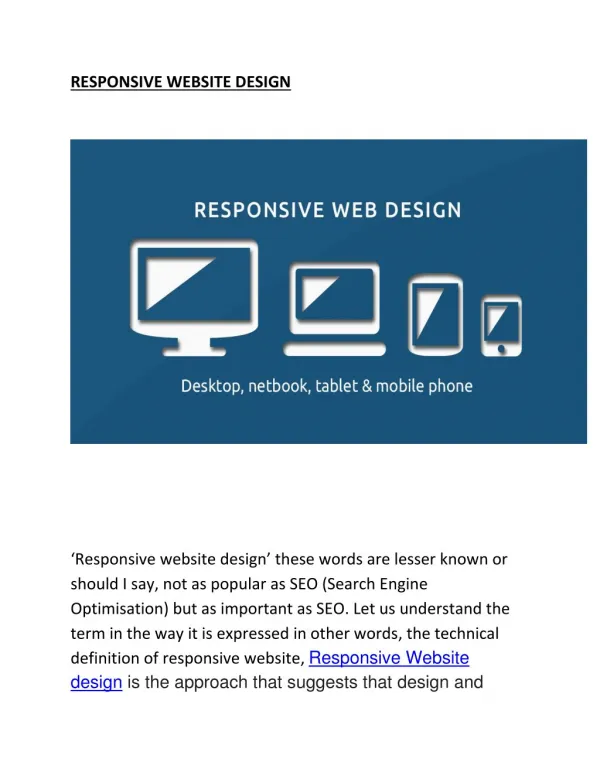
The Importance of Responsive Web Design for Your Elementor Website Do you remember the last time you visited a website that didn't adjust to your device's screen size? You had to zoom in and out and scroll horizontally to read the content. It was frustrating, right? Well, that's why responsive web design
has become crucial for website owners, especially those who use Elementor. In this article, we'll discuss the importance of responsive web design for your Elementor website, and how it can impact your online presence. To put it briefly, responsive web design ensures that your website adjusts to the device's screen size, making it easier for users to navigate and access your content. It is even more crucial for Elementor website owners, as Elementor is a powerful website builder that allows you to create visually appealing and interactive web pages. However, without a responsive design, all your hard work could go in vain. If you're still not convinced about the significance of responsive web design for your Elementor website, then let us tell you that it can a?ect your online visibility, user experience, and ultimately, your business's success. So, it's essential to prioritize this aspect of your website's design and development. But, how can you make your Elementor website responsive? What are the best practices to follow? Don't worry, we've got you covered. In this article, we'll share some valuable tips and tricks that will help you create a responsive website that not only looks great but also provides an excellent user experience. So, without further ado, let's dive into the world of responsive web design for your Elementor website and make sure that your visitors never have to struggle to access your content again! What is Responsive Web Design? Responsive web design is a design technique that ensures a website can adapt to the device it's being viewed on. This means that the website's layout, images, and content will adjust automatically based on the screen size and resolution of the device being used to view it. Responsive design eliminates the need for a separate mobile version of your website. Instead, your website will have one design that works seamlessly across all devices. This not only saves you time and money but also provides a better user experience for your visitors.
Why Responsive Web Design is Important for Your Elementor Website There are several reasons why responsive web design is important for your Elementor website. Here are a few: 1. Mobile Usage is on the Rise As mentioned earlier, mobile usage is on the rise. Mobile devices account for over half of all internet usage worldwide. This means that if your website is not optimized for mobile devices, you are missing out on a significant portion of your potential audience. 2. Improved User Experience Responsive web design provides a better user experience for your visitors. A website that is not optimized for mobile devices can be di?cult to navigate and read on a small screen. This can lead to frustration and a high bounce rate. A responsive website, on the other hand, is easy to navigate and read on any device. This provides a better user experience, which can lead to increased engagement and conversions. 3. Better SEO Google has stated that responsive web design is its recommended design pattern. This is because a responsive website provides a better user experience and is easier for Google to crawl and index. This can lead to better search engine rankings and more organic tra?c to your website. 4. Cost-E?ective Responsive web design is a cost-e?ective solution for your Elementor website. Instead of having to design and maintain separate versions of your website for desktop and mobile devices, you can have one design that works across all devices. This not only saves you time and money but also ensures that your website is always up-to-date and consistent across all devices.
How to Create a Responsive Elementor Website Now that you understand the importance of responsive web design for your Elementor website, let's discuss how to create a responsive website. 1. Use a Responsive Elementor Theme The first step to creating a responsive Elementor website is to use a responsive Elementor theme. There are several free and premium Elementor themes available that are optimized for mobile devices. Make sure to choose a theme that is responsive and looks great on all devices. 2. Optimize Your Images Images can significantly impact the load time of your website, especially on mobile devices. Make sure to optimize your images for the web by compressing them without losing quality. You can use a plugin like Smush to optimize your images automatically. 3. Use Responsive Elementor Widgets Elementor provides several responsive widgets that can adapt to di?erent screen sizes and resolutions. Make sure to use these widgets instead of static widgets that do not adjust to di?erent devices. 4. Test Your Website Once you have created a responsive Elementor website, it's crucial to test it on di?erent devices to ensure that it's functioning properly. You can use tools like Google's Mobile-Friendly Test and Responsinator to test your website on di?erent screen sizes and resolutions. 5. Stay Up-to-Date Finally, it's essential to stay up-to-date with the latest web design trends and technologies. As technology continues to evolve, so do the best practices for
web design. Make sure to keep your Elementor website updated with the latest versions and features. Conclusion In conclusion, responsive web design is crucial for your Elementor website's success. It ensures that your website looks great and functions properly on any device, provides a better user experience, and can even improve your SEO. By following the steps outlined in this article, you can create a responsive Elementor website that outranks your competitors and provides an excellent user experience for your visitors. FAQs What is Elementor? Elementor is a drag-and-drop page builder plugin for WordPress. It allows users to create custom web pages without having to write any code. Can I use Elementor with any WordPress theme? Yes, Elementor can be used with any WordPress theme. However, using a theme that is optimized for Elementor can provide a better user experience and more customization options. Do I need any coding experience to use Elementor? No, Elementor is designed for users of all skill levels. It has a simple, intuitive interface that allows users to create custom web pages without any coding experience. Can Elementor slow down my website?
Elementor can slow down your website if it's not optimized properly. However, by following best practices for web design and using optimization plugins, you can minimize the impact on your website's speed. Is responsive web design important for all websites? Yes, responsive web design is important for all websites. With mobile usage on the rise, your website must be optimized for mobile devices to provide the best user experience possible.