Download

1 / 39
390 likes | 466 Views
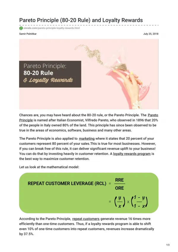
Learn how the Pareto Principle, or 80/20 rule, can be applied to identify and prioritize key issues for corrective action. Discover the significance of Pareto diagrams in focusing resources efficiently. Follow step-by-step instructions for constructing and interpreting Pareto diagrams to enhance operational improvements.

E N D
The Pareto Principle Vilfredo Pareto was an economist who is credited with establishing what is now widely known as the Pareto Principle or 80/20 rule. When he discovered the principle, it established that 80% of the land in Italy was owned by 20% of the population. Later, he discovered that the pareto principle was valid in other parts of his life, such as gardening: 80% of his garden peas were produced by 20% of the peapods.
The Pareto Principle Some Sample 80/20 Rule Applications • 80% of process defects arise from 20% of the process issues. • 20% of your sales force produces 80% of your company revenues. • 80% of delays in schedule arise from 20% of the possible causes of the delays. • 80% of customer complaints arise from 20% of your products or services.(The above examples are rough estimates.)
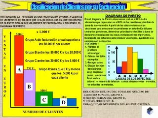
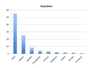
The Pareto Diagram • Graph that ranks data classifications in descending order from left to right • Pareto diagrams are used to identify the most important problems • Advantage: Provide a visual impact of those vital few characteristics that need attention • Resources are then directed to take the necessary corrective action
The Pareto Diagram • Helps a team focus on causes that have the greatest impact • Displays the relative importance of problems in a simple visual format • Helps prevent “shifting the problem” where the solution removes some causes but worsens others
Constructing a Pareto Diagram Steps: • Determine the method of classifying the data: by problem, cause, type of nonconformity, etc • Decide if dollars (best), weighted frequency, or frequency is to be used to rank the characteristics • Collect data for an appropriate time interval
Constructing a Pareto Diagram Steps cont’d: • Summarize the data and rank order categories from largest to smallest • Compute the cumulative percentage if it is to be used • Construct the diagram and find the vital few
Percent of components Number of defects Pareto diagram 50% reduction Pareto diagram can be used to identify the degree of severity of quality problems. To eliminate defects and improve the operation, this tool can help us to make decision that which problems should be solved first.
Before improvement After improvement Pareto diagram
Pareto diagram No. of accidents
Pareto diagram (Exp1) ในการศึกษาเพื่อปรับปรุงคุณภาพของคุณภาพวาล์วสำหรับโถส้วมแบบชักโครกของโรงงานแห่งหนึ่ง โดยพิจารณาจากสาเหตุที่ทำให้เกิดการซ่อมวาล์วได้ผลดังนี้ จากข้อมูลดังกล่าวจงใช้ Pareto diagram ทำการวิเคราะห์ข้อมูลเบื้องต้น
Questions • อธิบายข้อเหมือนและข้อแตกต่างของ Histogram และ Pareto diagram • เมื่อท่านอยู่ในสถานที่ปฏิบัติงานจริง (ในโรงงาน) กรณีใดที่ท่านควรเลือกใช้ Histogram หรือ Pareto diagram
The Box Plot(or Box-and-Whisker Plot) Box plot (กราฟแบบสี่เหลี่ยม) มีประโยชน์มากในการวิเคราะห์ข้อมูลเพราะBox plot สามารถบ่งบอกถึงค่าแนวโน้มสู่ศูนย์กลางของข้อมูล(ค่ามัธยฐาน) ความเบ้ของข้อมูลคุณสมบัติพิเศษของBox plot ที่เหนือกว่าHistogram และStem-and-leaf plotคือBox plotสามารถใช้วิเคราะห์ค่าข้อมูลที่สูงหรือต่ำผิดปกติ(Outlier)ได้
The Box Plot • การสร้าง Box plot • เรียงลำดับข้มูลจากน้อยไปมาก • หาค่า Q1เพื่อใช้เป็นค่าขอบล่าง(หรือขอบซ้าย) • หาค่า Q3เพื่อใช้เป็นค่าขอบบน (หรือขอบขวา) • ความยาวของBox จะอยู่ในช่วง Inter-quartile Range (IQR) • หาค่าQ2และทำเครื่องหมายของตำแหน่งQ2ไว้ในBox plot เพื่อใช้แสดงค่าแนวโน้มสู่ศูนย์กลางของข้อมูล • สร้าง upper whisker(หนวดด้านบน) โดยลากเส้นตรงต่อจากขอบบน ความยาวของเส้นตรงมีค่าเท่ากับ ค่าที่น้อยที่สุดระหว่างค่าที่มากที่สุดของข้อมูลกับค่า (Q3 + IQR) • สร้างLower whisker (หนวดด้านล่าง) โดยลากเส้นตรงต่อจากขอบบนความยาวของเส้นตรงมีค่าเท่ากับค่าที่มากที่สุดระหว่างค่าที่น้อยที่สุดของข้อมูลกับค่า(Q3 - IQR)
The Box Plot หาค่าขอบเขตล่าง(lower inner and outer fence) และบน(upper inner and outer fence) จาก lower inner fence (L1): Q1 - 1.5*IQRlower outer fence (L2): Q1 - 3*IQRupper inner fence (U1): Q3 + 1.5*IQRupper outer fence (U2): Q3 + 3*IQRข้อมูลที่อยู่ระหว่าง L1 และL2 หรือระหว่าง U1และU2 เรียกว่า mild outlierข้อมูลที่อยู่ระหว่างL1 และL2หรือระหว่างU1และU2เรียกว่าextreme outlier extreme outlier mild outlier U2 U1 L2 L1 Q2 Q1 Q3 * 1.5*IQR 1.5*IQR 1.5*IQR 1.5*IQR
The Box Plot (Exp3) จงใช้ Box plot เพื่อเปรียบเทียบค่าการกระจายของข้อมูลของความหนืดของสารผสม ชนิด (หน่วย: Centipoise) * กิตติ พลอยพานิชเจริญ, สถิติสำหรับงานวิศวกรรม,2540
The Box Plot (HW4) • The data set of N = 90 ordered observations as shown below • Find the dispersion of data using a box plot (i.e. calculate Q1, Q2, Q3, Outlier, find the skewness of the dispersion) • Compare the result obtained from (1) with histograms (find mean, SD, skewness of histograms) • 30, 171, 184, 201, 212, 250, 265, 270, 272, 289, 305, 306, 322, 322, 336, 346, 351, 370, 390, 404, 409, 411, 436, 437, 439, 441, 444, 448, 451, 453, 470, 480, 482, 487, 494, 495, 499, 503, 514, 521, 522, 527, 548, 550, 559, 560, 570, 572, 574, 578, 585, 592, 592, 607, 616, 618, 621, 629, 637, 638, 640, 656, 668, 707, 709, 719, 737, 739, 752, 758, 766, 792, 792, 794, 802, 818, 830, 832, 843, 858, 860, 869, 918, 925, 953, 991, 1000, 1005, 1068, 1441
Cause-and-Effect Diagram • It was developed by Dr. Kaoru Ishikawa in 1943 • Picture composed of lines and symbols designed to represent a meaningful relationship between an effect and its causes • Effect (characteristics that need improvement) on the right and causeson theleft
Cause-and-Effect Diagram • Enables a team to focus on the content of a problem, not on the history of the problem or differing personal interests of team members • Creates a snapshot of collective knowledge and consensus of a team; builds support for solutions • Focuses the team on causes, not symptoms • Used to investigate either a “bad” effect and to take action to correct the causes or a “good” effect and to learn those causes responsible
Cause-and-Effect Diagram Advantages: • Analyzing actual conditions for the purpose of product or service quality improvement • Elimination of conditions causing nonconforming product or service and customer complaints • Standardization of existing and proposed operations • Education and training in decision-making
Cause-and-Effect Diagram There are 3 types of C&E diagram • Dispersion Analysis (การวิเคราะห์การกระจายหรือความแปรผัน) • Cause Enumeration (การวิเคราะห์รายการสาเหตุ) • Process Classification (การจำแนกตามกระบวนการ)
Cause-and-Effect Diagram Steps in the construction of a Cause-and-Effect Diagram: • Identify the effect or quality problem • Determine the major causes • Determine all the minor causes. Request a brainstorming session • Once the diagram is complete, evaluate it to determine the most likely causes • Develop solutions
Cause-and-effect diagram Work methods(Man/Methods) Materials Quality characteristic(สิ่งที่ส่งผลกระทบต่อคุณภาพ และเป็นสิ่งที่ต้องการปรับปรุง) Equipment(Machine) Inspection(Measurement) cause effect
2.6 Size Worker Materials G axle bearing Inspection Tools Cause-and-effect diagram Wobble
Cause-and-effect diagram (dispersion analysis/ cause enumeration)
Cause-and-effect diagram (process classification) Cause-and-effect diagram shows that how scarring occurs during steel tubing process.
Cause-and-effect diagram Cause-and-effect diagram with possible causes Is the cause-and-effect diagram good enough for solving the problem? How can we profoundly analyze and quantify the relationship between causes and effects?
Cause-and-effect diagram Cause-and-effect diagram after further study
Scattering diagram The result of investigating the conveyer speed (cause) and the severed length (effect) as shown above
Scattering diagram B C A Matching game D E
Previous 6 QC tools Check sheet Histogram Pareto diagram Cause-and-effect diagram Scattering diagram Consolidate data, แสดงลักษณะภาพรวมของข้อมูลให้ชัดเจนและมีความหมายยิ่งขึ้น (เช่นรูปแบบการกระจายตัวของข้อมูล) Indicate problem areas, บ่งชี้ให้เห็นถึงลำดับความสำคัญของปัญหา Static form of presentation Show potential causes of defects affecting quality problem areas, แสดงให้เห็นถึงสาเหตุที่เป็นไปได้ของปัญหาที่มีผลต่อคุณภาพ แสดงข้อมูลในช่วงเวลาหนึ่งๆ ไม่แสดงการเปลี่ยนแปลงของค่ามูลตามช่วงเวลา หรือ ล๊อตการผลิต Show quantitative relationship between causes and defects, แสดงความสัมพันธ์ระหว่างตัวแปรที่เป็นสาเหตุและปัญหาที่มีผลต่อคุณภาพ
day Control Chart Static form Dynamic form
day Control Chart 3 3 Put the limit lines on the graph so that we can see if the data out of control or not!
ข้อมูลต่อเนื่อง เช่น หน่วยวัด ข้อมูลไม่ต่อเนื่อง เช่น จำนวนชิ้นส่วนที่เสีย จำนวนของที่เสีย สัดส่วนของเสียต่อล๊อต ข้อมูลไม่ต่อเนื่อง จำนวนรอยตำหนิ ข้อมูลไม่ต่อเนื่อง เช่น จำนวนชิ้นส่วนที่เสียหาย จำนวนรอยตำหนิต่อหน่วยชิ้นงาน Types of Control Chart