Download
1 / 15
150 likes | 244 Views
Learn how to interpret histograms, create frequency tables, and analyze data in equal intervals with practical examples like state elevations and employment sectors. Understand histogram vocabulary and how to read and construct histograms effectively.

E N D
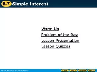
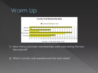
Warm Up How many Lostcreek memberships were sold during the four day period? Which country club experienced the best sales?
Histograms Section 13-5
Objectives Previously, you have already displayed data in a stem-and-leaf plot. (Lesson 13–2) • Today, we will display data in a histogram. • Also, we will interpret data in a histogram.
Vocabulary • histogram A histogram uses bars to display numerical data that have been organized into equal intervals
Parts of a Histogram Title Salary at the Acme Corporation y-axis units x-axis units
Interpreting a Histogram Read the ……… Title Units Number Values Intervals
Example 1 A. ELEVATIONS Use the histogram. How many states have highest points with elevations at least 3751 meters? Since 11 states have elevations in the 3751–5000 range and 1 state has an elevation in the 5001–6250 range, 11 + 1 or 12 states have highest points with elevations at least 3751 meters. Answer: 12 states
Answer: So, the percent of states with elevations above 2500 meters is or 30%. Example 1 B. ELEVATIONS Use the histogram. What percent of states contain elevations above 2500 meters? There are 22 + 13 + 3 + 11 + 1 or 50 states. There are 3 + 11 + 1 or 15 states that have elevations above 2500 meters.
Example 2 C. ELEVATIONS Use the histogram. How many states have highest points with elevations less than 2501 meters? A. 28 states B. 30 states C. 35 states D. 40 states
Example 2 D. ELEVATIONS Use the histogram. What percent of states contain elevations above 1250 meters? A. 50% B. 56% C. 60% D. 65%
Example 3 EMPLOYMENT Use the histograms. Which business sector has more states with the number of employees in the interval 1001 to 3000? The trade sector has 5 + 1 or 6 states and service sector has 8 + 3 or 11 states in the interval 1001 to 3000. Answer: So, the service sector has more.
Example 4 EATING OUT Use the histograms. Which coast has more people spending at least $60 weekly? East Coast West Coast C. Both have an equal number of people spending at least $60 weekly. D. cannot be determined
Great, we can read a histogram, but how do we create a histogram? • Histograms are bar graphs where the bars touch. • Histograms also measure frequency. • Therefore, we need to create a frequency table of the data. • We must also figure out what size to make the intervals. We should have at least 5 – 7 intervals.
Example-Test Scores on an 11th Grade Science Test • The test scores on an 11th grade science test: 58, 91, 78, 84, 93, 65, 73, 69, 77, 83, 80, 90, 85, 74, 61, 71, 83, 76, 63, 70 • Step 1: Find the range • 93-58=35 • Step 2: Determine the size of the intervals • 35÷7=5 (the intervals will 5 scores) • Step 3: Create a frequency table • Step 4: On the x-axis, space out your intervals; on the y-axis, put the frequency • Step 5: Label the axes • Step 6: Draw the graph
Here’s the Histogram Science Test Scores 4 3 2 1 0 F requency 58-62 63-67 68-72 73-77 78-82 83-87 88-93 Scores