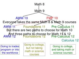
Analyzing Graphs: Understanding Scatterplots and Correlations
This lesson focuses on analyzing different types of graphs with an emphasis on scatterplots. Students will learn to identify and interpret scatterplots, understanding the relationships between two variables through positive, negative, and no correlation. Activities include estimating and plotting the ages of famous individuals based on provided images, constructing scatterplots to visualize data, and evaluating the accuracy of their predictions. By the end of the lesson, students will grasp how to read and create scatterplots effectively.

Analyzing Graphs: Understanding Scatterplots and Correlations
E N D
Presentation Transcript
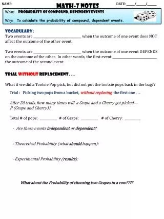
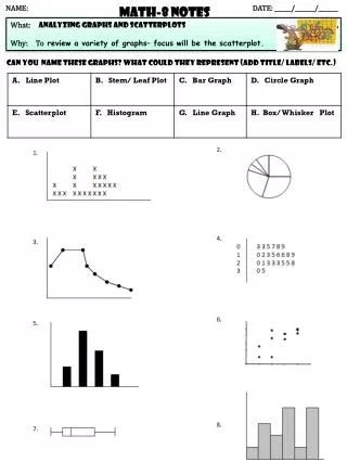
NAME: DATE: ______/_______/_______ Math-8 NOTES What: analyzing graphs and scatterplots Why: Toreview a variety of graphs– focus will be the scatterplot. Can you name these graphs? What could they represent (add title/ labels/ etc.)
Scatter Plots: A scatterplot is an “x” and “y” graph that is used to show the ________________ between two different things. Positive Correlation -- as x increases, y also ___________________________ . When this occurs, the points “scatter” in an _______________________________ direction from left to right. Negative Correlation -- as x increases, y _______________________________ . When this occurs, the points “scatter” in a ________________________________ direction from left to right. No Correlation – when there is no _______________________ between x and y. Line of Best Fit– straight line that best represents the __________ . All points do not have to fall perfectly on line. Also called a _______________ line. Positive Correlation Negative Correlation No Correlation
NAME:_____________________________________________________________________________NAME:_____________________________________________________________________________ DATE: ______/_______/_______ Math-8 classwork “scatterplots”
Name: “HOW OLD ARE THEY?”How good are you at estimating a famous person’s age? Task: You will be shown pictures of several famous people. As you see their picture, please record their name and your best estimate as to their age. If you do not know the famous person, take your best guess based on their photograph. ( Website ) Now, let’s graph the data on a scatterplot!
Use the below graph to construct a scatter plot using the data in the table. Use the • estimated age on the horizontal axis (“x”) and the actual age on the vertical axis (“y”). (HINT: There will be one point for each person) • 1. If your estimate was correct, what must be true about the x and y numbers? • Draw in the line that represents estimates that are 100% accurate (on the above graph). • How can you use the above line to interpret the accuracy of your estimates? • 4. In general, did you overestimate or underestimate? • 6. How can you tell this from your scatter plot? 60 50 40 30 20 18 16 14 12 10 10 12 14 16 18 20 30 40 50 60
NAME:_____________________________________________________________________________NAME:_____________________________________________________________________________ DATE: ______/_______/_______ Math-8 practice “scatterplots”