Download
1 / 8
80 likes | 161 Views
This information visualization project dives into Colorado job data to uncover trends in weekly wages, employee numbers, and business establishments in key industries from 2005 to 2011. With a focus on industries like hospitality, agriculture, education, and healthcare, the project aims to help potential job seekers identify employment hotspots within the state. Visualized using tools like Many Eyes and Google Motions, the project allows users to zoom, filter, and analyze trends for informed decision-making.

E N D
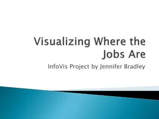
Visualizing Where the Jobs Are InfoVis Project by Jennifer Bradley
The Inspiration • It’s a question that’s pretty much been headlining the news, every other day, since the recession hit back in 2007, it’s a question that is often on the minds of new college grades: Where are all the jobs?
The Data • For my visualization project on job data, I wanted to work with information that I thought would matter, especially to me and those around me, so I specifically chose Colorado job data (the state where I’m from).
The Data • I browsed several through several public data websites to find the information I was looking for, and eventually settled on pulling data from the CMI Gateway (Colorado Department of Labor & Employment Information) • The data I selected ranged from 2011 (the most recent year available) to 2005 (a year before the earliest estimated start of the recession and covers every county in Colorado, though not every county had information for the selected categories.
The Data The data chosen for my project focuses on weekly wages, employee numbers, and business establishment numbers for the following major industries: • Accommodations & food service • Agriculture, hunting, fishing, forestry • Arts, entertainment, recreation • Construction • Education • Healthcare & social assistance • Manufacturing • Public Administration • Science & technical services • Transportation & warehousing
Visualizations • While the data is readable in chart form, the sheer amount of it would make it tedious for any user to browse through, and especially analyze for trends. • Though there were too many different data sets to use a cartogram visualization, my project is nevertheless designed with geo-location in mind, as each data-value is linked to a specific Colorado county.
Visualizations Snapshots • Both Many Eyes and Google Motions tools were used to create visuals that allow for: • zoom filters • trend analysis • Manipulation of the data into meaningful expressions
Impressions • My intentions for this project were to create sets of visualizations that allow for potential employment seekers to understand what might be potential hotspots within the state of Colorado for industry-specific jobs.