Download
1 / 4
40 likes | 55 Views
If you have a website, and itu2019s not designed to accommodate mobile traffic, youu2019re missing out on a massive amount of visitors. If they are unable to view your site because the navigation isnu2019t designed for touchscreens, or the content is simply difficult to read, they will bounce to another website leaving a potential sale in the dust. Contact an experienced Animink representative to get your responsive website design journey started today!<br>

E N D
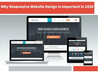
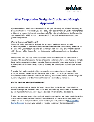
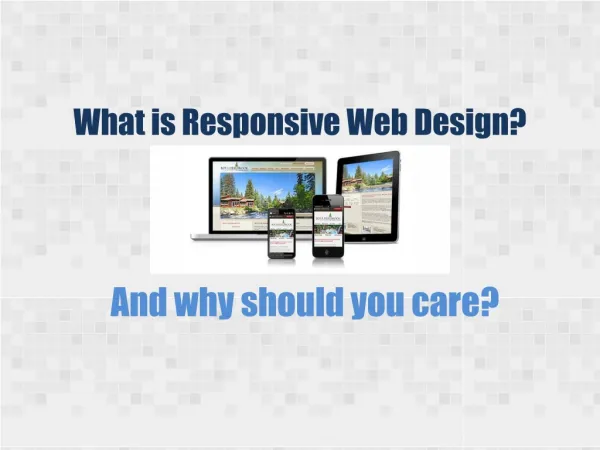
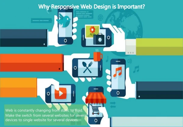
Why Responsive Design is Crucial and Google Approved If your website isn’t optimized for mobile device use, you are risking the potential of missing out a significant number of visitors to your site. Today, more people than ever use their smartphones and tablets to browse the internet. More than half of the internet traffic is generated from mobile devices as of 2021, which is a big increase from 2015, and only shows signs of continuing growth going forward. What is Responsive Web Design? Simply put, responsive website design is the process of building a website so that it automatically scales its elements and content to match the screen size it is being viewed on by the user. This type of design prevents text and images from appearing larger than the screen width, thereby making it easier for your visitors using mobile devices to view and read your content. Websites that have not been optimized to fit the needs of mobile users are often difficult to navigate. This can often result in the loss of potential customers who become frustrated trying to figure out how something works on your site. The primary goal of responsive website design is to avoid the unnecessary scrolling, zooming, panning, and resizing that frustrates your website visitors. A website that has been optimized to be responsive also replaces the previous need for additional websites built exclusively for mobile device users. You no longer need to create multiple websites to fit different screen sizes. You only need one responsive website design that automatically scales up or down to match the screen size it is being viewed on. Why Do You Need a Responsive Website? We may take the ability to browse the web on mobile devices for granted today, but only a decade or so ago that wasn’t the case. Back then, you were very likely to land on websites that cut out important information, or were just a zoomed-out version of the desktop site. The fact of the matter is that today, we live in a multi-screen society and desktop website design doesn’t transition seamlessly to mobile without assistance. You never know what device your visitors will use to view your website, so it’s vital that you seek professional Charlotte Web Design Services to ensure your website is viewable on as many devices as possible.
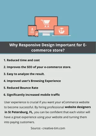
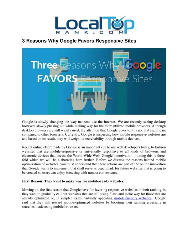
Additionally, Google announced in 2015 that mobile-friendliness would become a ranking factor in its search engine algorithms. This meant that websites not designed to be responsive to mobile users would lose ground in search result rankings because they couldn’t deliver a good user experience for mobile users. It is also a fact that Google prioritizes websites that use dynamic content, and has always been an advocate for responsive website design over fixed width ones. Just as a responsive website design makes things easier for you, it makes things easier for Google and other search engines as well. This is because Goolgebot crawls and indexes the content on your website in order to rank it. When there are multiple versions of your site, it takes numerous attempts to retrieve all of the information from each website. When you only have one responsive design, it is much easier for Google to keep your content indexed. More benefits of investing in a responsive website design: - Cost effective Trying to maintain separate sites for your desktop and mobile users can get quite expensive. With responsive website design, you eliminate the extra cost of paying for multiple website designs and maintenance. You only need to invest in one website that will appeal to all of your visitors on all devices. - Flexibility A responsive website design allows you to make changes to your site quickly and easily. There’s no longer a need to make changes to two or more sites. This offers a huge advantage when you need to tweak content or make changes on the fly because you only have to do it once. - Improved user experience A positive user experience is vital to the success of your website. When people get a good experience from your site they are much more likely to visit again. If your site isn’t easily viewable on a mobile device, or your content takes too long to load they most likely won’t return. Not only that, it can make your business look unprofessional. - Search engine optimization gains The higher you rank in search results, the better the chance is that potential customers will find you. SEO, or search engine optimization, is a very popular strategy used by a software development company to help boost your website Google’s search page rankings. Responsive web design works hand in hand with SEO because Google will always give preference to mobile friendly websites. Conclusion
The way that people access the web has undergone a radical shift in recent years. What once could only be viewed via desktop computers has now been made available almost anywhere on a variety of mobile devices. Over 50% of website traffic comes from these mobile devices, and that number is only expected to grow. People have always been on the move. Going mobile for online access simply makes life easier. Thus the need for responsive Web design in Charlotte NC. How does that affect your business? If you have a website, and it’s not designed to accommodate mobile traffic, you’re missing out on a massive amount of visitors. If they are unable to view your site because the navigation isn’t designed for touchscreens, or the content is simply difficult to read, they will bounce to another website leaving a potential sale in the dust. Contact an experienced Animink representative to get your responsive website design journey started today!


