Download
1 / 20
0 likes | 21 Views
The navigation menu is the backbone of any website's navigation system. It should be prominently placed and clearly labeled to guide users to different sections of the site. Use descriptive labels that accurately represent the content within each section, and keep the menu structure simple and intuitive. Consistency is keyu2014maintain the same navigation layout across all pages to provide a seamless browsing experience.

E N D
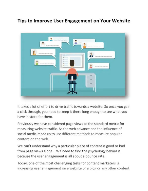
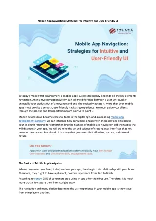
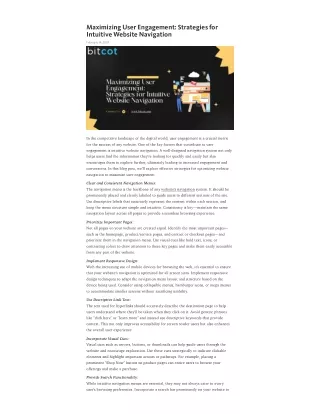
Maximizing User Engagement: Strategies for Intuitive Website Navigation February 14, 2024 In the competitive landscape of the digital world, user engagement is a crucial metric for the success of any website. One of the key factors that contribute to user engagement is intuitive website navigation. A well-designed navigation system not only helps users find the information they're looking for quickly and easily but also encourages them to explore further, ultimately leading to increased engagement and conversions. In this blog post, we'll explore effective strategies for optimizing website navigation to maximize user engagement. Clear and Consistent Navigation Menus: The navigation menu is the backbone of any website's navigation system. It should be prominently placed and clearly labeled to guide users to different sections of the site. Use descriptive labels that accurately represent the content within each section, and keep the menu structure simple and intuitive. Consistency is key—maintain the same navigation layout across all pages to provide a seamless browsing experience. Prioritize Important Pages: Not all pages on your website are created equal. Identify the most important pages— such as the homepage, product/service pages, and contact or checkout pages—and prioritize them in the navigation menu. Use visual cues like bold text, icons, or contrasting colors to draw attention to these key pages and make them easily accessible from any part of the website. Implement Responsive Design: With the increasing use of mobile devices for browsing the web, it's essential to ensure that your website's navigation is optimized for all screen sizes. Implement responsive design techniques to adapt the navigation menu layout and structure based on the device being used. Consider using collapsible menus, hamburger icons, or mega menus to accommodate smaller screens without sacrificing usability. Use Descriptive Link Text: The text used for hyperlinks should accurately describe the destination page to help users understand where they'll be taken when they click on it. Avoid generic phrases like "click here" or "learn more" and instead use descriptive keywords that provide context. This not only improves accessibility for screen reader users but also enhances the overall user experience. Incorporate Visual Cues: Visual cues such as arrows, buttons, or thumbnails can help guide users through the website and encourage exploration. Use these cues strategically to indicate clickable elements and highlight important actions or pathways. For example, placing a prominent "Shop Now" button on product pages can entice users to browse your offerings and make a purchase. Provide Search Functionality: While intuitive navigation menus are essential, they may not always cater to every user's browsing preferences. Incorporate a search bar prominently on your website to
allow users to quickly find specific content or products. Ensure that the search functionality is robust and returns relevant results based on user queries. Conclusion: Intuitive website navigation is essential for maximizing user engagement and driving conversions. By implementing clear, consistent, and user-friendly navigation strategies, you can enhance the overall browsing experience and encourage users to interact more deeply with your website. Remember to continuously monitor and analyze user behavior to identify areas for improvement and refine your navigation system accordingly. Read More: 15 Best Web Application Design Examples for Inspiration