Download
1 / 78
780 likes | 814 Views
Learn the fundamental building blocks of design - Line, Shape, Size, Space, Color - and how they are used in composition. Dive into color theory, contrast, and color wheels. Understand primary, secondary, and tertiary colors. Discover the harmony of analogous colors and the dynamic contrast of complementary colors.

E N D
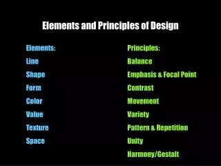
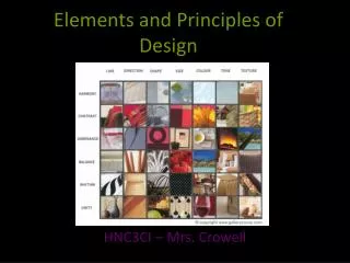
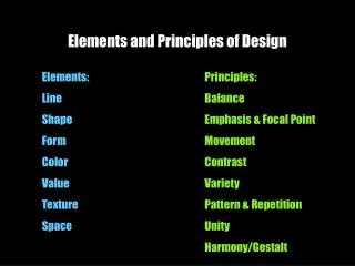
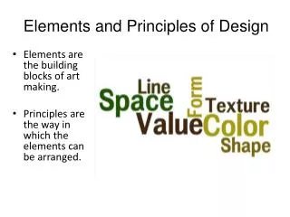
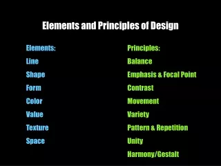
Elements of Design The building blocks of design.
Line A line is defined as a mark with length and direction, created by a point that moves across a surface. A line can vary in length, width, direction, curvature, and color. Line can be two-dimensional (a pencil line on paper), or implied three-dimensional.
Lines • Lines can be straight (vertical, horizontal or diagonal). • Lines can be curved. • Lines can zig zag. • How are lines used in the composition on this slide?
Lines • Lines can indicate motion or direction. • How are lines used in the composition on this slide?
Shape A flat figure, shape is created when actual or implied lines meet to surround a space. A change in color or shading can define a shape. Shapes can be divided into several types: geometric (square, triangle, circle) and organic (irregular in outline).
Shapes • Shapes are enclosed objects that can be created by line or created by color and value changes that define their edges.
Size (Form) This refers to variations in the proportions of objects, lines or shapes. There is a variation of sizes in objects either real or imagined. Can also be geometric, having a 3rd dimension (Example: Pyramid or cube.
Space Space is the empty or open area between, around, above, below, or within objects. Basic Rule: Use your space (positive space), do not leave lots of empty or white space (negative space).
Shapes and forms are made by the space around and within them. Space is often called three-dimensional or two- dimensional. Positive space is filled by a shape or form. Negative space surrounds a shape or form. Space
Color Color is the perceived character of a surface according to the wavelength of light reflected from it. The sensation of color is aroused in the brain by response of the eyes to different wavelengths of light.
Color has three dimensions: • HUE (another word for color, indicated by its name such as red or yellow) • VALUE (its lightness or darkness), • INTENSITY (its brightness or dullness).
Do you remember Roy G Biv from Art Class or the spectrum of light from science? Red Orange Yellow Green Blue Indigo Violet
Color definitions • Hue is another word for color. • Chroma is the intensity or purity of color. • Tint is a color mixed with white. • Tone is a color mixed with gray. • Shade is a color mixed with black.
Color and Contrast • Using color can enhance or detract from a composition.www.lighthouse.org/color_contrast.htm • Color wheels help determine which colors are in greatest contrast. • Use Kuler from Adobe Labs to try out new color schemes: http://kuler.adobe.com/
Color wheels • Analogous colors are a palette of compatible color combinations that blend well together. They are neighbors on the color wheel. They tend to live harmoniously because they are relatives to each other. • Complementary colors are opposite each other on the color wheel. They contrast, enhance and intensify each other. Therefore, complementary colors need to be used with caution.
Color in design • Use color to label or show hierarchy. • Use color to represent or imitate reality. • Use color to unify, separate, or emphasize. • Use color to decorate. • Use color consistently.
Color • Color theory encompasses a multitude of definitions, concepts and design applications. • All the information would fill several encyclopedias. As an introduction, here are a few basic concepts.
Primary ColorsRed,Yellow & Blue • A color circle, based on red, yellow and blue, is traditional in the field of art. Sir Isaac Newton developed the first circular diagram of colors in 1666. • Since then scientists and artists have studied and designed numerous variations of this concept. • Differences of opinion about the validity of one format over another continue to provoke debate. • In reality, any color circle or color wheel which presents a logically arranged sequence of pure hues has merit.
Primary ColorsRed,Yellow & Blue In traditional color theory, these are the 3 pigment colors that can not be mixed or formed by any combination of other colors. All other colors are derived from these 3 hues
Secondary Colors GREEN ORANGE PURPLE These are the colors formed by mixing the primary colors.
yellow-green. TERTIARY COLORS Yellow-orange blue-green red-orange blue-purple red-purple
Analogous colors Analogous colors are any three colors which are side by side on a 12 part color wheel, such as yellow-green, yellow, and yellow-orange. Usually one of the three colors predominates.
Complementary Colors Complementary colors are any two colors which are directly opposite each other, such as red and green and red-purple and yellow-green. In the illustration above, there are several variations of yellow-green in the leaves and several variations of red-purple in the orchid. These opposing colors create maximum contrast and maximum stability.
Nature Color Nature provides a perfect departure point for color harmony. In the illustration above, red yellow and green create a harmonious design, regardless of whether this combination fits into a technical formula for color harmony.
Neutral Colors • Neutral (NOO-trul) colors don't normally show up on the color wheel. • Neutral colors include black, white, gray, and sometimes brown and beige. • They are sometimes called “earth tones.”
Color Context How color behaves in relation to other colors and shapes is a complex area of color theory. Compare the contrast effects of different color backgrounds for the same red square. Red appears more brilliant against a black background and somewhat duller against the white background. In contrast with orange, the red appears lifeless; in contrast with blue-green, it exhibits brilliance. Notice that the red square appears larger on black than on other background colors.
Colour • Light that comes from the sun is basically white. It is made up of all colours When it passes through a specially shaped glass called a prism it breaks up into different colours. When the sun comes out while it is still raining, we often observe a rainbow because light must pass through raindrops. It breaks up into all the colours of the visible spectrum. Violet light is at one end of the spectrum because it has the shortest wavelength, red light, which has the longest wavelength, is at the other end.
Opaque (Opacity) • What happens to light depends on the kind of object or material that it hits. Transparent objects, like glass, let light waves pass through without mixing them up. You can see through this material. Translucent material also allows rays to pass through, but it mixes them up so that you cannot see through such objects clearly. Opaque materials don’t let any light pass through.
Different readings of the same color If your computer has sufficient color stability and gamma correction (link to Color Blind Computers) you will see that the small purple rectangle on the left appears to have a red-purple tinge when compared to the small purple rectangle on the right. They are both the same color as seen in the illustration below. This demonstrates how three colors can be perceived as four colors.
Different readings of the same color Observing the effects colors have on each other is the starting point for understanding the relativity of color. The relationship of values, saturations and the warmth or coolness of respective hues can cause noticeable differences in our perception of color.
Color Color Theory and Color Schemes
Color Theory: Study of color mixing and color schemes. A body of practical guidance to color mixing and the visual impacts of specific color combinations. (wikipedia.org)
According to color theory, certain color combinations work better than others. Using color schemes can help with the over all success of a composition.
Color Schemes: An arrangement or pattern of colors or colored objects conceived of as forming an integrated whole. (dictionary.com)
Primary: Red, Blue, Yellow If you mix red, yellow & blue, you will make brown. Depending on the ratio of colors, you can also produce a beautiful gray and a wide variety of browns or flesh tones.
Complimentary Colors: Colors across from each other on the color wheel. RedandGreen Orangeand Blue Yellowand Violet
Spilt-Complimentary Colors: Triad of colors consisting of a compliment, plus the two tertiary/intermediate colors on each side of it’s compliment.
Analogous Colors: Colors next to each other on the color wheel. Red, orange, and yellow. Green, Blue, Purple.