Balance in Design
Balance in Design. “Happiness is not a matter of intensity but of balance, order, rhythm and harmony.” — Thomas Merton. Balance in Design. Balance is important in life. Work and play; diet and exercise; yin and yang. A beautiful face is often a matter of the right balance of features. .

Balance in Design
E N D
Presentation Transcript
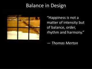
Balance in Design “Happiness is not a matter of intensity but of balance, order, rhythm and harmony.” — Thomas Merton
Balance in Design Balance is important in life. Work and play; diet and exercise; yin and yang. A beautiful face is often a matter of the right balance of features.
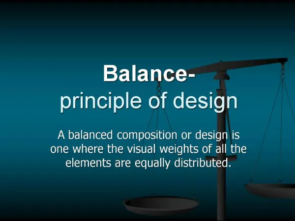
Balance in Design Balance is also a very important design principle. It will help you create an aesthetically pleasing whole and help you better control flow in your designs.
What is Balance in Design? “ balance is the state of equalized tension ” — Alex W. White from “The Elements of Graphic Design“
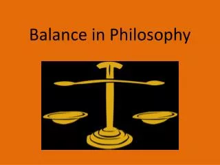
Balance in Design Let’s take a step back from design and think about physical balance. Picture a lever with a fulcrum at the midpoint; a see saw perhaps. If you place two equal weights the same distance away on opposite sides of the fulcrum, the lever will balance.
Balance in Design We can use a simple formula to express this. F1 x D1 = F2 x D2 (where F is the force and D is the distance from the fulcrum)
Balance in Design When the force x distance on each side of the equation is equal, balance is achieved. In the example above the force (weight) of each object is the same as is their distance from the fulcrum so we have balance.
Balance in Design What if the fulcrum is off center?
Balance in Design In that case the force of one of the objects needs to be increased in order to achieve balances. An adult on a see saw must move toward the center if there’s a child on the other side.
Balance in Design Nothing too difficult to understand even if I did lapse into physics momentarily. Balance in design works the same way as a lever or see saw.
Balance in Design Your design will have a vertical (or horizontal) axis and the weight of the various elements on either side of the axis and their distance from the axis will determine if your design is balanced.
Balance in Design There are two kinds of balance that correspond to our lever images above, namely symmetrical and asymmetrical balance, but first what gives an element visual weight?
Visual Weight in Design Elements The major difference in design balance and physical balance is that your visual elements don’t have a physical weight. They do however, have visual weight.
Balance in Design Some things that affect visual weight : Size – As you would expect larger elements carry more weight Color – It’s not fully understood why, but some colors are perceived as weighing more than others. Red seems to be heaviest while yellow seems to be lightest. Density – Packing more elements into a given space, gives more weight to that space Value – A darker object will have more weight than a lighter object Whitespace – Positive space weighs more than negative space or whitespace
Symmetrical Balance Symmetrical balance is like having our fulcrum in the center of the lever. To achieve balance we need to have elements of equal weight on both sides of a central axis. Symmetrical balance tends to be more formal and more static. It evokes feelings of consistency, elegance and classicism.
Balance in Design Think of a wedding invitation. They tend to use centered text in part because this helps achieve symmetrical balance, which leads to feelings of formality and elegance. Exactly what a wedding is expected to be. Symmetrical design balance is easy to see and relatively easy to achieve.
Balance in Design Leonardo DaVinci’sLast Supper is a great example of symmetrical balance in art. For everything on the left side of the painting there’s something of equal weight on the right.
Balance in Design The entire painting is balanced around the central figure of Jesus Christ, which makes perfect sense given what the painting is about.
Balance in Design It’s easy to see the balance in the home page of Tilly Moss. Equal weights exist on each side of the middle column. The central part of the page is symmetrically balanced both vertically and horizontally lending elegance to the products.
Asymmetrical Balance Asymmetrical balance is like having our fulcrum off center. Unequal weights need to be placed on either side of the fulcrum in order for balance to be in equilibrium.
Asymmetrical Balance Visual weight will not be evenly distributed around a central axis and often you’ll find one dominant form on one side of the axis offset by several less dominant forms on the other.
Balance in Design Asymmetrical balance is more dynamic as there’s more visual variety in design elements. It’s more interesting because of that variety, but also more difficult to achieve.
Balance in Design Elements in asymmetrical design will have more complex relationships between them and the overall design will use more whitespace to equalize the balance. Asymmetrical design evokes modernism and feelings of forcefulness, vitality, and movement.
Balance in Design In Kandinsky’s Composition #8 the dominant element is the dark circle in the upper left. No single element on the right side of the painting carries the same weight as this circle, but the dense line work on the right side carries enough weight together to give a counterbalance to the painting.
Balance in Design Notice how the left side of the painting contains more whitespace, since the circle already carries enough weight for that side.
Balance in Design Equilibrium is achieved on the home page for the Ernest Hemingway Collection, by balancing the larger content area on the right with a variety of objects packed closer together on the left. The darker color of the elements on the left adds to their weight as does the idea of there being a full cup of coffee in the center of the left hand side.
Radial & Mosaic Balance in Design Most of the time you’ll be dealing with either symmetrical or asymmetrical design, but two other types of balance are worth mentioning: Radial balance – Mosaic balance –
Radial Balance Radial balance– all elements radiate in or out from the center. Think beams of light coming from the sun. It’s easy to maintain a focal point in radial balance as it will always be the center.
Radial Balance Mosaic balance– many elements on the page create a sort of balanced chaos. Think of a Jackson Pollack painting. Mosaic balance lacks hierarchy and can look like noise. It’s harder to define a single focal point in all the chaos.
Summary As in life balance in design is important. It’s one of the principles of design. A balanced design has a unity of composition and helps the design make a single impression on the viewer and just feels right.
Summary In unbalanced design the individual elements tend to dominate instead of the whole. The parts become more visible and there are many messages instead of a singular unified message. This becomes confusing to the viewer and can hinder getting the message intended across.
Summary Your own judgment can go far in achieving balance in your designs. Train your eye to see balance in the compositions of others. Which elements of the composition look heavier or lighter and why do they appear that way?
Summary By training your eye and learning to control the weight of different elements you’ll be able to achieve balance in your compositions and create more appealing designs.
Balance in Design Lecture courtesy of Vanseodesign.com By Steven Bradley – October 28, 2009 Modified Feb-2013 By Stephen Copel