Interpreting a Bar Graph: Volcanoes
Learn to interpret a bar graph to determine which country has the most historically active volcanoes.

Interpreting a Bar Graph: Volcanoes
E N D
Presentation Transcript
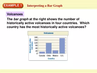
EXAMPLE 1 Interpreting a Bar Graph Volcanoes The bar graph at the right shows the number of historically active volcanoes in four countries. Which country has the most historically active volcanoes?
EXAMPLE 1 Interpreting a Bar Graph Use the bar graph above about volcanoes. Answer the question or explain why you can’t answer the question using the graph. a. Which country has the most historically active volcanoes? b. Which country has the most volcanic eruptions in a given year?
EXAMPLE 1 Interpreting a Bar Graph SOLUTION a. The vertical axis in the bar graph is labeled Historically active volcanoes, so the tallest bar represents the country with the most historically active volcanoes. Because the United States has the tallest bar, it has the most historically active volcanoes. b. Having more historically active volcanoes doesn’t necessarily mean having more eruptions, so you can’t answer this question from the bar graph.
ANSWER About 80 volcanoes for Example 1 GUIDED PRACTICE Use the bar graph above about historically active volcanoes. 1. About how many more historically active volcanoes does Chile have than Mexico?
ANSWER Canada for Example 1 GUIDED PRACTICE Use the bar graph above about historically active volcanoes. 2. Which country has the least number of historically active volcanoes?
ANSWER 215 volcanoes for Example 1 GUIDED PRACTICE Use the bar graph above about historically active volcanoes. 3. About how many historically active volcanoes do Canada, Mexico, and the U.S. have altogether?
EXAMPLE 2 Making a Frequency Table Roller Coasters The data show the heights, in meters, of some of the tallest roller coasters in the world. Make a frequency table of the data. 66.4, 94.5, 68.3, 115, 62.5, 97, 66.4, 126.5, 63.4, 74.7, 63.4, 70.1, 66.4, 64.9, 63.7, 79, 63.4, 63.1, 62.5, 61.9, 71.6
STEP 1 Choose intervals of equal size for the data. The intervals should include numbers from 61.9 to 126.5. STEP 2 Tally the data in each interval. Use tally marks to record each occurrence of a height in its interval. STEP 3 Write the frequency for each interval by totaling the tally marks. EXAMPLE 2 Making a Frequency Table SOLUTION
EXAMPLE 2 Making a Frequency Table
STEP 1 Draw and label the horizontal and vertical axes. Start the vertical scale at 0 and end at a point greater than 13. Use equal increments. STEP 2 Draw a bar to represent the frequency of each interval. The bars of neighboring intervals should touch. STEP 3 Write a title for the histogram. EXAMPLE 3 Making a Histogram Make a histogram of the data in the frequency table above.
EXAMPLE 3 Making a Histogram
4. What If? Using the data from Example 2, make a new frequency table using 6 intervals. Then make a histogram from your frequency table. for Examples 2 and 3 GUIDED PRACTICE SOLUTION