Download
1 / 10
100 likes | 243 Views
The impact of logos. If you look at the centre of this logo, you can see two people enjoying a Tostito chip with a bowl of salsa . This logo conveys an idea of people connecting with each other. The impact of logos.

E N D
The impact of logos If you look at the centre of this logo, you can see two people enjoying a Tostito chip with a bowl of salsa. This logo conveys an idea of people connecting with each other.
The impact of logos At first, this logo might not make much sense. But if you look closely, you'll see the number 1 in the negative space between the F and the red stripes. This logo also communicates a feeling of speed.
The impact of logos The Milwaukee Brewers is a professional baseball team from Milwaukee. Their logo is actually made up of the letters M (on top) and B (below the m). These two letters also form a baseball glove.
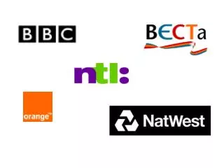
The impact of logos This simple looking logo actually carries a lot of information. First of all you can see the letters N and W, the first two letters of the brand name. But what most people don't see is the compass that points to the Northwest, another reference to the brand name.
The impact of logos This logo doesn't seem to hide much at first sight, but it gives you a little insight in the philosophy behind the brand. First of all, the yellow swoosh looks like a smile: Amazon wants to have the best customer satisfaction. The swoosh also connects the letters a and z, meaning that this store has everything from a to z.
The impact of logos Toblerone is a chocolate-company from Bern , Switzerland. Bern is sometimes called The City Of Bears. They have incorporated this idea in the Toblerone logo, because if you look closely, you'll see the silhouette of a bear.
The impact of logos The old logo of Baskin Robbins had the number 31 with an arc above it. The new logo took this idea to the next level. The pink parts of the BR still form the number 31, a reference to the 31 flavours.
The impact of logos Sony Vaio is a well known brand of laptops. But did you know that the name Vaio logo also had a hidden meaning? Well, the first two letters represent the basic analogue signal. The last two letters look like a 1 and 0, representing the digital signal.
The impact of logos Do you see any arrows on FedEx’s logo? The clue is that the arrow is located in between the alphabet E and X, and the arrow is white, acting as a background.
The impact of logos Last one