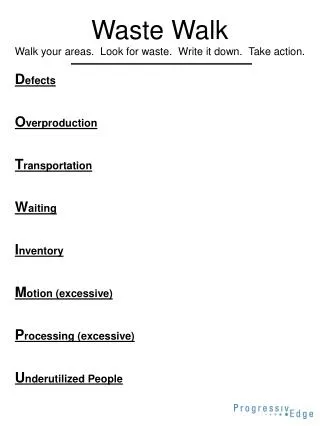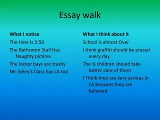
Walk
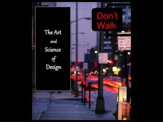
The Art and Science of Design. Don’t. Walk. What is Visual Design?. Design is a process of purposeful visual creation Unlike artwork, which are realizations of the artist's personal visions and dreams, design fills practical needs

Walk
E N D
Presentation Transcript
The Art and Science of Design Don’t Walk
What is Visual Design? • Design is a process of purposeful visual creation • Unlike artwork, which are realizations of the artist's personal visions and dreams, design fills practical needs • A design has to be placed before the eye of the problem and convey a predetermined message • Training product has to meet the learner's requirement
Parts of a Layout Header Sub-header Body Caption Margin Columns Illustration Space Graphic elements Lines Logos Texture Arrows Role of Design Attention Interest Desire Action
What is Visual Design? • It is the art of sending a message that can be understood by the intended receiver • Visual information is everywhere. Television, computer screens, signs, symbols, books, magazines, movies, and even body language provide visual messages.
If you saw this poster in a gym locker room what would you give thought to doing?
Principals of Visual Design The following are good design principals to follow in the design of instructional visuals, whether they be a billboard, poster, page in a magazine,website, or multimedia production. • BALANCE: • UNITY: • EMPHASIS: • HARMONY: • ORGANIZATION: • CLARITY: • SIMPLICITY: = 7 Elements of Design
7 Principals of Visual Design • Clarity- is the topic of the site immediately apparent? • Simplicity- Is the layout and content to the point and not “over the top”? • Harmony- is the layout, content, navigation and treatment consistent? • Emphasis- Are the key elements of the site emphasized? • Organization- Is the content “chunked” and is the content placement within the site intuitive? • Unity- Are the design elements visually tied together, is there a consistent type of graphic or media type? • Balance- Is the site visually balanced, does it draw the eye to the key points/ areas?
Balance Balance is a psychological sense of equilibrium As a design principle, balance places the parts of a visual in an aesthetically pleasing arrangement.
Symmetrical Balance When a design can be centered or evenly divided both vertically and horizontally it has the most complete symmetry possible. Symmetrical balance generally lends itself to more formal, orderly layouts. They often convey a sense of tranquility or familiarity or elegance.
Symmetrical Design Example
Asymmetrical Balance Balance is informal when sides are not exactly symmetrical, but the resulting image is still balanced. Asymmetrical design is typically off-center or created with an odd or mismatched number of disparate elements. Uneven elements present us with more possibilities for arranging the page and creating interesting designs than perfectly symmetrical objects. Asymmetrical layouts are generally more dynamic and by intentionally ignoring balance the designer can create tension, express movement, or convey a mood such as anger, excitement, joy, or casual amusement
Asymmetrical Design Example
Unity Unity is the relationship among the elements of a visual that helps all the elements function together. Unity gives a sense of oneness to a visual image. In other words, the words and the images work together to create meaning.
Unitycan be achieved through the use of a common background.
Unity In this example the viewer’s eye has to make an uncomfortable jump to link the two groups of buildings. By including a road the link is more comfortable. The picture has better unity.
HARMONY Harmony - the blending of elements to create a more pleasing and integrated appearance. For example, in a slide presentation harmony is created by the repetition of the same elements, such as repeating the same font, color, or the same bullets, using the same background on each linked page.
Emphasis is the most important element of the layout emphasized? Emphasis gives a layout interest, counteracting confusion and monotony. • changing the of key words • changing the • using a different color • Underlining or italicizing • or by using an asterisk or check mark beside key phrases or words. • enlarging the image typeface font size What message is stressed here?
Emphasis This condition exists when an element or elements within a visual format contain a hierarchy of visual importance.
Emphasis Change in size and boarder color adds interest.
Simplicity Is the layout restricted to one idea?
Harmony Do all the elements of the layout fit together or are some elements contradictory? Home Page Product Page
Organization The elements of the layout must be arranged in a pattern which is easy for the viewer to comprehend.
Clarity Is the purpose of the layout obvious to the audience for whom the message is intended?
Creating a Dramatic Homepage • Fast Loading- <8-10 sec. (<20 for all other pages) • Purpose- Define your purpose. • Purpose drives content. Content drives design. • Careful use of images • Pictures, Flash, movies, etc.- must have a reason to be there! • Good Flash is transparent- integrated into design not added in • K.I.S.S.- Keep it simple st…. • Navigation Design • 3 Click rule- user finds what they need in 3 clicks or less • No more than 7-10 links on homepage (drop downs don’t count) • Proper use of color • No left to right scrolling- 2 ½ -3 screens vertical okay • Do not dictate a necessary browser
Some Things to Remember • Less is more-keep the first page, card, slide, video title to a minimum • Pay attention to the elements and principles of art and design. • Text must contrast against a background for easy reading. • Text should be laid out in columns or blocks of space like a magazine, not horizontally like a novel. • Content is most important-no errors in grammar or spelling allowed. • The heading or title should grab a visitor's attention. • Include similar headings throughout for consistency. • Repeat basic formats-same background, same icons, same color combinations, and same layout.
Some Things to Remember cont. • Provide visitor with enough information and menus in the beginning to make wise choices. • Do not include links to the outside world on the first page of a web site. You will lose your audience. • Post a month, day, and year of the publishing. On a web page the footer should contain a date, person to contact, navigational tools, and author of the page. • Treat web pages like slides or hyper cards, they need categories to link to and should not have endless scrolling. • Too much of a good thing like color or texture spells disaster. • An image or animated gif that is too big will diminish the content.
Elements of Design Ways to Represent Objects There are three major ways to represent objects: • pictorial symbols, • graphic symbols, • or text/verbal symbols
Being Creative Elements of Design • Being creative... Designing visual images for instruction requires the ability to think visually coupled with the ability to relate verbal symbols (words) with corresponding visual symbols (pictures or graphical images) in a meaningful and creative way.
Rule of Thirds • Research on eye movement states that people from Western cultures tend to look at the upper left-hand area of a visual first. Eye movement then tends to move to the right and then to the bottom. Start
Elements of Design Rule of Thirds Center of Interest – most people look here first • The 'rule-of-thirds' is a principle of photographic and graphic composition in which an area is divided into thirds both vertically and horizontally and the centers of interest are located near the intersections of the lines.
Elements of Design Variety of Visuals • Changes in a visual image help keep attention directed on the visual. • Too much detail in a visual image can detract from instruction. The age and developmental level of people viewing the visual determine the amount of detail to include in a visual image. Younger children need more detail than older children.
Amount of Detail Elements of Design
Elements of Design Layout • The layout of a visual needs to be clear and focus attention to the appropriate places in the image. • The shapes of several letters are useful to guide layout patterns. The letters C, O, S, Z, L, T, and U can be used as basic guidelines for layout.
Elements of Design Do you see the letter Z and how your eye follows the angle of the hotdog to the bottom text?
Elements of Design Letters styles are either serif or sans serif. Serif style fonts have finishing lines at the ends of the letters. Sans serif fonts are more block-like.
Elements of Design Text Placement • When words are added to label parts of a visual image, be sure it is clear to the viewer of the image which words go with which objects. • Move labels close to the objects they refer to. Poor Good
Elements of Design Use of Contrast • To make your visuals easy to read, be sure to have a good amount of contrast between the color of the letters and the color of the background. • These examples do not have good contrast between the color of the letters and the color of the background making them difficult to read.
Use of Contrast • These examples have good contrast between the color of the letters and the color of the background making them easy to read. good contrast good contrast
Contrast • You can use the color wheel to determine which colors contrast best. • Analogous colors are adjacent to each other on the color wheel. • Complementary colors are opposite each other on the color wheel.
. To make your visuals easy to read, be sure to have a good amount of contrast between the color of the letters and the color of the background. Text should be in lower case. Use capitals only where normally required. All capital letters are hard to read, especially for one line. The arrangement of words in a visual image should help clarify the message or information to be conveyed Elements of Design Using Fonts for Effect • To make your visuals easy to read, be sure to have a good amount of contrast between the color of the letters and the color of the background. Text should be in lower case. Use capitals only where normally required. ALL CAPITAL LETTERS ARE HARD TO READ, ESPECIALLY FOR MORE THAN ONE LINE. The arrangement of words in a visual image should help clarify the message or information to be conveyed
Elements of Design Using Fonts as Message • Typography has to do with the size, shape, and placement of words. Text should be in lower case. Use capitals only where normally required. • ALL CAPITAL LETTERS ARE HARD TO READ, ESPECIALLY FOR MORE THAN ONE LINE . • The arrangement of words in a visual image should help clarify the message or information to be conveyed. W o r d s W O r D s
Size of Font • The size of letters used depends on the purpose of the visual. • Posters need letters large enough to be read at a distance, approximately 1/4² for every eight feet of viewer distance from the visual.
Color and the Emotions Hueis another word for color. Chromais the intensity or purity of color. Tintis a color mixed with white. Toneis a color mixed with gray. Shadeis a color mixed with black.
Color and the Emotions • RED - Red sets the pituitary gland going at a rapid pace. Any design in red takes on a persona that is exciting, passionate, provocative, and dynamic. Aggressive in nature, it commands attention and demands action. Seen as the sexiest of all colors, red is equally seductive in the marketplace. Deepen the red tones to shades of burgundy and they still maintain the inherent excitement of the "mother" color but are more subdued. Consumers respond well to wine tones. They see them as rich, refined, expensive as well as more authoritative, mature, lush, opulent, and elegant than a vibrant red. The result: burgundy is an excellent choice for expensive products.