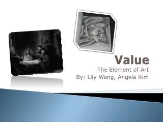
Understanding Value in Art: Lightness, Darkness, and Contrast Techniques
100 likes | 221 Views
Value refers to the lightness or darkness of a tone or color, playing a crucial role in our perception of objects. It manipulates the recognition of shapes and forms in art, often deemed more important than color. The Value Scale illustrates the spectrum between pure white and deep black, while Value Contrast helps differentiate forms by juxtaposing light and dark tones. Techniques like Chiaroscuro create depth through rules of light and shadow, enhancing the illusion of three-dimensionality. Explore this concept further with practical exercises using light and shadows.

Understanding Value in Art: Lightness, Darkness, and Contrast Techniques
E N D
Presentation Transcript
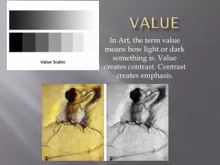
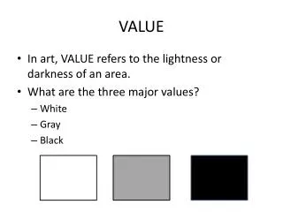
VALUE refers to the lightness or darkness of a tone or color. It is the differences in value that allow us to recognize what we see. In fact, value is more important than color when it comes to recognizing objects. The proof of this is a black and white photo.
A Value Scale is a scale that shows the range of light and dark tones (the gray values) that exist between the whitest white and the blackest black. 1 2 3 4 5 6 7 8 9 10 11
Value Contrast refers to placing light tones or colors next to dark tones or colors in a picture to help distinguish the different shapes in a picture or painting. #1 #2 #3 Which Value Contrast caught your eye first - #1, #2 or #3? Why you think you noticed that one first?
Chiaroscuro is a method for applying value to a 2-D piece of artwork to create the illusion of a 3-D solid form. In this system, if light is coming from one direction, then light and shadow will conform to a set of rules.
Notice on forms with flat sides, each side is covered with a different value – according to how the light source hits the object. This Value Contrast helps us distinguish the different shapes that make up the object.
Notice on spheres and curved surfaces, the lightest spot on the object is where the light hits it first. Then the light wraps around the curved surface gradually getting darker. This is called Gradation.
Cast Shadows are shadows that an object makes onto its surroundings. Notice they are usually of the same shape as the object and on the side opposite from the light source.
Now complete the Value Worksheet by shading in the values for each form according to the light source. Then add a cast shadow to each form. If needed, use the wooden blocks and flashlights to explore how light hits the surfaces of these objects and the shapes of their cast shadows.