Download
1 / 4
40 likes | 71 Views
Do you want to Improve Mobile App User Experience using Visual Elements? AppClues Infotech is the best place where you can implement great visual elements in accordance with the principles of good UX design.

E N D
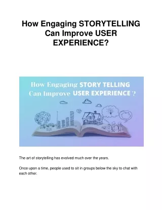
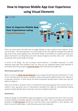
How to Improve Mobile App User Experience using Visual Elements There are many metrics by which we can judge whether an app is good or bad. However, at the end of the day – the most important one is the quality of the user experience people have with the app. Ease of use, quick loading times, and similar things are all staples of a quality app that users expect. But there’s one thing that users don’t always recognize, but they value a lot –and that’s the quality of the visual design of the app. In terms of UX design, the use of proper visual elements is incredibly important; it’s what separates great apps from mediocre ones. So, how can you implement great visual elements in accordance with the principles of good UX design? We’ll talk about that right here. Minimizing Cognitive Load When it comes to mobile app development, many people will talk about the importance of “ease of use”. But what does this mean in reality? It means reducing the cognitive load a user requires to an absolute minimum. In other words, the fewer brainpower people need to utilize your app, the better its design is. After all, much like a computer, there is a limited level of processing power that a human brain can exhibit. If your app gives users an informational overload, this might be overwhelming; leading people to simply abandon the current task, and soon enough the app itself. Decluttering While the design of multi-platform apps and websites is more important than ever, there are ways in which desktop and laptop websites and mobile apps differ. Sure, any professional WordPress developer like WP Full Care will tell you that they value visual simplicity in their websites. But when it comes to mobile apps – clarity becomes even more important.
Clutter is one of the biggest enemies of quality mobile design. If you clutter the interface with too many elements, you’ll have the informational overload we’ve described above; something you don’t want. And these elements don’t have to be huge walls of text to represent clutter; every single icon, image, and button you add will complicate your screen further. With this in mind, you want to maximize user comprehension by reducing clutter to an absolute minimum. Functional minimalism is one of the key pillars of professional mobile design. Familiar Screens When you’remaking a mobile app, you need to maintain a careful balance. On the one hand, you want to be as original as possible, so that your app doesn’t look like an imitator – you wish to stand out from the competition. But on the other hand, you must not be too radical in your design either, so that your interface is intuitive to people when they use it for the first time. That’s where familiar screens are useful. These are screens like “Getting Started” or “Search Results” – parts of the interface that have, over time, become standards in terms of mobile design. You want to include as many of these in your app as possible, as they won’t require much additional explanation; people have already encountered them in numerous other apps. So, you’ll be able to improve the mobile app user experience by reducing the learning curve people have with your product. Minimal User Input Regardless of how big someone’s phone is –typing on a mobile phone still isn’t the most rewarding experience. And while there are keyboard apps out there that are designed to reduce mistakes –you’ve still got a much bigger chance of making an error than with an actual keyboard. Nevertheless – at some point or another, users will likely need to fill out some forms related to your app.
If you want to make this process as stress-free as possible, there are a few things that you have to keep in mind in terms of visual design. First of all, take a look at these forms and think about whether there are any fields you don’t need. Removing excess fields and requesting minimal user information will make these forms shorter, and thus less annoying. Also, give your users input masks. The technique of field masking helps format the text that users input more easily. Once a user has focused on a particular field, the text therein will be automatically formatted as the user fills it out; many apps do this with date formats, or addresses. Consistent Design One of the most fundamental principles of visual design is consistency. Make no mistake – consistency will play a large role in eliminating any confusion on the users’ part. To be more precise – you want to maintain a consistent visual style and appearance throughout the entirety of your app. And that means three things: •Visual Consistency •Functional Consistency •External Consistency Firstly, visual consistency means that all the labels, buttons, and typefaces used in your app need to be seamless. Functional consistency pertains to the interactive elements the mobile app has – all of which are supposed to work similarly in different segments. Lastly, external consistency means that, if you have multiple products and apps, there should be a similar and recognizable design between all of them. Predictability In terms of functional consistency, there is one segment we’d like to focus a bit more here in the end. And that’s predictability. In UXdesign, interactive predictability is a core principle. If a user’s experience with an app is unfolding like they’ve predicted it would, the users feel like they’ve got control in the app. This is important because the design of a mobile app must be far more intuitive than with a desktop one.
With a desktop app, users have tooltips, which they discover after hovering with their cursor; these can easily explain the functions of different visual elements. But in a mobile app, the only way users can discover the interactive properties of elements is by tapping on them. Considering this, the visual design itself should communicate the function of the interface. If you design a visual element that looks similar to a button, it needs to be clickable; otherwise, you’re just creating confusion. Read More: Top 5 UI/UX Designing Companies in New York Top 10 Mobile App Designs in 2020 Mobile App UI/UX Trends That will Influence Your App for 2020 and Upcoming Years