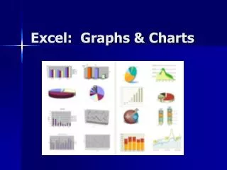
Microsoft Excel 2003 Charts and Graphs:
400 likes | 715 Views
Microsoft Excel 2003 Charts and Graphs: . Presenter: Jolanta Soltis MCSE, MCT, A+. Course Objectives. In this course you will learn how to: Create a chart Display a series in columns using the Chart Wizard Customize the chart Add data to chart Remove data from chart

Microsoft Excel 2003 Charts and Graphs:
E N D
Presentation Transcript
Microsoft Excel 2003Charts and Graphs: Presenter: Jolanta Soltis MCSE, MCT, A+
Course Objectives • In this course you will learn how to: • Create a chart • Display a series in columns using the Chart Wizard • Customize the chart • Add data to chart • Remove data from chart • Formatting techniques
Before creating a chart, ask yourself the question: “What story do I need to tell?”
COLUMN CHART (STANDARD) Bill, a production manager within XYZ Corporation, has to give a presentation to the president of the company on the past 6 months’ widget output. Bill’s goal is to establish a straight forward graph with no frills, just hard data that is easily visible. The above column chart shows Bill’s final accomplishment. COLUMN CHARTS
COLUMN CHART In an effort to turnaround the company, Michael has to come up with an analysis to show how poor the company’s performance has been over the past 4 quarters. He mentioned to management that costs have gone through the roof and profits have dwindled. In an upcoming meeting he wants to be able to illustrate an discuss the critical issues. In an effort not to forget the issues, he embedded them on the graph for emphasis and discussion. COLUMN CHARTS
COMBINATION COLUMN/LINE CHART Dustin is presenting to the sales force next week. His agenda includes showing the sales force their exceptional performance over the past 6 months relative to what was originally projected. To add further emphasis on their outstanding efforts he inserted a trend line to show what it looks like will happen in the future. The above column/line chart illustrates his final presentation.
COMBINATION COLUMN CHART Chris works with the local newspaper. His daily ritual includes coming up with statistical information that relates to the seasons. Because of a recent cold spell, he decided to look at the average temperature over the past two years. By creating a visual overlay, his chart acts as a thermometer representing both this year’s and last year’s information. COLUMN CHARTS
COMPARATIVE MODELS Tanner needed to provide a time comparison over the last 9 months between several items, sometimes this means separating multiple charts laid out over time. If all of this information was in one chart it could get cluttered, and further, the more specific question was the impact in the 4th quarter, by creating a comparative model, all of this information becomes easily viewable on one page. MULTIPLE COMBINATION CHARTS
3 DIMENSIONAL CONE CHART Hunter works for XYZ’s Corporate newspapers, he’s constantly looking for ways to be creative and to get the point across, here’s an example of combining drawing tools, perspective, as well as 3 dimensional elements to drive home a point. MULTIPLE COMBINATION CHARTS
HIGH/LOW/CLOSE/COLUMN CHART Bob, a stock market analyst working with a brokerage firm, has to establish a stock market diary. His objective is to follow the high and low for the day, as well as, the volume traded. He achieves this by creating two graphs and layering them together as shown, while leaving space at the bottom to insert daily diary comments MULTIPLE COMBINATION CHARTS
STACKED COLUMN/TRENDLINE CHART Kim, an analyst for XYZ Analysis division, was asked to put a cost analysis together for the 4 divisional departments. In Kim’s analysis she wanted to point out the percentage increase between last year and this year, thus dividing the two years and highlighting the increase. Additionally, based on the percentage increase she established the next period trend as well. MULTIPLE COMBINATION CHARTS
Sample data • Please enter the following information
Column • A column chart shows data changes over a period of time or illustrates comparisons among items. Categories are organized horizontally, values vertically, to emphasize variation over time. • Stacked column charts show the relationship of individual items to the whole. The 3-D perspective column chart compares data points along two axes. • In this 3-D chart, you can compare four quarters of sales performance in Europe with the performance of two other divisions.
Bar • A bar chart illustrates comparisons among individual items. Categories are organized vertically, values horizontally, to focus on comparing values and to place less emphasis on time. • Stacked bar charts show the relationship of individual items to the whole.
Area • An area chart emphasizes the magnitude of change over time. By displaying the sum of the plotted values, an area chart also shows the relationship of parts to a whole. • In this example, an area chart emphasizes increased sales in Washington and illustrates the contribution of each state to total sales.
Line • A line chart shows trends in data at equal intervals.
Pie • A pie chart shows the proportional size of items that make up a data series to the sum of the items. It always shows only one data series and is useful when you want to emphasize a significant element.
Doughnut • Like a pie chart, a doughnut chart shows the relationship of parts to a whole, but it can contain more than one data series. Each ring of the doughnut chart represents a data series.
Cone, Cylinder, Pyramid • The cone, cylinder, and pyramid data markers can lend a dramatic effect to 3-D column and bar charts.
XY Scatter • An XY (scatter) chart either shows the relationships among the numeric valuesin several data series, orplots two groups of numbers as one series of XY coordinates. This chart is commonly used for scientific data. • When you arrange your data place x values in one row or column, and then enter corresponding y values in the adjacent rows or columns.
Bubble • A Bubble chart is a type of xy (scatter) chart. The size of the data marker indicates the value of a third variable.
Radar • A radar chartcompares the aggregate values of a number of data series. • In this chart, the data series that covers the most area, Brand A, represents the brand with the highest vitamin content.
Surface • A surface chart is useful when you want to find optimum combinations between two sets of data. As in a topographic map, colors and patterns indicate areas that are in the same range of values.
Stock • The high-low-close chart is often used to illustrate stock prices. This chart can also be used for scientific data; for example, to indicate temperature changes. You must organize your data in the correct order to create this and other stock charts. • A stock chart that measures volume has two value axes: one for the columns that measure volume, and the other for the stock prices. You can include volume in a high-low-close or open-high-low-close chart.
The Chart Wizard(1) – Chart Type • Select or click within the data • Click on the Chart Wizard icon • This will guide you through the chart creation process
The Chart Wizard (2) - Data Source • Allows you to define the data that will be used to create the chart
The Chart Wizard (3) – Chart Options • Allows you to define the options you wish to include or customize, including: - Titles - Axis - Gridlines - Legend - Data Labels - Data Table
The Chart Wizard (4) – Chart Location • Allows you to insert the chart into the current worksheet or to create it in a new worksheet which will be added to the current workbook
Adding or Removing Data • After you have created a chart, data can easily be added to it or selectively removed from it • You can use drag and drop techniques or use the Windows Clipboard
Changing Data By Dragging and Dropping Columns • If you use drag and drop techniques within a chart to, for instance, make a column taller or shorter, then this change will be reflected in the original data used to create the chart
Chart Formatting – Chart Area • Double click on the chart area to display the relevant dialog boxes • The chart area is the “empty” chart background
Chart Formatting - Legends • Double click on the Legend to display the relevant dialog boxes
Chart formatting - Axis • Double click on an Axis to display the relevant dialog box
Chart Formatting – The Plot Area • Double click on the Plot area to display the relevant dialog box • The plot area is the “empty “ area of the actual graph
Chart Formatting - Gridlines • Double click on a gridline to display the relevant dialog box
Chart Formatting – The Data Series • Double click on a data series to display the relevant dialog box
Add eye-catching formatting to your charts • Colors, textures, and gradient fills • You can apply colors, borders, and fill effects to data markers, the chart area, the plot area, and other chart items. • In the example above, the plot area is filled with a two-color gradient. The data marker for the first data series (Actual) is filled with a texture. The data marker for the second series (Projected) is filled with one color. The data marker for the third series (Expenses) has a shadow.
If you have any questions, please feel free to contact Academic Computing Services Jolanta Soltis IT Consultant (973) 596-2925 e-mail soltis@njit.edu