Download
1 / 29
370 likes | 1.67k Views
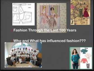
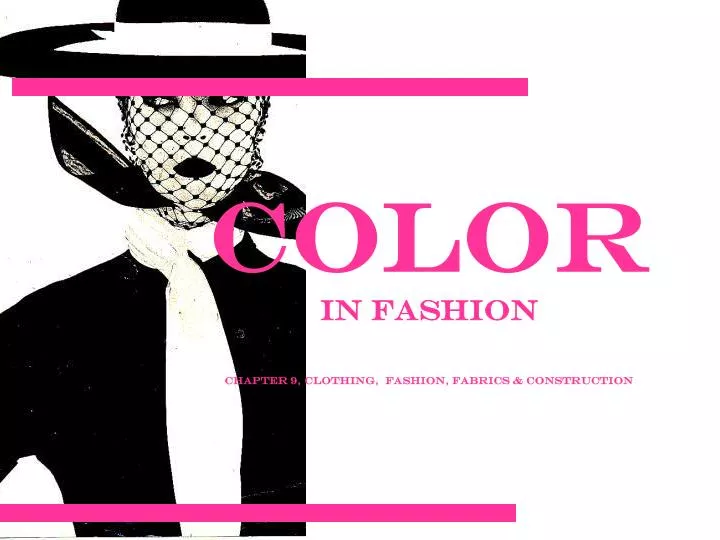
Color in Fashion Chapter 9, Clothing, Fashion, Fabrics & Construction. Human eye sees 6-7 million colours Figure 9.4, 9.5 Colour is used in fashion by the buyer, co-ordinator, designer, fashion writer or consultant Colour and Clothing

E N D
Colorin FashionChapter 9, Clothing, Fashion, Fabrics & Construction
Human eye sees 6-7 million coloursFigure 9.4, 9.5 Colour is used in fashion by the buyer, co-ordinator, designer, fashion writer or consultant Colour and Clothing • Out of all the design elements of fashion; line, shape, texture, space, We notice COLOUR first. • When you understand colour, you can choose the best colour for YOU • Designers often pick colour as an integral element of their collection
Things colour can do for you: • Draw attention to or away from parts of your body • Cooler hues • Darker values • Duller intensities • Close contrasts • Examples: navy, khaki, grape, charcoal, mauve • Emphasize a special feature (colour of eyes) • Create illusions in height or size • Can be used as a design element • Act as a symbol, communicate feelings, send messages
color • To increase attention and apparent size, to appear shorter and heavier • Warmer hues • Lighter values • Brighter intensities • Strong contrasts • Examples: shocking pink, pumpkin, tangerine, raspberry
Color personalities!! • To appear refined, romantic • Warm to cool hues • Lighter values • Dull, muted to medium intensities including pastels • Close contrasts, subtle • Examples: shell pink, lavender, misty rose, orchid, blue, peach, all pastels
Color Personalities!!! • To feel and appear happy, youthful, sporty • Warmer hues • Light to dark values • Medium to bright intensities • Strong contrasts, bold • Examples: coral, red, khaki, ivory, brown, camel, cinnamon, brick
Color personalities!!! • To appear mature, serious, somber, classic • Cool hues • Dark values • Dull intensities • Examples: navy blue, taupe, charcoal, maroon, gray, black
Color personalities!! • To feel and appear dramatic/exotic • Warm to cool hues • Dark values, deep • Bright intensities, rich • Strong contrasts, bold • Magenta, fuchsia, emerald green, royal blue, regal purple, sapphire, amethyst
Colours have specific names that identify them, these are called HUES. • Without light we wouldn’t see these hues. Figure. 9.4 • All objects contain pigments-some aborb light rays, some reflect them. We only see the rays that are REFLECTED. • Ex. If a fabric looks red, it is only because the red pigments are being reflected.
Colour Wheel • Figure 9.6 • A colour wheel is a way to organize hues, it is a system that places colours around a wheel, they show how colours relate to one another.
Colour Wheel Basics Primary Colours • Basic colours that all other colours are made from • Red, yellow, blue Secondary Colours • When equal amounts of two primary colours have been combined, ex. Blue + red=violet Intermediate Colours • Primary colour + a neighbouring secondary colour • Ex. Red + orange=red orange Complementary Colours • Colours that are directly opposite on the colour wheel
Colour Variations Intensity • Brightness (lots of colour pigment) or dullness of a colour (softer, muted colours) • Vibration: when two colours of equal brightness compete Colour Value • Adding white (tint) or black (shade) changes it`s value Figure 9.7 Neutral Colours • Black, white and grey (when all colour is absorbed or reflected • Can change the value/intensity of a colour
Monochromatic • Mono means “one”, refers to the tints tones and shades of one color • Possible color combinations are limitless! • Mint green and forest green • Generally calming, however it depends on the hue
Analogous • Often referred to as adjacent. Two, three, or four hues that lie next to one another on the color wheel. All hues have one hue in common. • Possible colors (Can include tints, tones & shades) • Yellow-green, yellow, yellow-orange, orange • Feeling created: can be calming or exciting depending on whether they come from the cool or warm side of the color wheel. • This color scheme is most effective if one of the hues repeats some aspect of your personal coloring… eyes, hair…
Complementary • Combine two colors from the opposite side of the color wheel. • Possible colors: red & green, blue & orange • Feeling associated: stimulating due to opposite visual characteristics. By dulling the intensity or value, calming effect may be achieved. • Can be very flattering to personal coloring, and versatile
Triad • Three colors equally spaced on the color wheel • Possible colors: tints, tones and shades of primary or secondary colors • Very exciting and stimulating if used in full strength.
Neutral • One, two, or three achromatic neutrals, may or may not vary in the degree of warmness or coolness, lightness or darkness, brightness or dullness • Possible colors: black and white, combination of browns • Effect: vary in mood depending on the degree of light and dark value contrast • Are most effective if the degree of lightness or darkness in your hair and/or skin coloring is repeated in the lightness or darkness of the clothing
Accented neutral • One color added to other neutrals to form a scheme. • Possible colors: black, white & red, browns with light blue • Effect: draws attention to the one added hue
Selecting colours for you • Some say you can wear every colour, depending on hue/intensity (they look different on different people) • Evaluate in natural light • Consider: Height, personal colouring, body shape (figure 9-17, pg 168) • Hold against your skin • Switch between a variety of Warm/Cool tones • See page 167 for `How to Choose your colours`
http://www.schwarzkopf.com/sk/en/home/hair_colour/blonde_hair.htmlhttp://www.schwarzkopf.com/sk/en/home/hair_colour/blonde_hair.html • http://trepanrr.tripod.com/color_analysis_test.htm