
TQM Tools Pie Chart
E N D
Presentation Transcript
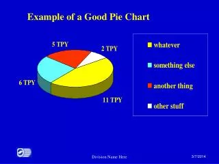
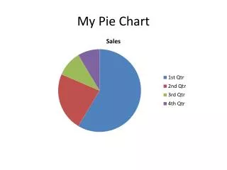
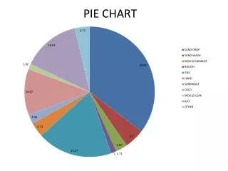
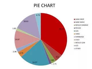
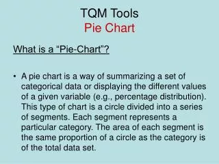
TQM ToolsPie Chart What is a “Pie-Chart”? • A pie chart is a way of summarizing a set of categorical data or displaying the different values of a given variable (e.g., percentage distribution). This type of chart is a circle divided into a series of segments. Each segment represents a particular category. The area of each segment is the same proportion of a circle as the category is of the total data set.
TQM ToolsPie Chart Pie charts usually show the component parts of a whole. Often you will see a segment of the drawing separated from the rest of the pie in order to emphasize an important piece of information.
TQM ToolsPie Chart • How can you construct a “Pie-Chart”? A pie chart is constructed by converting the share of each component into a percentage of 360 degrees. Example for 2 components each 50%: - Draw a circle with your protractor. - Starting from the 12 o'clock position on the circle, measure an angle of 180 degrees with your protractor. The first component should make up half of your circle(50%). The other half is for the second 50%
TQM ToolsPie Chart If you have to do a ‘pie-chart’ with other percentages you only have to follow an easy rule to change from your scale to a 360º scale. 360___________100 x_____________y where x are the degrees corresponded with your y amount of percentage
TQM ToolsPie Chart The following example chart is based on preliminary results of the election for the European Parliament in 2004. *Because of rounding, these totals do not add up to 100 and 360.
TQM ToolsPie Chart Pie charts are a very useful quality tool because of its simplicity. You can get a whole idea only by looking at it once. On this way, you can detect fast: • Mean the average of all the data points in the series (when appropiate). • Maximum the maximum value (biggest slice) in the series.
TQM ToolsPie Chart • Minimum the minimum value (smallest slice) in the series. • Sample Size the number of values (slices) in the series. • Range the maximum value minus the minimum value. • Standard Deviation Indicates how widely data is spread around the mean.
TQM ToolsPie Chart Example : What type of film do people like the most?
TQM ToolsPie Chart In this example, we can see: • Maximum : COMEDY • Minimum: SCIENCE- FICTION and FOREIGN • Sample Size: 7 slices • Range: 27% - 8% = 19%
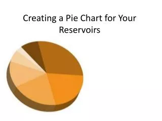
TQM ToolsPie Chart As we have explained pie charts can be drawn by hand, however an easier way to create pie charts is via computer software. For example Microsoft Excel, MATLAB…