Download

1 / 43
440 likes | 575 Views
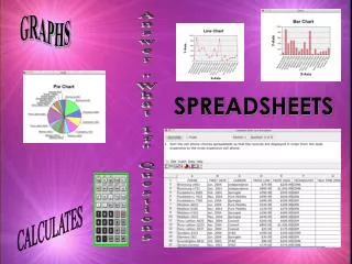
Data & Graphs. Review. Frequency Tables. Statistics involves collecting, organizing, analyzing, and presenting data. Data are pieces of information that are often numerical. A frequency table shows the number of pieces of data that fall within given intervals. Make a Frequency Table.

E N D
Data & Graphs Review CONFIDENTIAL
Frequency Tables • Statistics involves collecting, organizing, analyzing, and presenting data. • Data are pieces of information that are often numerical. • A frequency table shows the number of pieces of data that fall within given intervals. CONFIDENTIAL
Make a Frequency Table • Example: The number of points scored by major league soccer teams in a recent season is shown. CONFIDENTIAL
Make a Frequency Table • Step 1: Choose an appropriate scale and interval for the data • Scale: 1 to 60 • Interval: 15 The scale includes all of the data, the least number and the greatest The interval separates the scale into equal parts. CONFIDENTIAL
Make a Frequency Table • Step 2: Draw a table with three columns and label the columns Points, Tally, and Frequency • Step 3: In the first column, list the intervals. In the second column, tally the data. In the third column, add the tallies. Some frequency tables may not have scales and intervals CONFIDENTIAL
Your Turn Make a Frequency Table • Make a frequency table of the data shown in the table. CONFIDENTIAL
Line Graphs • A line graph is used to show how a set of data changes over a period of time. The scale and interval are also shown on the vertical axis. Each frequency is shown using a point. Number of Coasters A line graph also has titles and labels The categories are written on the horizontal axis. CONFIDENTIAL
Make & Interpret a Line Graph • Example: Make a line graph of the data at the left. Then describe the change in the number of tornadoes from 2001 to 2003. • Step 1; Decide on the scale and the interval. The data includes numbers from 941 to 1,424. The scale is 900 to 1,500 and the interval is 100. CONFIDENTIAL
Make & Interpret a Line Graph • Step 2: Label the horizontal and vertical axes. • Step 3: Draw and connect the points for each year. Each point shows the number of tornadoes in that year. • Step 4: Label the graph with a title. Tornadoes The number of tornadoes decreased from 2001 to 2002 and then increased from 2002 to 2003. CONFIDENTIAL
Your Turn Make & Interpret a Line Graph • Make a line graph of the data. Then describe the change from 1960 to 1995. CONFIDENTIAL
Bar Graphs • A bar graph is used to compare data. The title and label describe the data The scale is written on the vertical axis Sales of toys The height of each bar represents the frequency Revenue $ millions On this scale, the interval is 50 Time The categories are written on the horizontal axis. CONFIDENTIAL
Make & Interpret a Bar Graph • Example: Make a vertical bar graph of the data. Compare the number of students who scored a B to the number who scored a C. • Step 1: Decide on the scale and interval. The data includes numbers from 2 to 13. So, a scale from 0 to 14 and an interval of 2 is reasonable. CONFIDENTIAL
Make & Interpret a Bar Graph • Step 2: Label the horizontal and vertical axes. • Step 3: Draw bars for each grade. The height of each bar shows the number of students earning that grade. • Step 4: Label the graph with a title. About twice as many students scored a B than a C. CONFIDENTIAL
Your Turn Make & Interpret a Bar Graph • Make a vertical bar graph of the data. Compare the time it takes for a rabbit to be born to the time it takes for a camel to be born. CONFIDENTIAL
Circle Graphs • A circle graph is used to compare parts of a whole. • Analyze data by comparing the size of the sections of the circle. • One can compare the percents to analyze the data as well. The interior of the circle represents a set of data. The pie-shaped sections show the groups. The percents add up to 100% CONFIDENTIAL
Your Turn Circle Graphs • The circle graph shows which method of transportation students use to get to Martin Luther King, Jr. Middle School. • Which method of transportation do most students use? • How does the number of students who ride a moped to school compare to the number of students who take the bus? CONFIDENTIAL
Stem & Leaf Plots • In a stem-and-leaf plot, the data is ordered from least to greatest and is organized by place value. • Step 1: Order the data from least to greatest 56 60 62 67 68 68 69 70 70 70 71 72 76 76 78 82 83 84 88 93 97 • Step 2: Draw a vertical line and write the tens digits from least to greatest to the left of the line. These digits form the stems. Since the least value is 56 and the greatest value is 97, the stems are 5, 6, 7, 8, and 9. CONFIDENTIAL
Stem & Leaf Plots • Step 3: Write the units digits in order to the right of the line with the corresponding stem. The units digits form the leaves. Leaf Stem 5 6 The ones digit of the data form the leaves. In this data, the tens digit forms the stem. 6 0 2 7 8 8 9 7 0 0 0 1 2 6 6 8 Always write each leaf even if it repeats. 8 2 3 4 8 9 3 7 7 6 points key CONFIDENTIAL
Your Turn Stem & Leaf Plots • Make a stem-and-leaf plot for the data in the table. CONFIDENTIAL
Making Predictions & Interpreting Graphs • Line graphs are often used to predict future events because they show trends over time. Example: You can predict the average temperature for Miami in February by the trend in the line graph. CONFIDENTIAL
Your Turn Making Predictions & Interpreting Graphs • The graph shows the number of participants in bowling from 1975 to 2000. What does the graph tell you about the popularity of bowling? CONFIDENTIAL
Mean • The mean of a set of data is the sum of the data divided by the number of pieces of data. • Example: data set : 8, 7, 9, 6, 10 • Mean = 8 + 7 + 9 + 6 + 10 = 40 = 8 5 5 CONFIDENTIAL
Determine how Outliers affect Mean • A set of data may contain a value much higher or lower than the other values. This value is called outlier. • Outliers can significantly affect the mean. • Example: data set : 80, 81, 40, 77, 82 • Mean with outlier = 80 + 81 + 40 + 77 + 82 = 360 = 72 5 5 • Mean without outlier = 80 + 81 + 77 + 82 = 320 = 80 4 4 CONFIDENTIAL
Median, Mode, and Range • The median of a set of data is the middle number of the ordered data, or the mean of the middle two numbers. • Examples: • data set: 3, 4, 8, 10, 12 -> median: 8 • data set: 2, 4, 6, 8, 11, 12 -> median: 6 + 8 = 7 2 CONFIDENTIAL
Median, Mode, and Range • The mode of a set of data is the number or numbers that occur most often. • Examples: • data set: 12, 23, 28, 28, 32, 46, 46 -> modes: 28 and 46 CONFIDENTIAL
Median, Mode, and Range • The range of a set of data is the difference between the greatest and the least values of the set. • Examples: • data set: 125, 45, 67, 150, 32, 12 • The greatest value is 150. • The least value is 12. • So, the range is 150 – 12 or 138. CONFIDENTIAL
Median, Mode, and Range • Concept Summary CONFIDENTIAL
Your Turn Median, Mode, and Range • What are the mean, median, mode, and range of the temperature data 640, 700, 560, 580, 600, and 700 . CONFIDENTIAL
Let us take a break! CONFIDENTIAL
Jig-saw puzzle • http://www.thekidzpage.com/onlinejigsawpuzzles/jigsaw-puzzles/12-piece-jigsaw/05-04-06-kitten.html CONFIDENTIAL
Box & Whisker Plots • A Box-and-whisker plot is a way to show how data are clustered or spread out. • Example: The monthly mean temperatures for Burlington, Vermont, are shown. CONFIDENTIAL
Box & Whisker Plots • Step 1: Write the data from least to greatest. 16 18 23 31 37 44 48 56 59 65 68 71 • Step 2: Draw a number line that includes all of the data. 20 25 50 15 30 60 65 75 55 70 40 45 35 • Step 3: Mark the least and greatest as the lower extreme and upper extreme. Find and label the median. Lower Extreme Upper Extreme Median 20 25 50 15 30 60 65 75 55 70 40 45 35 CONFIDENTIAL
Box & Whisker Plots • Step 4: The median of a data set separates the set in half. Find the medians of the lower and upper halves. 16 18 23 31 37 44 48 56 59 65 68 71 Median 59 + 65 = 62 2 23 + 31 = 27 2 • Label these values as lower quartile and upper quartile. Draw a box around the quartile values, and whiskers that extend from each quartile to the extreme data points. Upper Quartile Lower Quartile Median Upper Extreme Lower Extreme 20 25 50 15 30 60 65 75 55 70 40 45 35 CONFIDENTIAL
Your Turn Box & Whisker Plots • Draw a Box-and-whisker plot for the set of data below. CONFIDENTIAL
Assessment 1) Make a frequency table for the set of data. CONFIDENTIAL
Assessment 2) Make a line graph for the set of data. CONFIDENTIAL
Assessment 3) Name two muffins that together are preferred by half the people surveyed. CONFIDENTIAL
Assessment 4) Describe the trend in the winning times. Predict the winning time in 2006. CONFIDENTIAL
Assessment 5) Make a stem-and-leaf plot for the set of data. 83, 72, 95, 64, 90, 88, 78, 84, 61, 73 CONFIDENTIAL
Assessment 6) Find the mean for the set of data. 23, 34, 29, 36, 18, 22, 27 CONFIDENTIAL
Assessment 7) Find the median, mode, and range for the set of data. 21, 23, 27, 30 CONFIDENTIAL
Assessment 8) Which graph would you show to a telephone customer? Explain. CONFIDENTIAL
Great Job! Session! See you in the CONFIDENTIAL