Download
1 / 16
160 likes | 183 Views
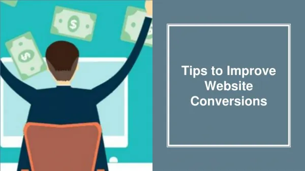
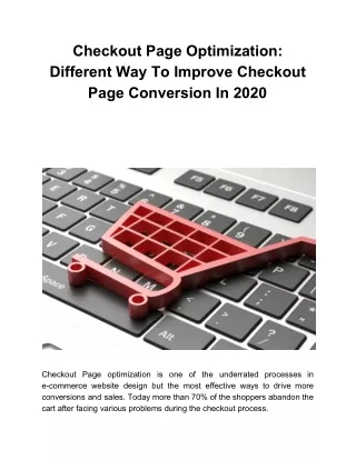
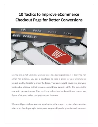
If your eCommerce checkout page is not optimized correctly, your customers will likely lose trust and confidence. Let them proceed with the flawless eCommerce checkout page; they will be back for sure. Read more to know what are the 10 tactics to improve the eCommerce checkout page for better conversions.

E N D
10 Tactics to Improve eCommerce Checkout Page for Better Conversions Leaving things half undone always equates to a bad experience. It is like living half a life! For instance, you ask a developer to code a piece for your eCommerce project, and he forgets to close the loops. That code would never run, and your trust and confidence in that employee would fade away in a jiffy. The same is the case with your customers. They are likely to lose trust and confidence in you, too, if your eCommerce checkout page misses the mark. Why would you lead someone on a path where the bridge is broken after about ten miles or so. Coming straight to the point, why would you let your visitors/customers
browse and add products to the cart if they can’t proceed with navigating through the cart & checkout page? The latest example of this scenario is that of Adidas. A frustrated customer rightly asked the Adidas team on Reddit, “Why won’t you take my money.” This is the worst scenario where a customer is ready to pay, but the interface would create issues. It is quite similar to striking an ax on your feet, quite literally. But, it isn’t just Adidas that unknowingly created such bad experiences, but this is a common scenario in the eCommerce business arena, and everyone has been there at some point in time. And, thus designing a seamless checkout page when proceeding with eCommerce development project should be a priority.
Urgency Behind Building a Workabale eCommerce Checkout Page? Again it narrows down to halfway experiences, which is a complete no-no when concerned about uplifting the ROIs. Perfection should be your favorite buzzword when checkout page optimization is in question. This is an initiative that you need to take for creating a shopping experience that will result in making a data- informed decision. Here are some eye-opening stats that your business needs to keep track of.
Why fall into the trap of these never-ending customer plights, when there is always a second chance to make things better. Highlighting the Need to Cope up with Customer Expectations According to the Salesforce report State of the Connected Customer, “84% of customers say the experience a company provides is as important as its products or services.” That is, customized and flawless experiences across multiple touchpoints need to be in place in the online space where various disruptive businesses are already setting standards in the market. Other takeaways from this report that can’t be overlooked include:
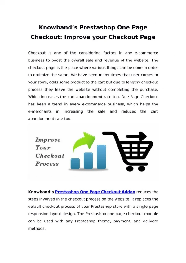
So, the question is – What can you do to make it up for the user experience that would count? Here are some unprecedented tips to help you kick-start the eCommerce checkout page optimization. How to Create the Best eCommerce Checkout Pages? Follow these seven tips that can help you get ahead of the pack in this era of online business. 1. Single Page Checkout The traditional eCommerce checkout flow that almost every eCommerce business follows – Review the cart, enter the shipping details, select the payment method, and finally make the payment. There are separate pages to go through each of the steps, isn’t it? But, that needs to change. The need for a single page checkout is on the rise, i.e., all the steps involved in placing the order are consolidated on a single page. The customers get the convenience to choose which step they need to complete first, and also the order gets placed in about one to two clicks. Thus, the low rate of shopping cart abandonment becomes achievable.
2. Reduce Manual Workload The greatest salespeople in the world are good listeners; they do not ask much from their prospective clients. This is the same logic you need to apply when making sales online. From reducing the number of form fields to saving the billing details for later, everything adds up to create an enjoyable checkout experience. An outstanding example of this is for, of course, Amazon. They save the billing and shipping information so that they do not have to fetch cards to feed information time and again. A study by Baymard Institute, says that an average checkout flow has around 15 form fields. If that is the case with your UX design, too, customers are likely to leave. Talk to a reliable user experience agency that can help you cut this intimidating process by about 60% percent to help create a minimalistic checkout design. How Net Solutions Helped Legend Footwear Improve Checkout Performance? Legend Footwear is an eCommerce brand that sells shoes across the world. Their platform is built on Magento 2, and when they approached us, the checkout process was broken that led to low conversion rates.
The checkout page loading speed was pretty slow, and lack of payment options was the major challenge. We went ahead with embedding the instant checkout process, and integrated payment gateways that were popular in the market. The result: Better customer engagement Smooth and fast checkout process Checkout time reduced by up to 80% To know more about how we made this possible, you can read our case study here.
3. Visual Progress Bars If you still insist on sticking to the multi-page checkout process, try maintaining transparency by keeping customers informed about where they are on the journey to order completion. It is a simple psychological trick that would work in your favor. Let’s say you are running a marathon and you get exhausted on the way. Just when you are about to give up, you look at the billboard ahead that says, “One Lap Left.” Your brain signals you to collect all the energy you are left with to complete the race because you are almost 90% done. The last lap is just like around the corner, and that hope leads to a win. If there were no signals, giving up would dominate the urge to proceed. The same is the case with your customers who are trying to make a purchase. That is why pay heed to include progress bars, which makes for a great UX design practice when working on the eCommerce checkout page. 4. Promote Membership Subscriptions Amazon has “Prime,” which makes it one of the top disruptors in the market in terms of innovation. Be it their “one-day shipping” plan or “free delivery,” Amazon continues to entice and attract users like a pro. Consumers are more than willing to place orders on Amazon even for low-cost items such as toiletries. Here is an insight by eMarketer that says so.
That is why your eCommerce checkout page design should include an option to subscribe to such privileged memberships. This way, you’ll make money from subscriptions along with building trust among the peers, and order placement probabilities will escalate too. It is indeed a win-win situation. 5. Multiple Payment Options Embedding all the popular payment options result in getting your customers to the end of the funnel. And, do not miss out on the latest ones such as “Apple Pay.” It is slowly garnering attention for the extravagant security it offers. It is only available for the Safari browser on iPhone, iPad, or Mac for now, but is expected to become a mainstream payment option soon. As for other globally popular payment options, do not give a miss to cash payments, credit cards and debit cards, and wallet induced payments. For instance, according to eMarketer, 41% of the US internet buyers prefer making payments through credit cards when buying online, while 28% of smartphone users prefer using a mobile wallet. The lesson is that you cannot let fate take charge. Embrace this payment-oriented checkout page strategy and see a direct upsurge in the expected ROIs. If you have a Magento store, you can easily integrate popular payment options and apply them to your store.
6. Spot-On Recommendations If someone buys a smartphone, it is quite likely that they’ll need a back cover too. Or, if someone buys a study table, they are likely to buy a chair too. Such suggestions can be automated by building a robust recommendation engine and embedding it on the checkout page. Amazon again takes the brownie points for its recommendation engine. 35% of Prime Day shoppers bought something they hadn’t planned to buy at all. Where half the credit can be given to the amazing deals, the other half is a contribution by its recommendation engine. Thus, try and make space for such recommendations on the eCommerce checkout page along with offers available. Your checkout page conversions will surely touch sky-rocketed heights all because you made your customers feel empowered. 7. Promo Codes with Distinctive CTA Buttons Offering discounts on the cart page can be a game-changer for your business. Almost every eCommerce business is doing it today because consumers love it. Even a 10% discount becomes a reason behind complete transactions. Nearly two-thirds of the US internet users said they are ready to trade their location-based data in turn of discounts & rewards – Forrester Consulting
Seasonal discounts are obvious, but offering applicable promo codes on a particular cart value or through a specific payment method should be promoted. And, do not forget to make the promo code field identifiable. This is because sometimes customers complain that they did not spot the field and proceed with canceling the already placed order only to repeat the ordering loop. 8. BOPUS is Gaining Traction Another valuable aspect of the eCommerce market that has been making news for all good reasons is – BOPUS, i.e., Buy Online, Pick Up in Store. If your eCommerce business has a stronghold in the online space, you can consider moving to brick- and-mortar stores. Like what Amazon has already been doing. Thus adding the BOPUS facility on the eCommerce checkout page design can make things a lot better for your business. In 2018, 81.4% of shoppers placed orders online and scheduled a pick-up from the stores. Do not let go of this opportunity, whether you are already brick-and-mortar or thinking to establish one. BOPUS provides tangible benefits to both consumers and retailers. Consumers get convenience, instant gratification, and avoid shipping costs. Retailers reduce operational costs, and it gives them the opportunity to bring customers back to physical stores for additional purchase opportunities – Martín Utreras
9. Secure Checkout Badges “I did not trust the site with my credit card information.” This is one of the prominent reasons for checkout abandonments, which makes it essential to eliminate this kind of hesitation. Consumers are smart these days. They have certain pictures in their heads that equate for trust and assurance. Something like “Ok, Tested” or “Assured.” One of the best eCommerce checkout tips highlights the need for building trust. And, the simple strategy is to insert trust seals or what they call it as “security badges” on the eCommerce checkout page. Also, make sure that these symbols are recognizable. Here is a study by ConversionXL that shows which security badges add what level of security to the checkout pages.
10. Test, Check, Test, Repeat Some users complain that they were ready to make the payment, but their credit card got declined. Like what that Adidas customer reported, “Why wouldn’t you
take my money.” This is a common scenario that creates a distasteful experience and leads to lost revenues. Well, you need to take the bull by the horns when this happens. The trick is to test the entire cart and checkout flow and see it for yourself. Tell your back-end team to make payments through every payment option available. These self-run purchases can quickly help detect what is wrong with the payments and where do you need to push your efforts. It is high time that you take the efforts off the ground and conduct this activity in full swing so that the customer experience does not suffer. Conclusion Be relevant to your customers 365 days of the year and see how your business raises the bar in the eCommerce market. If someone is willing to add products to the cart that means you already sell what they need. But, if you let them proceed with the eCommerce checkout page flawlessly and securely, they will be back for sure without you having to approach them. The simple step is to keep going and never stop innovating and improving. Source - https://www.netsolutions.com/insights/ecommerce-checkout-page-optimization/